cameosis
Moderators
-
Joined
Everything posted by cameosis
-
vector: https://images.mlssoccer.com/image/upload/v1709221457/assets/nyc/logos/mnp/NYCFC_badge_rgb_full-color_2024-web_w4fla0.svg
-
are you a club? how does my criticism of the logo affect you? again, still no justified reason for your post above, instead you keep talking about the logo, but it has nothing to do with you or your reaction. the logo is a collage, you should look up the definition of collage and the technique. i won’t derail the topic further.
-
i’m not responsible for what triggers you or what you assume. »clearly denigrating« towards you, are you serious? you’re pretty much the only one with that unfounded opinion, which doesn’t make sense in the first place. i have never criticized any of the uploaders because of some shitty logos, least of all you. again, if you jump to conclusions without asking first and then lash out, i won’t tolerate it. that’s all from me on the matter.
-
i advise you to watch your mouth, andrea, thanks. i commented on the quality of the logo, which is terrible. not sure what got you so riled up, but your response is way out of line. ask first before you assume things and go out on a personal attack.
-
i’ve done some digging, here’s what i came up with: the line is part of the character’s clothing and actually the border / contour shape in the neck and upper arm area to set it apart from the logo’sbackground (visible below). the black version has deleted the upper part of the shape and now it looks like scribbling (when you compare the two) … they had one job. 🤣 i would suggest using the logo with the white background as the main variant and the all-black one as an alternative - of course, the bottom has to be corrected -- how they managed to cut it off TWICE when taking a screenshot is beyond me. i will definitely need to redraw this one eventually. the club uses the version with the white background for match announcements and it has been on their kits both with main and inverted colors. check out the football player on the right, it’s amazing how he continues playing with a dislocated rubber leg! as a bonus, i also found the historical logo, unfortunately blurry:


-
this one is ... remarkable ... a black hole in the center 💀🌚 do you know if the bottom is a signature or just graphic decoration? i have the impression something is missing in the center.
-
-
ma non è vero … clubs are doing collage logos now … this looks a bit like a mix of a fever dream and a kindergarten art project.
-
an african samurai in feudal japan ... epic fail. next thing will be that shaka zulu was in fact a danish guy ...
-
-
that's inevitable with the transition to a new engine, the graphic parameters will be very different, as the possibilities will be very distinct from the current and retired engine framework. i'm curious to see how it will affect the dimensions of graphics, could be an increase in display size again.
-
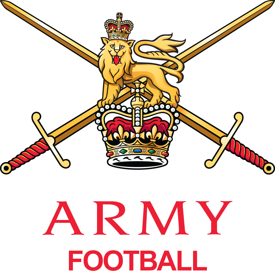
»great britain« - id 145174 all the teams listed are army regiments, so it seems very likely that this is actually the army fa: https://sortitoutsi.net/football-manager-2024/nation/145174/great-britain#staff nation logo and team logo:

-
i was actually trying it out (cabo verde) a few months ago, but it wasn’t very user friendly. managing a national side in the game is what i’d almost find more interesting than a club, i’m one of those 5 percenters. 😂
-
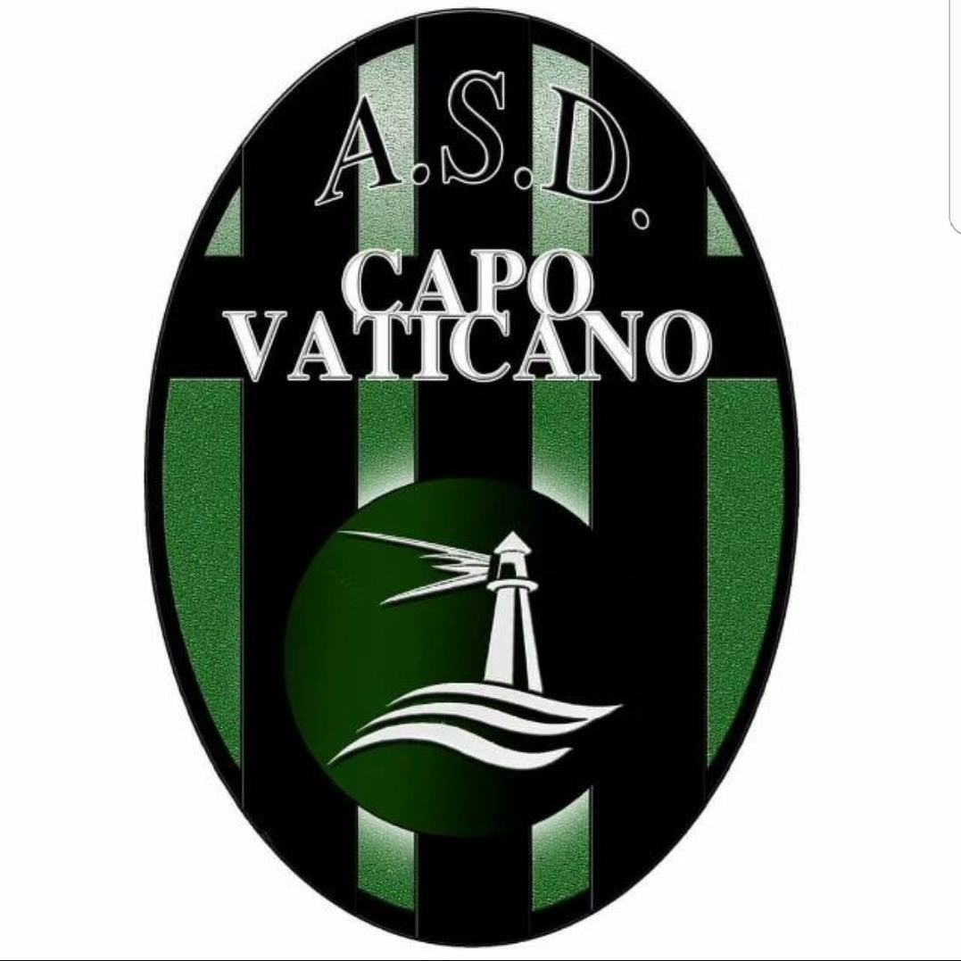
asd sport in vaticano - id 2000004828 historical: capo vaticano - id 43127061 historical 2017: historical 2016:


-
you have to wonder who would use a dropped ice cream cone as their logo ...
-
on another note, if you’re interested in making and recreating templates yourself, i recommend starting with video tutorials on youtube. depending on which program you use, there are numerous lessons that are usually easy to follow along - here are a few, just so you know what usually are the tools for graphics manipulation: 👉 photoshop (standard, but pricey - they offer a time-limited trial version … there are also versions out there that have been »upgraded«) 😂 👉 gimp (open source and freeware) 👉 affinity photo (affordable one-time purchase) 👉 there are more, but the above are the most common and powerful editing programs the techniques applied are usually the same across programs. keywords for you are LAYERS, OVERLAY, TEXTURES, BLEND MODES - you’ll branch out once you go from there. here are a few example tutorials to give you an idea: photoshop gimp affinity photo
-
a correction regarding the nation logo for great britain - it should be the following (vector): nation logo - id 219003 responsible organizing body for the team, like a football association for the respective national football team. national team logo - id 219003
-
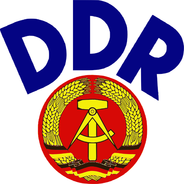
east germany - id 577 national team logo: vector:
-
great britain - id 219003 nation logo and national team logo - sortitoutsi uses the english fa logo, which is wrong: monochrome alternative (without year and place):
-
svg vector logos for clubs of the norwegian eliteserien: https://logotyp.us/logo/viking/ website offers vector logos in general (svg): https://logotyp.us/industry/
-
it should be noted that the background is not part of the logo:
-
sadly, not yet. if you had picked barcelona or lisbon, i could have recommended a few spots. but that’s the joy of exploring. 😂 i can definitely recommend tripadvisor for suggestions: https://www.tripadvisor.com/Tourism-g187514-Madrid-Vacations.html https://www.tripadvisor.com/Attractions-g562642-Activities-Community_of_Madrid.html
-
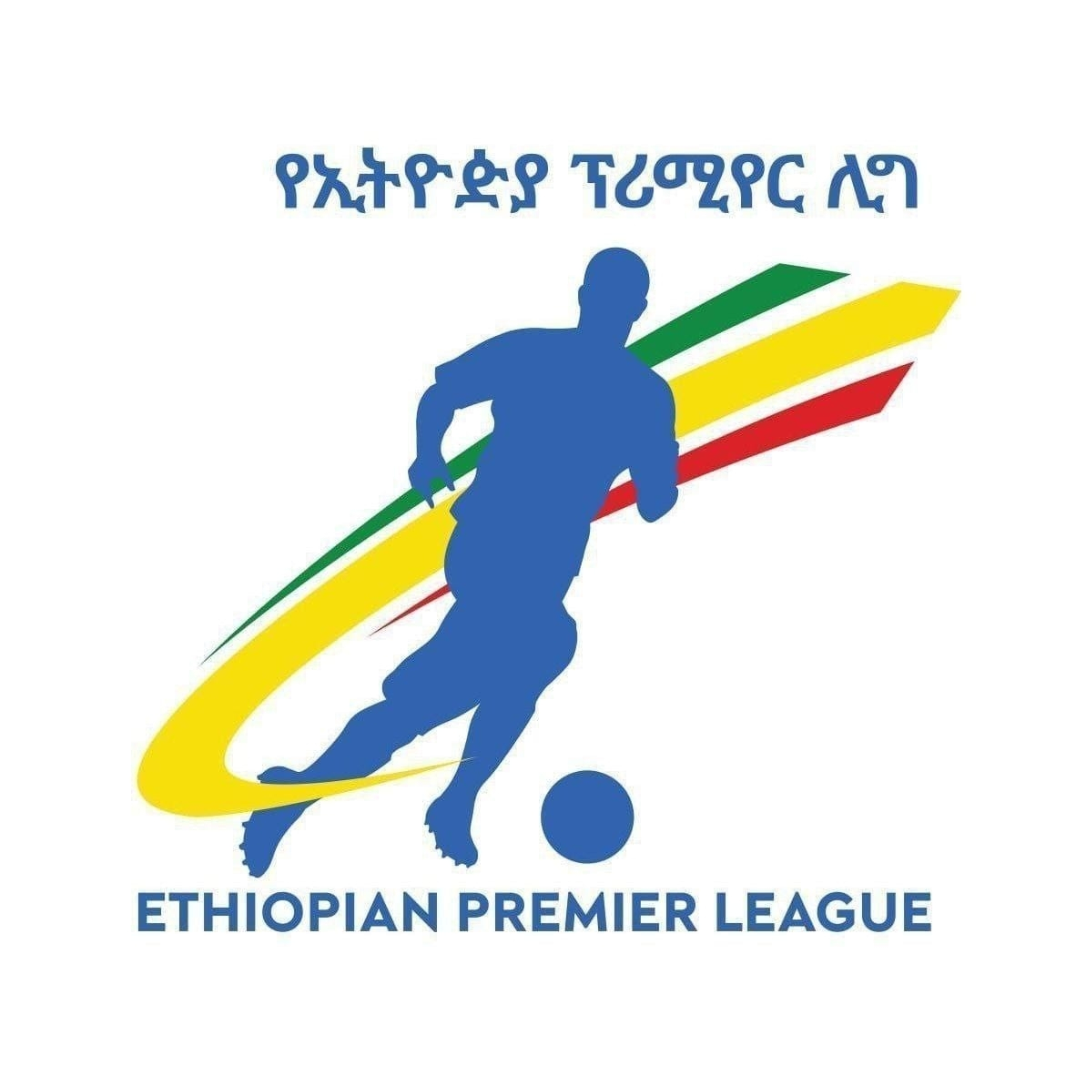
excellent, thanks for the correction - i wonder if the lines in the center of the logo are just ornaments or actual text in ge’ez: and a nice coincidental find - id 13211690 the ethiopian calendar is the reason they have »two« foundation dates in the federation’s logo 😄👍


-
no problem about that. i already have loads of trophies and player faces on my hd, looking forward to seeing what they will include.
-
will they cover clubs and players from all continents or just europe and the biggest five leagues? two games in one now 😂😂