cameosis
Moderators
-
Joined
Everything posted by cameosis
-
you cannot make this up: https://thenextweb.com/news/pico-lopes-linkedin-world-cup-cape-verde CP24How LinkedIn led Lopes on World Cup adventure with Cape V...When Roberto Lopes was originally contacted by the Cape Verdean football association on LinkedIn, he did what many people do with unsolicited messages on the professional social media platform - he igWhen Roberto Lopes was originally contacted by the Cape Verdean football association on LinkedIn, he did what many people do with unsolicited messages on the professional social media platform - he ignored it, almost costing him the chance to play at the 2026 World Cup. The teak-tough, Irish-born central defender thought the message in Portuguese was spam and did not bother replying. It was only when he received a follow-up message in English that he realized it was an offer to play international football for Cape Verde, who take on Spain in their opening World Cup group game on Monday. “Nine months later they messaged me back in English asking if I had thought about the proposal, and it was only then that I did what I should have done originally and Google-translated the original message asking if I would be interested in declaring for Cape Verde,” a laughing Lopes told Reuters in a telephone interview prior to the tournament.
-
in case anybody doubts the quality of players in ireland, i believe that issue has been settled today. 😂
-
new logo fk jablonec FK Jablonec — Nová vizuální identitaNová vizuální identita FK Jablonec staví na silném propojení s regionem, komunitou a tradicí. Symbol jabloně představuje stabilitu, růst a novou éru klubu.main (vector) alt the site also has all the historical logos:
-
don’t know if this has been updated in the meantime - i have been off for a longer while and am busy with off-site projects - hnk šibenik reverted to the previous logo color-wise: hnk šibenik is history, the club has been dissolved because it went bankrupt and didn’t receive a license for the first three league levels. there is a new phoenix club called gnk šibenik (which has yet to receive its own id) - this is allegedly the logo (on the right), but no official confirmation yet. Šibenik se ugasio. Osniva se novi klub koji će se zvati k...NAKON 94 godine postojanja, HNK Šibenik je zbog financijskog kraha odigrao svoju posljednju utakmicu. Klub se gasi, a tradiciju će nastaviti novi klub koji kreće od najnižeg ranga natjecanja.FOTO Grb novog Šibenika neodoljivo podsjeća na moćnu tvrt...OSNOVAN je novi klub.
-
vector:
-
feel free to include lower quality logos, either someone will find the time to redraw them or dig up a better image. also, logo collectors like me always need to satiate their completist urge. 😁
-
2000359675 - Nsingizini Hotspurs FC
-
vector
-
vector version
-
vector logo in much better quality
-
vector there is also a colored variant (vector) https://seeklogo.com/vector-logo/12308/associacao-desportiva-senador-guiomard
-
have you checked if this is the most recent logo they used? i had posted a timeline with all the logos and it‘s likely a different logo was in use when they dissolved. @Derek
-
this is still fantasy, the official league logos have all been posted several times, last time in november 2025. @Derek please don‘t upload from sources that are not the federation or league site.
-
nice one, there is no gap between the boar legs and the grass, however:


-
so the correct logo is the bilingual wordmark/text alone, did i get that right?
-
looks like an alt. they did update the football and the typefaces, cleaned up the paths.
-
malicki usually greatly improves logos even when altering details. not sure what the supporters were raging about, the changes were minimal.
-
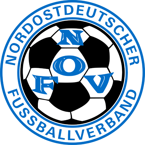
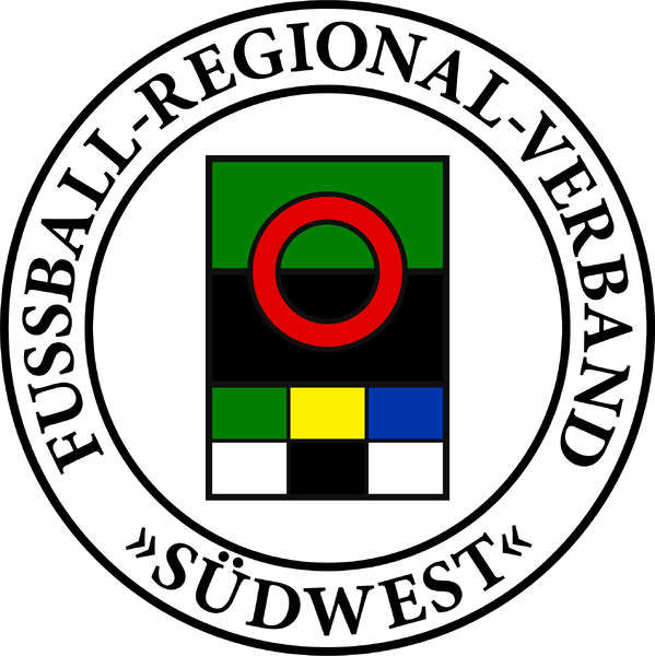
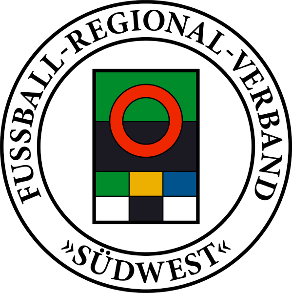
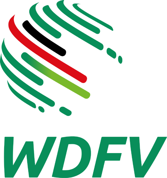
the regional federation logos should already be in the pack for the men and can be copied over: nord süd nordost - current nordost - historical südwest (regionalverband) - main südwest (regional) - alt west - main (just the competition logo) west (federation) - current (alt) west (federation) - historical (alt)


-
i think this is for the national team
-
i’m not sure if i understand correctly. fantasy logos are fine, as long as they are clearly marked as fantasy. @Derek has a separate directory/folder for fantasy logos in the packs. alternative and retro/historical logos also have separate directories/folders, so users can choose which logo they want to display in the game. there is also the issue of sports interactive inventing fantasy competitions and leagues very often - that means that there will only be fantasy logos in such cases. we aim to close all gaps eventually when it comes to displaying logos, rather than only having the graphics for the current db version in the packs.
-
excellent, thanks for the file. as to search filters and search options -> when i said i don’t play the game, it means i haven’t installed it. i have no time to play it, i only search for graphics and share them. i cannot look up entries at the moment - sometime in the future, i will reinstall fm 24. that also means that the version that i bought and own is fm 24, not fm 26. i had only installed fm 24 previously to extract all the ids and make research easier for logos, portraits, trophy graphics and background images, but that was more than a year ago and before a hard disk crash. the clubs in the list that i shared are not separated by men’s and women’s teams, because women were only officially added in fm 26, not in fm 24, which means that they all should be men’s team in that version of the db. それでは。
-
i am not playing the game. the list that i have posted is extracted directly from the database of fm 24. what i would personally be interested in, is a list with the club names in japanese - that would speed up logo research tremendously.
-
genie scout can batch export ids for staff, players and clubs, amongst other things -- only limited to the number of entries in the db: https://www.fmscout.com/a-fm-genie-scout-24.html here is the complete list of japanese clubs in fm 24 as a html, ods and csv chart - 2500 teams - ignore the leagues, most are incorrect due to how genie scout exports. the entries appearing in search but not results is a consequence of the db entries which are no longer in the most recent db version being suppressed/hidden, not deleted or removed. all the entries flagged from the first iteration of football manager are technically in the db from what i gathered, but the ones flagged as obsolete are marked as »hidden« and therefore are not displayed in the editor. jpn - checklist - clubs.html jpn - checklist - clubs.ods jpn - checklist - clubs.csv
-
i will send you a personal message later to clarify, cheers.
-
please read the rules again, the issues are addressed there. the editor screenshot is helpful, because it shows that even in the japanese version of football manager, they have not used the original japanese names for the clubs, which is terrible.