


cameosis
Moderators
-
Joined
Everything posted by cameosis
-
558338: Irish Shield
-
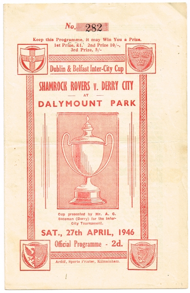
not sure where this one fits in: https://corkbusinessleague.ie/wp-content/uploads/2019/04/Logo-PNG-High-Res.png 52064245: Irish Junior Cup seems as if the fai indeed just uses its federation logo for many of the competitions … https://corkbusinessleague.ie/2023/08/26/fai-junior-cup-2023-24-round-1-round-2-draw-munster-region/ historical 1: historical 2: not familiar with the following, so just posting randomly: 559806: Irish Blaxnit Cup i suggest to take the blaxnit wordmark as the logo, that’s the closest we’ll get to having one: 559793: Irish Dublin and Belfast Inter-City Cup: the leaflet sold for € 240 😂 the image of the cup could be used as a logo https://www.whytes.ie/art/football-irish-programmes-1940s-to-1960s-collection/143880/ 565049: Irish Cross Border Senior Game:


-
could you possibly share the names of the competitions too? i don't play the game, names would alleviate searching for current logos, thanks!
-
a) use download managers that resume downloads in cases where the connection is reset or cut. b) suggest a viable file hosting option and contribute to a possible solution. no disrespect, but your post is not constructive. let me elaborate: we all invest significant amounts of time to make these graphic improvements and upgrades happen for the benefits of the community in general. we do this because we want to, not because we have to. on top of that, derek is covering the costs for the site, which are considerable - access to everything we share here is free. we are aware of the limitations or rather the bottleneck syndrome regarding the downloads. assistance in finding workarounds or better options is very welcomed, cheers.
-
100%, otherwise you risk too many issues, and people nowadays are not really patient anymore. 😐
-
looks like we lost 2½ pages worth of logos in this thread alone ... pages 123 - 125 are gone, they disappeared while i was browsing page 125.
-
vectors historical (inside is white, not transparent) @The Newic could you post the vectors right away, whenever they exist? thanks in advance.
-
bigger resolution
-
fk kauno žalgiris (the white border variant in vector format is for dark backgrounds) https://zalgiris.lt/football/ https://zalgiris.lt/wp-content/themes/zalgiris/assets/images/zalgiris_new.svg historical for the football section football academy / youth (in case they are included in the game) https://www.kzfa.lt/
-
the official version is without gradients, the version that you shared is for web/online purposes: https://fkzalgiris.lt/logotipas/ vector https://fkzalgiris.lt/wp-content/uploads/2019/10/FK_Zalgiris_logo.pdf football academy / youth (in case they are included in the game)

-
vector vector
-
bigger resolution
-
vector https://upload.wikimedia.org/wikipedia/fr/3/3c/Logo_RC_Lens_2014.svg
-
bigger resolution (without club name on top)
-
the regular / main version seems to be this, black »k« and white background: https://www.facebook.com/p/Футбольний-клуб-Колос-100084268195350/ https://ffl.org.ua/team/965 https://hoff.km.ua/kolos-polonne/ http://www.aafu.org.ua/news/chempionat-aafu/1211 the german bundesliga logo consists of only the pictogram on a red background with the wordmark. the white background is not part of the logo, it’s just used for readability purposes. see the official web site - plus, i’m in germany and follow german football. bl_logo_hor_RGB_pos.svg bundesliga_neg.svg 2_bl_logo_hor_RGB_pos.svg 2_bl_logo_hor_RGB_neg.svg https://www.bundesliga.com/de/bundesliga https://www.bundesliga.com/de/2bundesliga i had already provided derek with the main variants (vertical)


-
vector historical vector vector historical vector vector historical historical bigger resolution alternative historical historical


-
sending you a dm to your inbox. 👍 i generally do quality control for the logos whenever i find the time. and as a lawyer, i always pay attention to the »fine print«, so i usually find something when i look for it. 😂 for the alternatives, sure. there is the main variant of a logo and then the alternatives go into the alternatives folder for players to choose according to their preferences. in janowianka’s case however, the alternative may even be the main one, but i can’t say for certain. have a look at the date and where it is displayed.
-
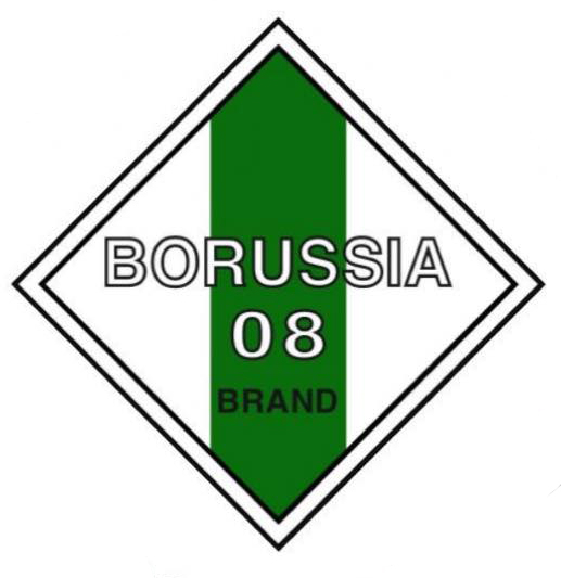
borussia brand, bigger resolution
-
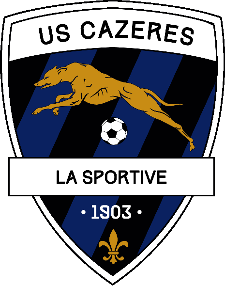
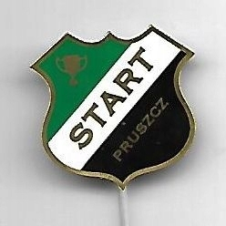
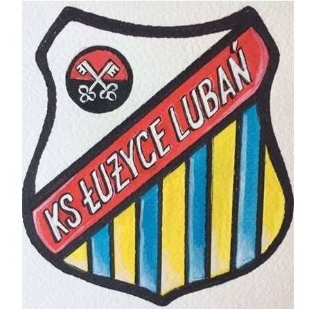
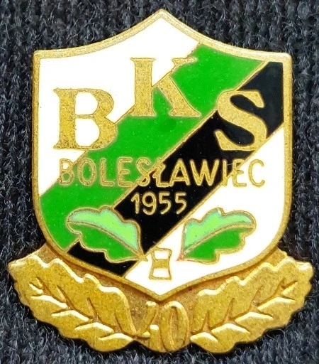
bigger resolution: ŁKS Łomża - 718314 Pniówek 74 Pawłowice - 96030171 historical Noteć Czarnków - 2000265456 vector https://seeklogo.com/vector-logo/498886/notec-czarnkow Łużyce Lubań - 2000274527 historical 1 historical 2 LKS Jawiszowice - 2000291253 Janowianka Janów Lubelski - 2000292591 alternative 1 (different typefaces) alternative 2 (blue mks, different typeface) BKS Bolesławiec - 2000274518 historical 1 historical 2 historical 3 historical 4 Start Pruszcz - 2000290931 historical Górnik Złotoryja - 2000274522 historical


-
hi, could you add the club names, too? the id numbers don’t show up anywhere in the fm23 and fm24 database on sortitoutsi (same with the previous posts), is this a custom database? according to the official club and facebook site, this is the correct logo for gherdenia: https://www.facebook.com/photo.php?fbid=819162256672122&set=pb.100057350662616.-2207520000&type=3 https://www.facebook.com/FcGherdeina http://www.fc-gherdeina.com/de/ https://www.fc-suedtirol.com/de/club/club-partership-partner/228-0.html only macron uses the logo you posted.
-
polskielogo.net, kuba malicki. great logo designer. 👍🏿
-
excellent, just the person we need for quality control. 😬👍🏿 the more, the better. i have the logos for the divisions as vectors somewhere on my hard disk, once i find them, will upload to have better resolution available.
-
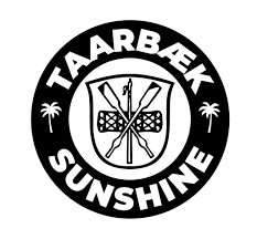
this seems to be the correct typeface according to dbu and club website (both images are compressed, however): historical 1 historical 2 taarbæk needs to be round, they compressed the club logo: bigger resolution:


-
haha, i need to retract what i said, apparently, this is official, at least as the logo template for the jerseys/kits: 🤦♂️🤦♀️ complete rubbish, look at the eagle. i’ll upload a version with the correct outlines. nigeria never disappoints, the federation’s logo on the pennant is different again, see the ball for example: official facebook page has this 🤣:


Important Information
Terms & Conditions