cameosis
Moderators
-
Joined
Everything posted by cameosis
-

-
barau fc - 2000378388 historical

453082576_122166821720114730_8646264662450109889_n.thumb.jpg.45f4fa0a6bd36efd9ee62de5dbc42e0e.jpg)
-
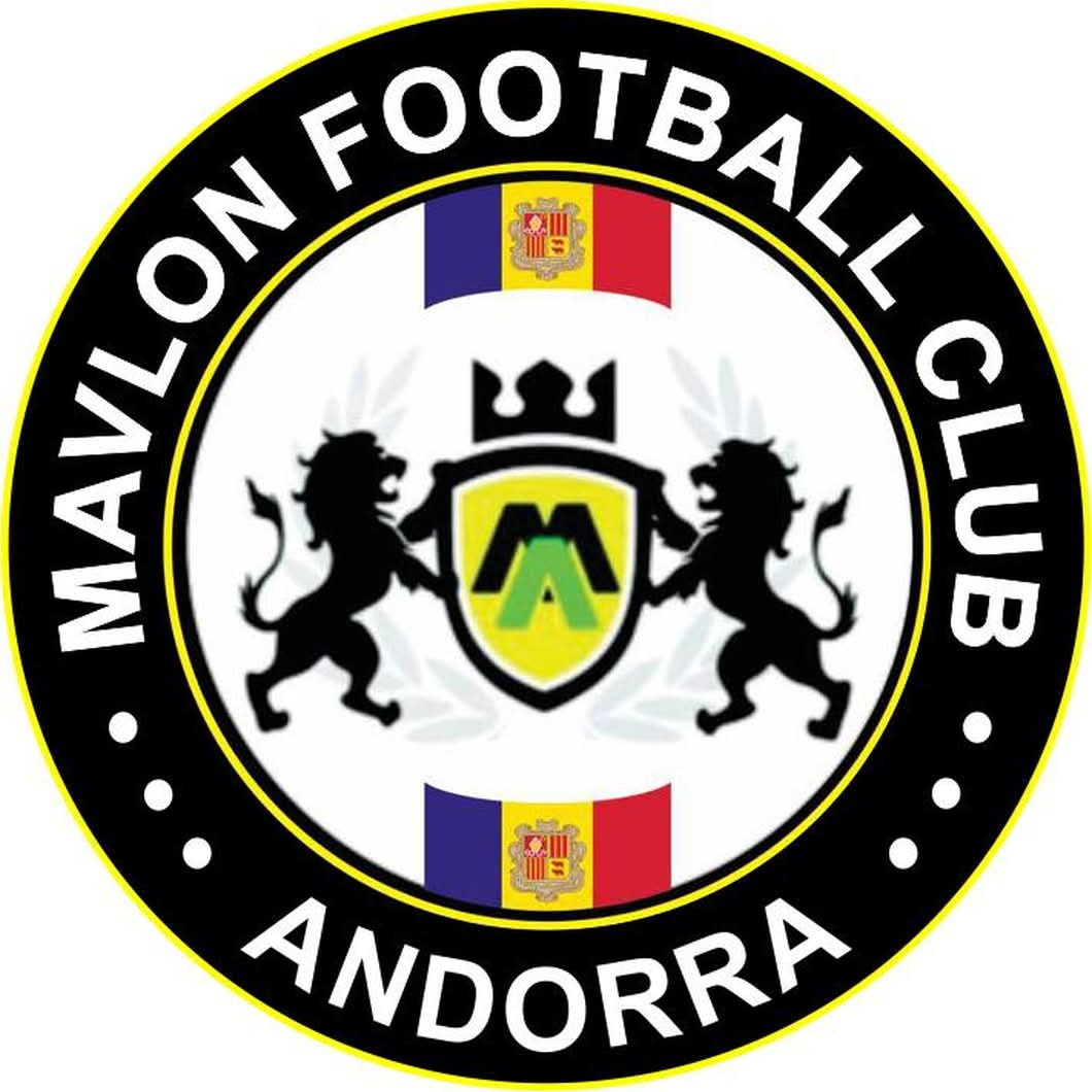
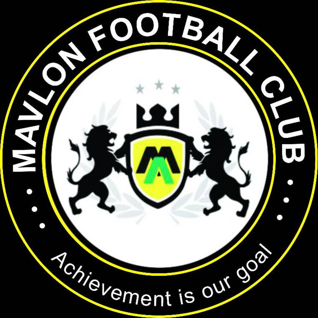
mavlon fc andorra is penya encarnada. they had posted a logo in 2022, that was it, then reverted. La Penya Encarnada es refunda en el Mavlon FCmavlon fc is actually a nigerian youth club from abuja which took part in that italian youth tournament, viareggio. https://www.mavlonfc.com/ https://www.facebook.com/mavlonfootballclub/ we can expect the db to be messed up like the ui, if this is the level of work present for research. the logo for the period 2022-2023 - id 2000240443, 2000488557 (according to fmref): mavlon fc, the nigerian youth club below - id 2000337355 (fmref): alt bigger resolution, but cut off


-
i think i have posted these already andrea did as well:
-
@Derek could you have a look and tell me if the andorran club penya encarnada is active or extinct in fm 26? on sortitoutsi, penya encarnada is listed as an »extinct club«, but is playing in the premier andorran division … https://sortitoutsi.net/football-manager-data-update/team/67109224 https://www.sofascore.com/football/team/penya-encarnada-dandorra/37966
-
it's called ocd. 🤣 and you will post dupes, no worries -- we all do. with the sheer amount of logos, this is inevitable.
-
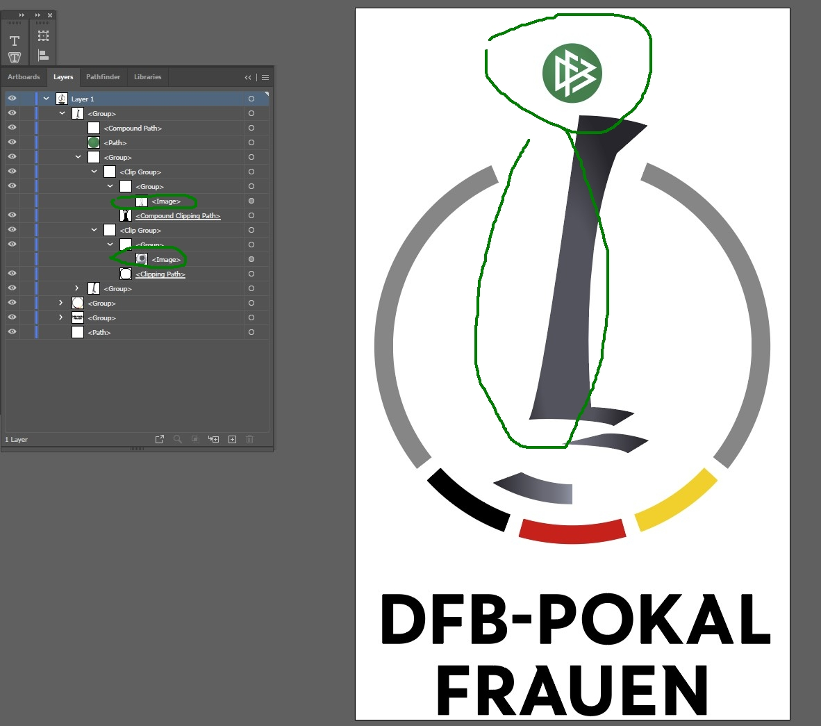
please don’t take the comment as criticism, that’s not what it was. there are often official logos that are really terrible and need to be cleaned up, because the design agencies figured, nobody will notice and it’s »good enough« -- and to be honest, who in their right mind would check all these logos? that’s where i come in. 😆 sadly, it’s what i expected -- the monochrome variants are true vectors, the effect variant is a raster image spiced up with vector elements. of course this won’t have any effect at, say 500 pixels. it’s more of a personal thing where i want all the vectors to be clean and polished. anyway, here’s what i mean: the highlighted part shows »image«, which means it cannot be edited in illustrator, inkscape or another vector program. it’s basically a jpg, png, something of that kind. i’ve turned off the visibility for it in the second screenshot.


-
the league and cup logos are included in my pack above. i’ll have to see if the gradient/effect variant of the cup logo in the official pack is a true vector. copies floating online are a raster graphic with some vector highlights.
-
rebranding for the german federation since november 2025 (vector): background is supposed to be bright green -> there is another variant with bolder type (on the right), the new branding will be rolled out over the coming months and year:
-
girls’ (youth) logo pack from my vector collection -- mostly historic, but some current logos, too. 54 logos in total. no ids, sorry -- no time to look them up. full names included together with the years/periods when the logos were or still are in use. any questions, ask. some examples: girls_misc.rar


-
women’s (senior) logo pack from my vector collection -- mostly historic, but some current logos, too. 80 logos in total. no ids, sorry -- no time to look them up. full names included together with the years/periods when the logos were or still are in use. any questions, ask. some examples: women_misc.rar


-
fm assigns new ids to clubs after they merge or are absorbed. the period when they were independent clubs is retained in-game, together with the logos. the newly formed club gets a new id, to which the new logo is assigned. on another note, has birmingham anniversary been added? by-catch - both for men and women:
-
monochrome alt, from ipswich town’s site:
-
nope! why settle for second best? 😆
-
for completists: last logo before it was dissolved: historical (planned name was women’s major league soccer) barclays vector: VectorSeekWomen’s Super League Logo PNG, SVG, AI Vector – Free Down...Download the Women’s Super League logo in PNG, SVG, and AI formats. Free HD files in one ZIP — ready for web, print, and personal use.wsl 2 bigger resolution (right edge of 2 is cut):

-
ahh, excellent. you had a typo in your post (wls), and there was a league in the usa from 2011-2013 called women’s league soccer, so that threw me off -- they had a division 2. 😂 https://en.wikipedia.org/wiki/Women's_League_Soccer
-
wls as in women’s league soccer? haven’t delved into women’s research yet, had no ids. i’ll have a look. as to the »delay«: some of those should try and see how much time they need to invest in collecting and prepping the logos. ☠️
-
this is usually the case with lower league clubs where there are fewer sources from which logos in hd can be obtained.
-
@Derek by the way, give me a day or two before you release the women’s update -- i have to convert a load of vectors for women’s competitions, mostly historical and alts -- both senior and youth levels.
-
not 100% percent certain, but very likely this: 2000181661 <- u.s. invitational tournament the wicc is an annual invitational tournament in the usa -- or was, rather -- last edition was held in 2022: https://en.wikipedia.org/wiki/Women's_International_Champions_Cup
-
fifa wcc (vectors) women’s icc fifa u-17 wwc (vector) FU17WWC-Logo-for-header-v2.svg fifa u-20 wwc (vector) FU20WWC-2026-Logo-for-header-OK.svg fifa wwc (remove year - variant for dark backgrounds)

-
club wc, variant from fifa tournament site: fifa u-17 wc (vector) Header-Logo-TEST-SVG.svg
-
arab cup vector
-
current and correct logos, main and alt variants color wise: ILoveQatar.netFIFA Intercontinental Cup 2025™The FIFA Intercontinental Cup 2025™ final three matches will be taking place in Qatar from 10 - 17 December 2025.https://www.fifa.com/en/tournaments/mens/intercontinentalcup/2025/articles/intercontinental-cup-2025-everything-you-need-to-know the logo is the same, with the respective name of the qualifier added. haven’t found the derby of the americas and challenger cup variants, but that’s how they will look like, too.

-
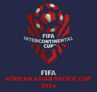
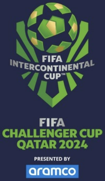
these are all historical/outdated logos from last year -- the main logo would be incorrect -- the qualifiers have their own logos. link to vector for main (color and black): https://fclogo.top/fifa/comp/FIFA-Intercontinental-Cup-v2024 the historical ones were color-coded:

453082576_122166821720114730_8646264662450109889_n.jpg.4024f1a9b26c2a40927e418fa99e3f99.jpg)