
cameosis
-
Posts
1,075 -
Joined
-
Last visited
-
Days Won
63
Everything posted by cameosis
-
svg vector: u19 svg vector: u17 svg vector:
-
this should go into the alternatives folder, if at all. it’s a fan page: https://www.facebook.com/people/Nasarawa-United/100063858840643/ official page on fb: https://www.facebook.com/people/Nasarawa-United/100057262765922/?sk=photos the logo has a red football and a solid color background, not a picture of rocks/minerals: https://www.facebook.com/people/Nasarawa-United/100057262765922/?sk=photos https://www.facebook.com/photo/?fbid=363377698914319&set=a.137865001465591 https://www.facebook.com/photo/?fbid=363377698914319&set=a.137865001465591 https://www.facebook.com/photo?fbid=660942222711067&set=pb.100063858840643.-2207520000. this looks like the one: https://twitter.com/NasarawaUnited/status/1638639514032783360/photo/1

-
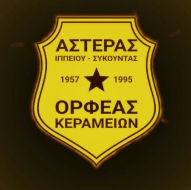
https://www.facebook.com/Asteras.Orfeas/photos/pb.100063448586350.-2207520000./440752911067288/?type=3 historical logo (1980s, most likely) https://m.facebook.com/ippeioslesvou/photos/a.562620797093638/3861274150561603/?type=3&_rdr&_se_imp=2E3WYhZxa07FI2ThE
-
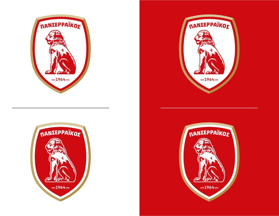
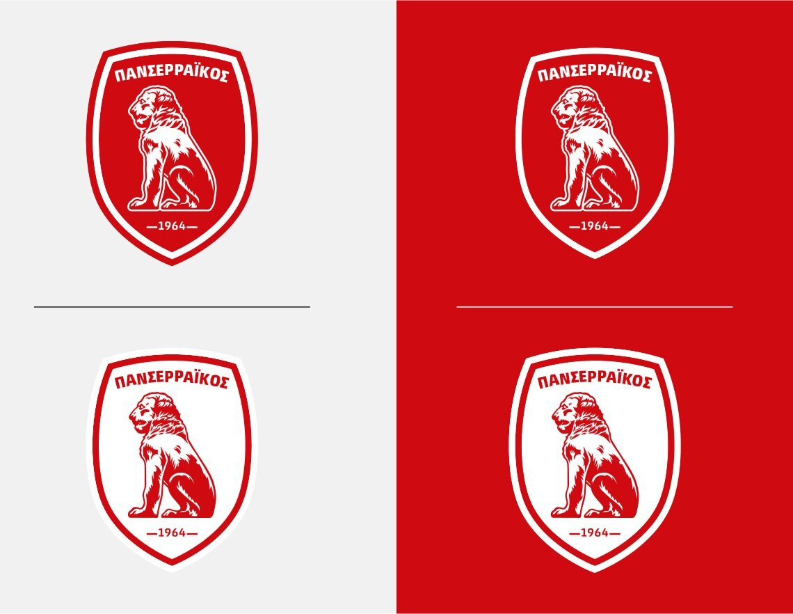
that was a misunderstanding, yes: i asked about the current logo. i couldn’t find any info on the greek sites why they would change the year to 1946 instead of 1964, and i wonder what the reason for this is. the image with the logo history »50 years of panserraikos« that i posted is from an article from 2014.
-
are you sure? they use it on their website and merchandise / jerseys (macron): https://panserraikosfc.gr/
-
do you know why they changed they year of foundation from 1964 to 1946? this one is from the club website: here, the year is omitted, same as the macedonian sun: historical logos: https://www.serressport.gr/50-χρόνια-πανσερραϊκός-50-ημερομηνίες-στ/ concept logos: https://www.lithografiki.gr/portfolio/mgs-panserraikos/ official profile with club history (1964 - present) https://www.multisportclubs.eu/index.php/9-teams/35-gsm-panserraikos
-
excellent, so the first two are concept logos, the last one is the historical one. what is a »fifa system«, a registry for clubs?
-
they have a lot of variants/alternatives flying around: https://www.facebook.com/photo?fbid=10160043572501634&set=g.708533505859731 https://www.futbolasyaf.com/talento-y-vida-fc
-
so it’s historical?
-
did you read about the background with messi? they apparently plan to persuade his former team mates to move to saudi arabia as well, so he would have a familiar environment and feel more at ease. this is like catering to a child with special needs, he's a fucking football player for god's sake, not a physician or someone else making fundamental improvements to society ... that's what i mean with perversion. at the same time, ngos for example struggle with fundraising for different causes.
-
it shows the perversion of professional football. hundreds of millions for kicking a ball. yes, the sport is popular but what is it actually other than entertainment? anyway, am digressing, i'll leave it at that.
-
well, that pretty much is true for all players, to be fair. look at the argentinian and the portuguese, for instance - the former needed gifted penalties to score and lift the world cup trophy, no impact in paris either, living off the past glory in barcelona; the latter was shrunk down to real size once the rest of the team's purpose was no longer assisting him to reach personal records, causing him to disappear to western asia and milk the sheikhs for as much money as possible. haaland was a prolific goal scorer for dortmund too, and they arguably had a weaker squad.
-
regional cup mecklenburg-vorpommern - id 2000073336 new logo for 2023: alternative
-
bigger resolution:
-
they have a lot of wrong names in their database, very sad.
-
commonwealth of independent states, not »soviet« states.
-
that works for me.
-
what wording do you suggest instead?
-
i didn’t say that anywhere, i posted a heads-up about the name change and the new logo.
-
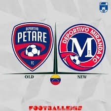
petare changed its name to miranda - id 86000033 https://www.instagram.com/reel/Cpd2hDppuLw/?igshid=MTIyMzRjYmRlZg%3D%3D https://www.balonazos.com/deportivo-petare-cambia-su-nombre-a-deportivo-miranda-fc-para-la-liga-futve-2/ the colors are solid, not semitransparent as in the image above:
-
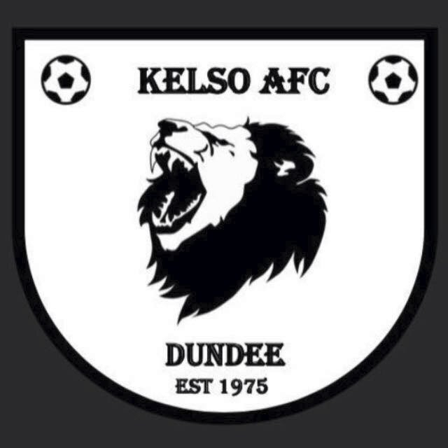
kelso is incorrect, this is the logo for the RUGBY club -- see initials: https://www.facebook.com/KelsoRFC/ the correct logo is this: https://www.facebook.com/MonTheKelso/ gala fairydean correct colors: plus a clone from edinburgh: concept / fantasy:
-
credit to @NassFas
-
it is a football team, but a portuguese one -- i had already posted the correction a few pages ago:
-
that is the case here, yes. what image tracing means: i don’t want to repeat myself here, because i mentioned/explained a lot of these things in my thread that i already shared and sent you the link, but this is one of the examples why official is not the same as good quality. look at the outlines of the initials »rvm«, the city coat of arms and you will see the difference. the vector file was auto traced from a raster/bitmap image, which resulted in loss of quality and detail. the paths are not clean or smooth, the width is uneven etc. another example of an official logo that was auto-traced and thus bad -- örgryte is: https://oisfotboll.se/ for game use, most of the people won’t even care and that’s fine. i personally look at all the details and therefore mention them whenever i notice flaws. redrawn version by me:
-
vector svg


.jpg.a8022b7d2844287936e08e2c3c922f63.jpg)