Everything posted by cameosis
-
Logo Update Thread (Men)
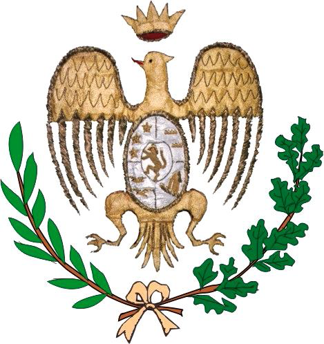
less busy background bigger resolution (left wing cut off) historical 1 historical 2 historical 3 (left wing cut off)
-
Logo Update Thread (Men)
-
What other games you play?
play it here: https://www.retrogames.cc/psx-games/international-karate-plus.html
-
What other games you play?
rpgs, the more, the better. beat them ups as well. if someone is familiar with the emulator mugen, i implore you to try it out: an incredible amount of old arcade graphics and sounds ported to modern desktop systems, too good. a special place in my heart is reserved for international karate plus, or ik+ for short. you need to play it in turbo mode, then you will understand. youtube videos galore, the soundtrack is incredible (1980s game). commodore and amiga for the win, always.
-
Logo Update Thread (Men)
complete iceland logos (clubs + competitions) - mostly vectors, some bitmaps: besta deild karla - league level 01 víkingur r. stjarnan valur breiðablik https://www.ksi.is/library/motakerfi/lid/200.svg fh https://www.ksi.is/library/motakerfi/lid/220.svg kr https://www.ksi.is/library/motakerfi/lid/107.svg ka hk https://www.ksi.is/library/motakerfi/lid/203.svg fylkir https://www.ksi.is/library/motakerfi/lid/110.svg fram https://www.ksi.is/library/motakerfi/lid/108.svg íbv vector (unofficial, but better typography and layout) keflavík https://www.ksi.is/library/motakerfi/lid/230.svg lengjudeild karla - league level 02 ía https://www.ksi.is/library/motakerfi/lid/300.svg afturelding vector https://www.brandsoftheworld.com/logo/umf-afturelding fjölnir https://www.ksi.is/library/motakerfi/lid/112.svg vestri https://www.ksi.is/library/motakerfi/lid/142389.svg leiknir alternative historical grindavík https://www.ksi.is/library/motakerfi/lid/240.svg þór þróttur r. https://www.ksi.is/library/motakerfi/lid/104.svg grótta njarðvík https://www.ksi.is/library/motakerfi/lid/260.svg selfoss https://www.ksi.is/library/motakerfi/lid/800.svg ægir https://www.ksi.is/library/motakerfi/lid/822.svg 2. deild karla - league level 03 dalvík/reynir https://www.ksi.is/library/motakerfi/lid/141080.svg ír https://www.ksi.is/library/motakerfi/lid/109.svg kfa þrottúr v. https://www.ksi.is/library/motakerfi/lid/190.svg víkingur ó. https://www.ksi.is/library/motakerfi/lid/355.svg höttur/hoginn https://www.ksi.is/library/motakerfi/lid/8026.svg haukar https://www.ksi.is/library/motakerfi/lid/221.svg kfg völsungur https://www.ksi.is/library/motakerfi/lid/640.svg kf https://www.ksi.is/library/motakerfi/lid/143712.svg sindri https://www.ksi.is/library/motakerfi/lid/780.svg kv https://www.ksi.is/library/motakerfi/lid/139941.svg 3. deild karla - league level 04 reynir s. https://www.ksi.is/library/motakerfi/lid/245.svg kormákur/hvöt vector https://www.brandsoftheworld.com/logo/kormakur-hvot árbær víðir https://www.ksi.is/library/motakerfi/lid/250.svg kári https://www.ksi.is/library/motakerfi/lid/297.svg augnablik magni elliði https://www.ksi.is/library/motakerfi/lid/139940.svg hvíti riddarinn https://www.ksi.is/library/motakerfi/lid/139301.svg íh https://www.ksi.is/library/motakerfi/lid/222.svg kfs https://www.ksi.is/library/motakerfi/lid/8011.svg ýmir https://www.ksi.is/library/motakerfi/lid/140020.svg 4. deild karla - league level 05 (not active for season 2024) kfk vængir júpiters árborg https://www.ksi.is/library/motakerfi/lid/811.svg tindastóll ká kh https://www.ksi.is/library/motakerfi/lid/143612.svg hamar https://www.ksi.is/library/motakerfi/lid/810.svg skallagrímur https://www.ksi.is/library/motakerfi/lid/310.svg álftanes https://www.ksi.is/library/motakerfi/lid/226.svg uppsveitir mjólkurbikar karla - milk cup lengjubikarinn - league cup kb km hafnir kría hörður í. vector https://seeklogo.com/vector-logo/350992/hordur-isafjordur afríka https://www.ksi.is/library/motakerfi/lid/138543.svg kfr https://www.ksi.is/library/motakerfi/lid/866.svg léttir gg beserkir/mídas (logos should be combined, as it’s a combined team) https://www.ksi.is/library/motakerfi/lid/141740.svg historical úlfarnir sr https://www.ksi.is/library/motakerfi/lid/143.svg samherjar rb keflavík stokkseyri https://www.ksi.is/library/motakerfi/lid/825.svg álafoss fótbolti.net bikarinn - fótbolti.net cup alternative (top part)
-
Logo Update Thread (Men)
artificial upscaling and resizing should only be used when there is no other solution. it degrades the typeface outlines and paths, similar to autotrace, and turns them into blotches and blobs, as is visible above. official vector with clean text (typeface is bookman old style): https://www.ksi.is/library/motakerfi/lid/250.svg alternative 1 (jerseys): alternative 2: historical 1: historical 2:
-
Logo Update Thread (Men)
Rinascita Netina historical with better details and higher resolution: current alternative: https://www.notonews.it/rinascita-netina-fusca-confermato-allenatore-nasce-la-squadra-di-calcio-a-5/ Alessandria della Rocca better resolution + city coat of arms - note the football player inside the club logo: Riesi bigger resolution:
-
Logo Update Thread (Men)
-
Logo Update Thread (Men)
new friendly knockout tournament for national teams (biannual) - winsunited cup (no id yet) inaugural edition this year
- FMG Round Logos
-
Logo Update Thread (Men)
same logo posted twice (atletico club), but only correct for the second entry, going by the name . vector ACアルマレッザ入間 https://aca12.jp/wp-content/themes/aca12/img/logo.svg
-
Logo Update Thread (Men)
happy new year!
-
Logo Update Thread (Men)
terrible choice of fonts and gradients …
-
Logo Update Thread (Men)
these are fa logos, not competition logos: japan university fa, tōkai chapter, tōhoku chapter regular tōhoku fa logo is the one in blue
-
Weird things that have happened in FM
he could have scored a few more i think, but for some reason the manager decided to substitute him after the fourth goal … 🤡
-
Logo Update Thread (Men)
correct logo for the competition, bitmap and vector -> tōkyō amateur football championship, several divisions https://tokyo-fa.com/about/ https://www.tokyofootball.com/pr/conference/img/logo-tsl.svg
-
Logo Update Thread (Men)
i think they will update it in due time, at least as soon as the website and social media are completely rebranded. do you know if neom is an abbreviation or a name?
-
Logo Update Thread (Men)
below the regional university leagues, there are prefectural university leagues (tōkyō, chiba, kanagawa and northern kantō) as the lowest tier (infographic doesn’t reflect recent reorganization and division 3)
-
Logo Update Thread (Men)
the logo for all divisions, including division 1
-
Logo Update Thread (Men)
this is the logo of the kantō university club association (as in university club for extra curricular activities), not a league or division logo: http://jucfa.com/kanto/
-
Logo Update Thread (Men)
shinagawa cc vector - id 45120124 https://shinagawa.cc/wp/wp-content/themes/renewal2023/shared_renew/img/logo_scc.svg alternative version - the football section adds »football« at the bottom of the logo ichikawa sc correct logo - id 788973 https://ichikawasc.com/
-
Logo Update Thread (Men)
this is great news! feliz navidad 😂🎄
-
Logo Update Thread (Men)
uganda super 8 cup logo since august 2023 - id 13217110:
-
Logo Update Thread (Men)
two grassroots tournaments in uganda, no ids yet (and unlikely that they will be added soon): fufa drum (since 2018): https://www.fufa.co.ug/new-football-tournament-fufa-drum-launched-16-provinces-uganda/ inter-provincial tournament for representative sides to scout undiscovered talent fufa tv cup (since 2023): https://www.fufa.co.ug/fufa-launches-fufa-tv-cup/ »invitational tournament for 8 schools that is expected to later on grow into a 16 -team nationwide competition. the fufa tv cup is a competition that has been designed to give an opportunity to football players, referees and coaches at traditional secondary schools more re-known for academic excellence, to undertake football development in a safe, secure and technically managed environment without compromising academics.«
-
Logo Update Thread (Men)
bigger logo of the company (slightly different pattern) there will probably be more club renamings: https://twitter.com/999saudsalman/status/1665717980653559808/photo/1 »the ministry of sport transfers the ownership of al-qadisiyah to aramco, al-diriyah to the diriyah gate development authority, al-suqoor to neom, and al-ula to the royal commission for al-ula.«


