cameosis
Moderators
-
Joined
Everything posted by cameosis
-
bigger resolution:


-
better quality/clean paths, name would need to be updated:

-
vectors: https://campeonatochileno.cl//uploads/primera/imagen/1697458193080_DWS_2023_7.svg https://campeonatochileno.cl//uploads/ascenso/imagen/1697458205197_DWS_2023_5.svg https://campeonatochileno.cl//uploads/segunda/imagen/1672519314786_DWS_2022_6.svg bigger resolutions: historical:


-
you seem to misunderstand, i will clarify it for you: the color of the jersey is irrelevant just as is the fact if you remember seeing them play or not - the coat of arms is always on the team jerseys, whether home or away kit, it has been for many years. i'm sure you saw that it's the official federation web shop. the point of contention was not that the main logo should not be the federation logo - we had staff discussions where i also suggested to only display federation crests. your claim that it's the »wrong« logo is wrong, however. many federations have different logos for the organization itself and for the national team, some even have different logos for female and male teams. this has become increasingly common for several years now. armenia is one of a number of federations where the national coat of arms or national symbol is used for the team; turkey, russia are others. in fact, this is technically the CORRECT logo, because in the game you manage a team/squad, not the federation itself. because many federations don't have separate team logos, for consistency purposes it is better to use the federation logos, but the team logo is not »wrong«. there are alternative/retro/fantasy folders in the pack where you can choose the logo of your liking.
-
vector: according to official fb and club site, this is logo is on their jerseys (left académie de football - right amadou diallo): https://www.facebook.com/afadplateauofficiel variant without text on the left and the right: historical:


-
no idea about the id(ea) 😂
-
cleaner paths, official club site:
-
this statement is only partly correct - armenia uses the coat of arms on the team jerseys, therefore it’s the team logo / alternative logo: https://fanshop.ffa.am/hy/product/հայաստանի-ազգային-հավաքականի-շապիկ․/ vector: https://img.uefa.com/imgml/uefacom/elements/logos/ma/ARM.svg
-
bigger resolutions:

-
working on it - here is the historical one in bigger resolution:
-
@AndreaSSL1900 this one is historical or just for the youth sections now? cleaner paths:

-
they get new ids and count as new clubs.
-
yes, i read the background info. you probably mean this one, which is located in bucaramanga: https://dimayor.com.co/team/real-santander-2/ the concept logo is for the club that represented the island for a season, so everything is correct: https://www.behance.net/gallery/77245765/REBRANDING-REAL-SAN-ANDRES-FUTBOL
-
concept:
-
i'll add more links to your post once i have some free time to copy them.
-
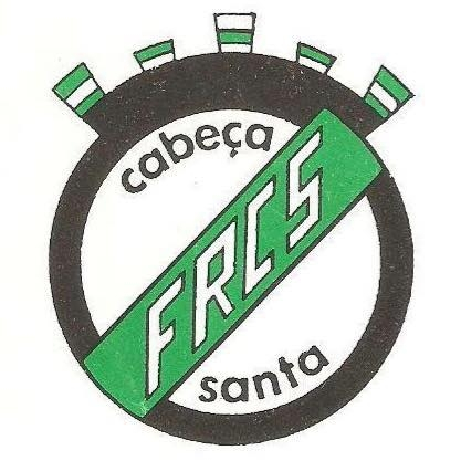
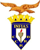
Cabeça Santa 2000279316 - bigger resolution + alternative + historical: Eja 2000279313 - bigger resolution + alternative (red outline): Faro do Alentejo 2000288668 - bigger resolution: GD Ronda 2000097058 - bigger resolution + historical: Infias 2000117718 - bigger resolution + alternative:


-
technically, it is research, thus it would be a logical move.
-
slightly bigger resolution:
-
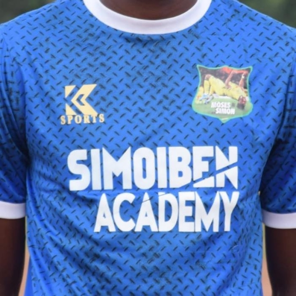
bigger resolution: historical (moses simon backflip):

-
don’t know if this one has an id, levels 07 (premier division) and 08 (first division) of the irish football pyramid: https://en.wikipedia.org/wiki/Republic_of_Ireland_football_league_system

-
this should already be included in the pack(s), if i’m not mistaken. i had shared redrawn logos with clean paths last year, including sponsor-free main variants.
-
bigger resolution (not better) - both from official fb page: alternative (bottom cut off): »g« is taken from green bay packers:


-
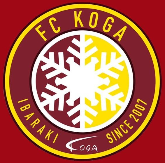
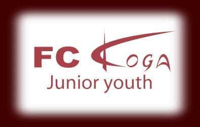
bigger resolution: historical (without the »junior youth« text): bigger resolution:

-
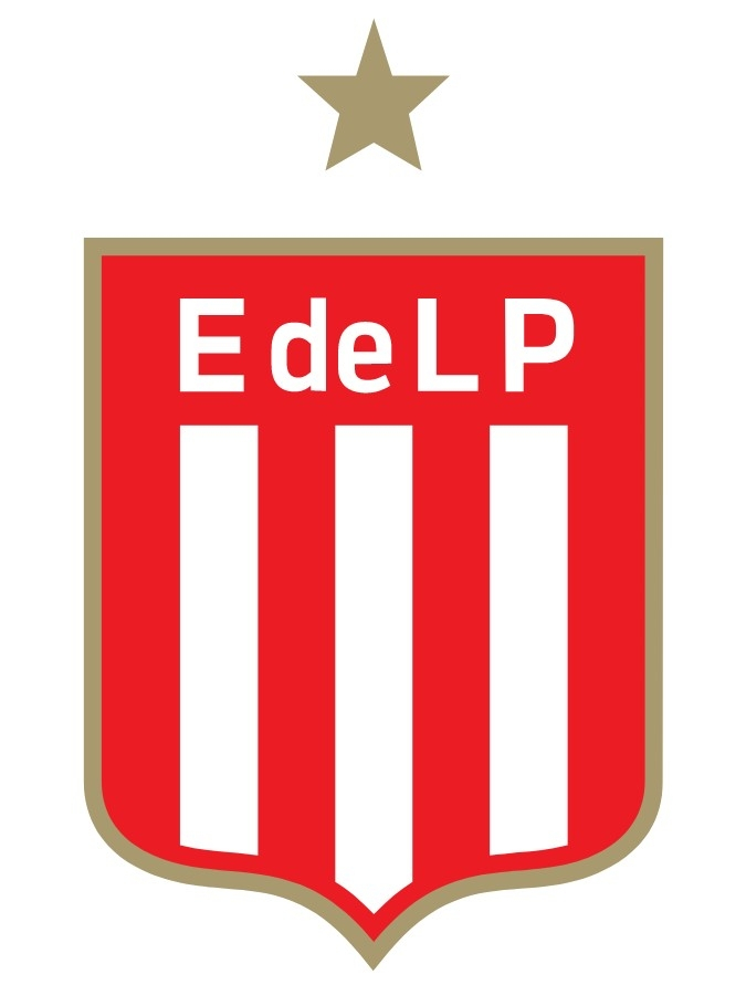
logo is incorrect. this is the current logo, official club website: https://estudiantesdelaplata.com/wp-content/themes/edelp_v2/imgs/logo_edelp.svg https://estudiantesdelaplata.com/

-
historical: https://marlincoastrangersfc.com.au/wp-content/uploads/2019/04/MCR-Handbook-V2-Jan-19.pdf