cameosis
Moderators
-
Joined
Everything posted by cameosis
-
vector
-
Recently, a number of logo submissions have suffered from various problems: they were either not marked as fantasy, or they were posted in the wrong club and thread. Please follow these rules that will be in effect from now on to make the workload manageable – in the future, submissions that fail to meet these rules will be ignored. Always VERIFY that the in-game ID you submit is CORRECT. Repeated failure to do so will result in in flagging your submissions as unreliable and thus demote them to lower priority. LOGO CATEGORIES 1. MAIN: This is the default category for correct and real-life logos that are current at the time of submission. 2. ALT(ERNATIVE): This is the default category for correct and real-life logos that are secondary, such as wordmarks or icons. 3. RETRO: This is the default category for correct and real-life logos that are historical or obsolete. 4. FAN(TASY): This is the default category for any fantasy logos, be it for real clubs and competitions, or fantasy clubs and competitions. Please make sure to post only MEN’S logos in the MEN’S thread, and WOMEN’S logos in the the WOMEN’S thread – in the future, submissions that fail to meet these rules will be ignored. Always VERIFY that the in-game ID you submit is CORRECT. Repeated failure to do so will result in in flagging your submissions as unreliable and thus demote them to lower priority. The larger the logo collections grow, the more critical it is to avoid and minimize CONTAMINATION with incorrect submissions, as it increases the workload multifold and jeopardizes successful updates and corrections. While this notification will be occasionally posted as a reminder until we figure out the most efficient way to inform all members about the rules, you should be aware that common sense is required to make the experience positive and enjoyable for all of us.
-
historical
-
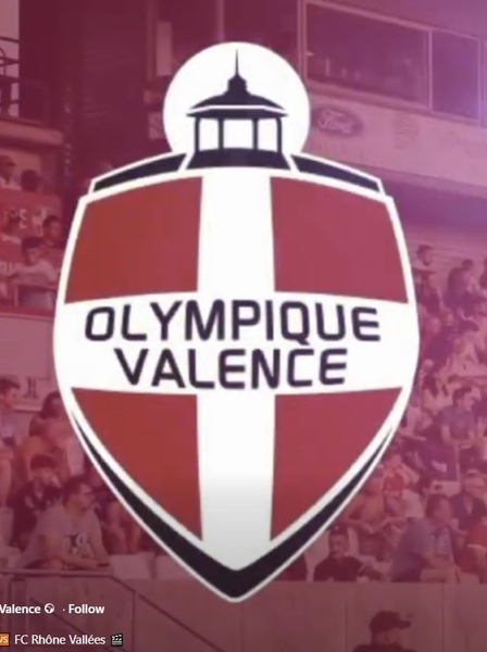
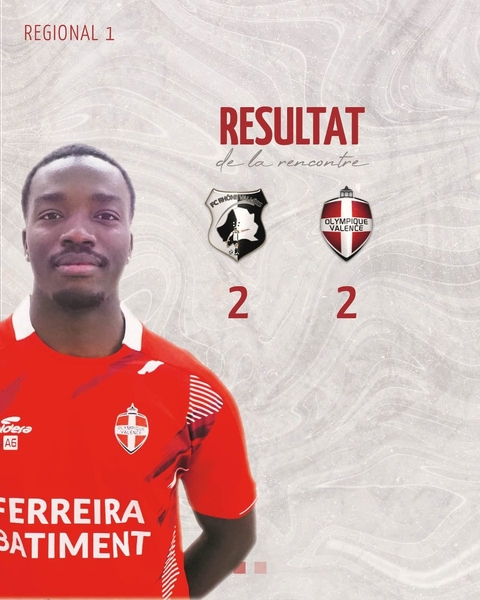
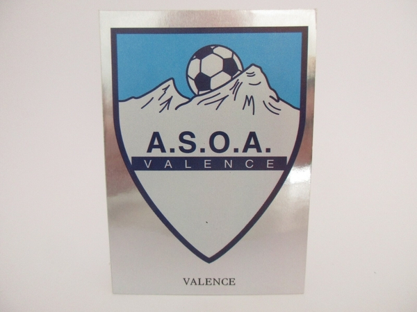
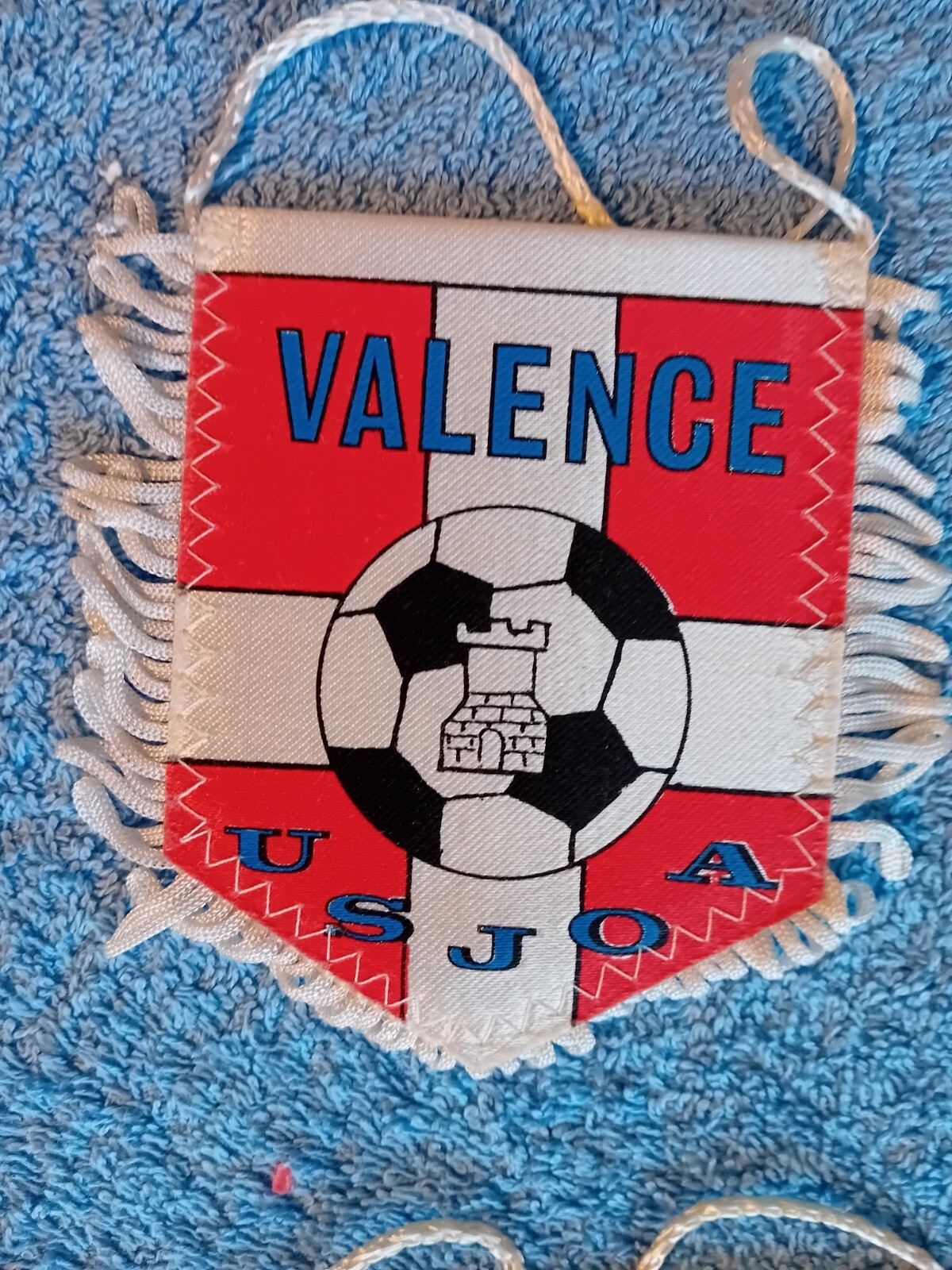
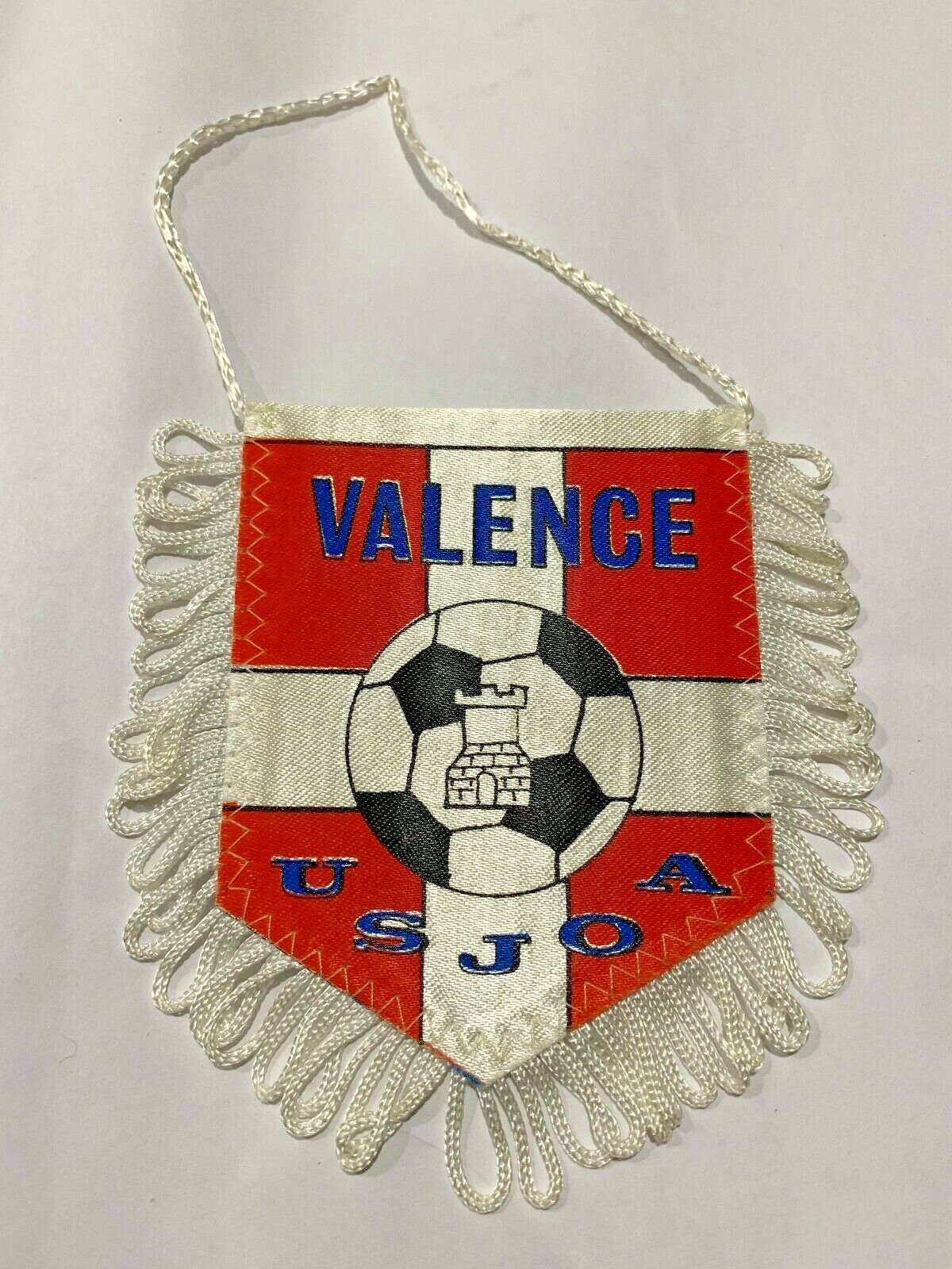
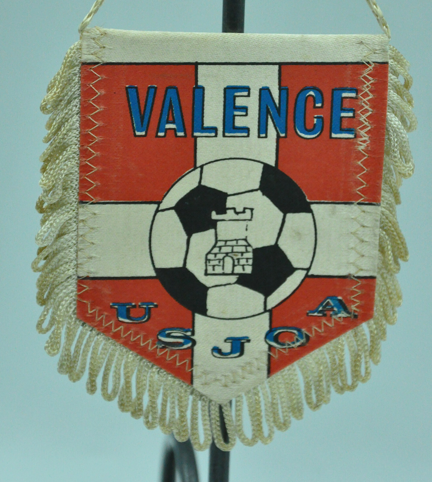
olympique de valence gibt’s immer noch - das ist nur das erste wappen von 2014-2020
-
2000297189 - first one is the emblem for the prefecture, second one is for the prefectural government and tourism office - neither is of the team https://www.pref.oita.jp/soshiki/10400/symbol01.html https://www.pref.oita.jp/ 2000297724 - first one is historical, second one is current since 2024 https://www.instagram.com/p/C1a67Q8hoOd/ 2000297864 - both are company logos, the second one is the current one. football is no longer listed as sponsored, however - rugby, rowing and curling. the company logo is the alt/secondary logo for the rugby team, can be used as placeholder if the primary for the football team ever shows up. https://www.chuden.co.jp/corporate/cor_policy/symbol/ https://www.chuden.co.jp/topics/sports_topi/rug_202006_02.html https://www.instagram.com/p/DTWbTLIEvHp/ 2000297884 - first one is company logo, second one is team logo https://www.toyota-body.co.jp/ https://www.instagram.com/toyotasyatai2024/
-
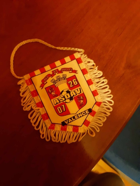
2000340329 Logo_Olympique_Valence.svg i would suggest using the logo without effects for both women and men - this is a screenshot from a match summary video on their official fb page, jerseys are also without effects/gradients
-
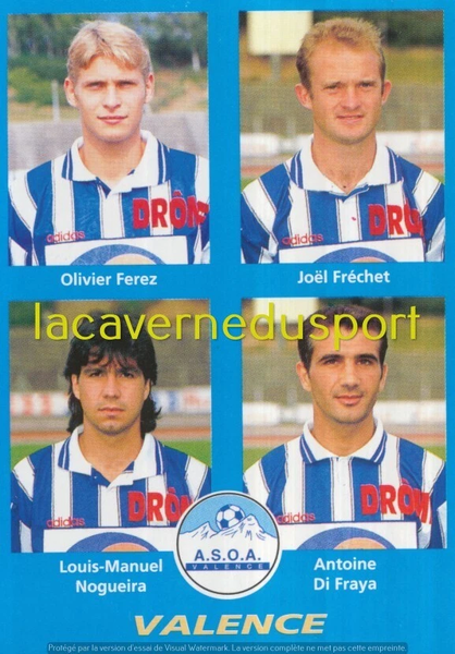
85036835 - historical (2014-2020)
-
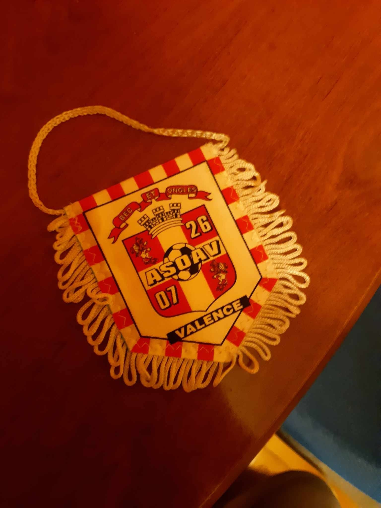
this is an older one - here are the logos from most recent (last) to older: just remove the checkered bg and remove the yellow hue, that should do it. ca. 2002-2003 (just shield) ca. 1999-2002 ca. 1996-1999 alt ca. 1994-1996 85036839 - predecessor (correcting soritoutsi sloppiness again) last (most recent) ca. 1991-1992 alt historical (older)


559146172_1394458539355329_5671670767380122752_n.thumb.jpg.a657ca17680121dd1a049ff66084fc15.jpg)


-
@Derek if the comp is updated, i.e. not marked as extinct, then the latest/current logo should be used, even if it’s incorrect in the real world (in this case the current federation logo) -- i’d agree with @kenolio so as not to add further to the confusion. since it’s now fantasay anyway, i will make a note to create a logo for it as an update of sorts to the historical one. the fm db would need a few years of weeding out and restructuring to be cleansed, not going to happen, sadly.
-
henry‘s reaction 🤣🤣🤣 the comments 🤣🤣🤣 https://youtu.be/t2_hLd8jFRg?si=eNb2oqxv5PCaVV4U
-
alt color scheme: CPLCanadian Premier League Reveals a Bold New Identity Built...New CPL look unveiled alongside the new Premier Soccer Leagues Canada brand as part of a coordinated visual evolution across Canadian Soccer Business’s league portfolio.CPLPremier Soccer Leagues Canada Unveils New Identity Reflec...New PSLC name and look unveiled alongside the Canadian Premier League’s refreshed identity as part of a coordinated visual evolution across Canadian Soccer Business’s league portfolio.asset pack - includes french and english language logos (png only, but very high rez) 2026 jan - PSLC logo brand assets-20260129T211950Z-3-001.zip alt (eng) vectors -> québec has not (yet) transitioned with the others from ligue1/league1 to première ligue/premier league federation logo bc: 2026 -> historical
-
for some reason, the text (typeface) is garbled and the paths are terrible. looks like it was traced, even though the graphic element wasn’t.
-
for my personal collection, i remove all copyright and trademark symbols. the logo are evidently the respective organisation’s ip, so this is redundant and not very appealing visually, but it is what it is.
-
there are small deviations on my end usually -- redrawing means i draw vector versions of all the logos for my personal collection. sometimes, a 1:1 copy would not justify the time investment, or the original is crap etc. here, there might be minute differences in the hues, but i think it was close enough. if there is demand for the monochrome alts, i can export pngs for those. i personally didn’t make any for myself. i’m mostly interested in flat design without any effects and gradients, and only keep those with effects as alts (when they are original sources), or when conversion to flat design is too much work, as with many sponsor or tournament logos (wc 2006 and similar). for pack makers like derek it’s also easier and more convenient to batch apply their own effects on top when the logos are neutral.
-
i think i had uploaded this one that i redrew a few years back - ball is different, i liked a clean version better: the blog is private now, so no longer a publicly accessible source.
-
alt
-
hehe, creative. but mark them as fantasy so @Derek and others know - there’s no problem with that, but there might be a higher resolution photo showing up in the future, and then we can use that as the main. i’ll see if i can convert yours to svg when i have the time.
-
the high res logo is ai-generated based on the sources, i take it?
-
outstanding! can you share the links?
-
excellent catch
-
all good. i lived in japan for a year and am familiar with the language. the game has a lot of errors in the db, which make research difficult in non-latin scripts and non-european languages.
-
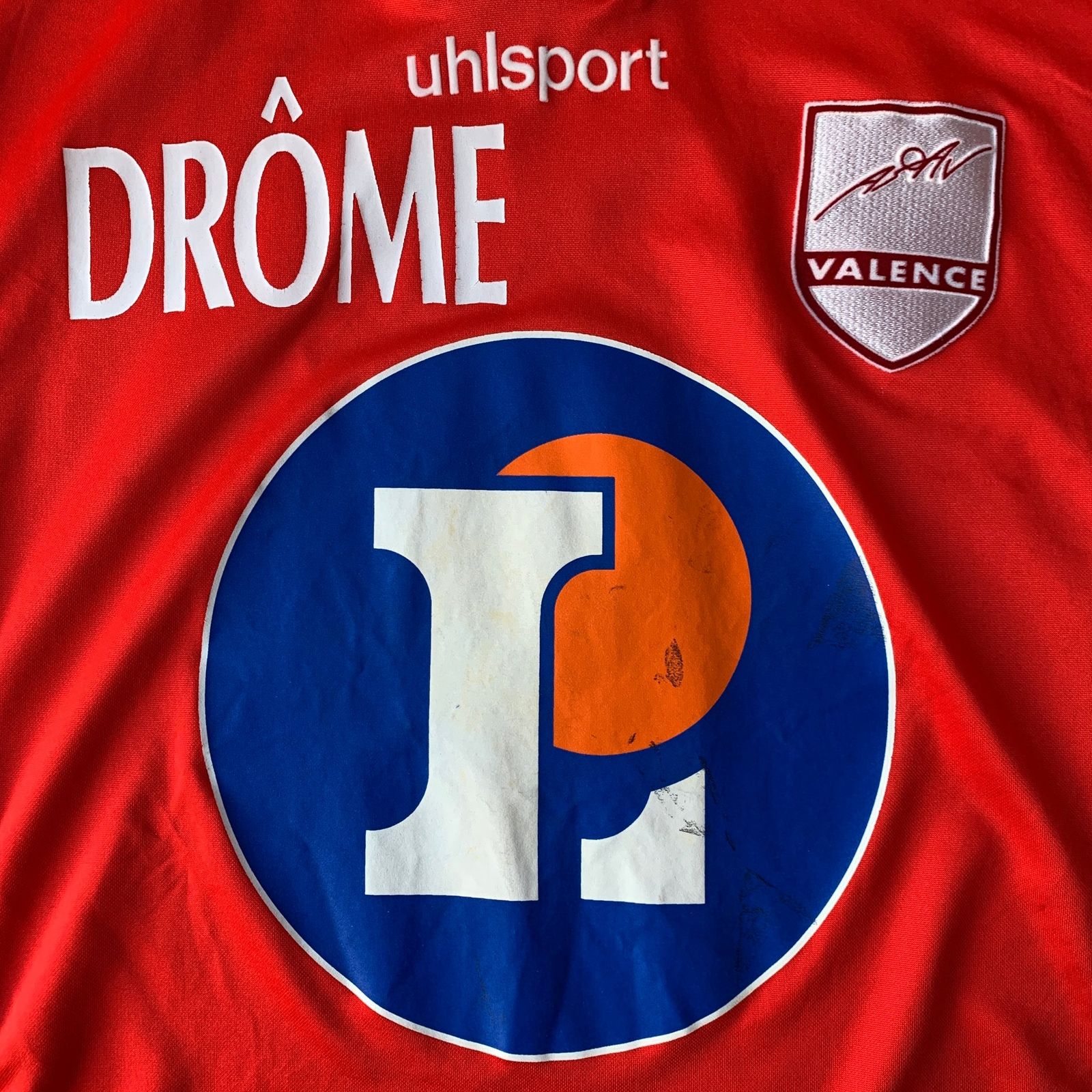
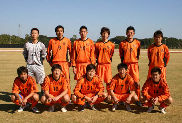
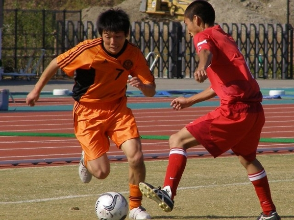
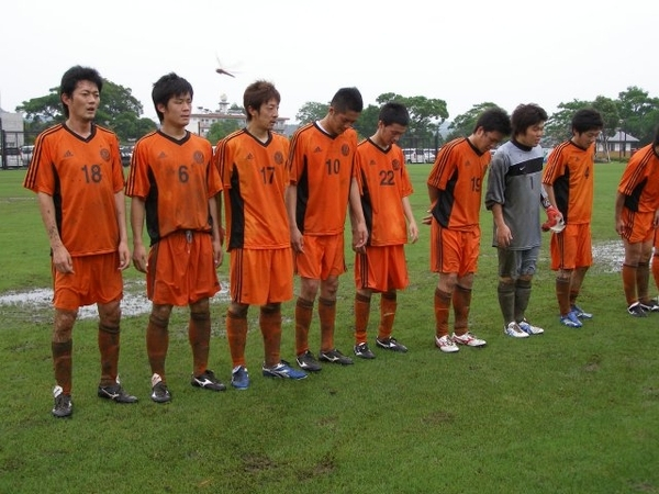
788944 not usable, but it is what it is - pics are from 2006-2010 - round monochrome logo 45002987 - alt


559146172_1394458539355329_5671670767380122752_n.jpg.7f033dcd299c56de49e0195c8bf9cb6d.jpg)