cameosis
Moderators
-
Joined
Everything posted by cameosis
-
the correct logos for these two have already been posted. -> correct reading for »sanwa« is miwa.
-
vector unavailable -> 2016-2019 2020
-
@NassFas the macron one was autotraced, but it’s a good starting point. excellent work! the perspective of the towers and the bridge is all over the place …
-
outdated, this is the historical logo. the current logo is plain green, can be copied from the men.
-
ahh, ok 👍🏿
-
the laurel colors should be changed to silver and gold to make it generally viable, instead of the colors for england and brazil.
-
the logo is comparatively new and has been introduced sometime around 2022. azzurri in white text in the middle, navy blue background and white rim/border. there is a graphic element at the bottom, possibly the logo of fukui shimbun, there is some connection, maybe through the coach hiroshi hata: https://www.facebook.com/profile.php?id=100054567845437 https://www.facebook.com/profile.php?id=100012514485090&sk=photos before that, they only had a wordmark (at least from 2016, maybe earlier). here’s the redrawn version of the historical or alt logo -- it should be the main logo until we end up with a high resolution of the other logo:

-
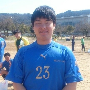
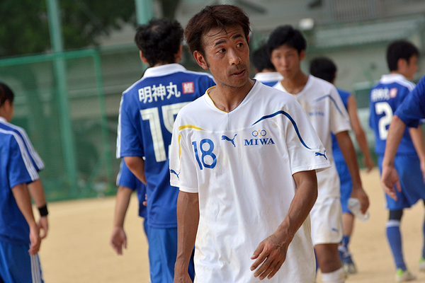
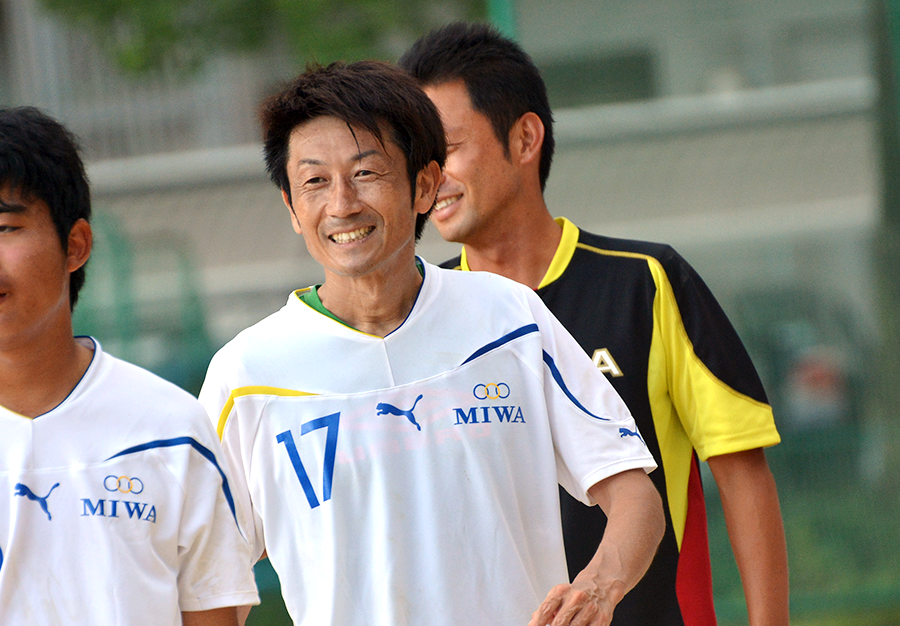
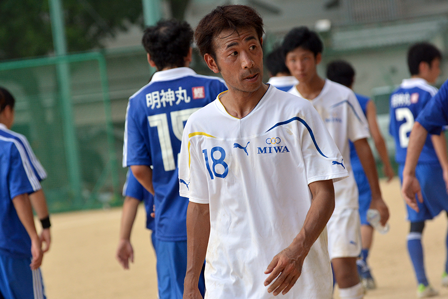
from what i could find, the correct reading of the kanji 三和クラブ is MIWA club, not »SANWA club«. japanese kanji are notorious for having various -- often irregular -- readings, especially for personal and place names. according to the fa sources, there was never a team named sanwa in the kōchi prefectural leagues, only miwa. this is the team’s logo -> three rings, the middle one yellow, the outer two dark blue, with miwa text in capitals, in blue (serif typeface) https://www.facebook.com/media/set/?set=a.522100264537784&s=12 https://www.kochi-fa.com/media-download/3982/00036c6949c46d62/

-
i caught that one, yes -- but there is this id 2000326587 <- isn’t this one supposed to be for the new/current logo? from what i understand, the name Corporación Club Deportivo Tuluá was for the club before it moved and changed its name. i couldn’t find the id for internacional palmira on fmref. the club’s (internacional’s) official website is still active, has it withdrawn from competition or moved back and reverted to its old name, therefore id 312 applies to it again? bit difficult to follow for me.
-
please use only this thread for women’s logos, the two clubs are separated for easier updates and corrections. the men’s thread is only for men’s logos.
-
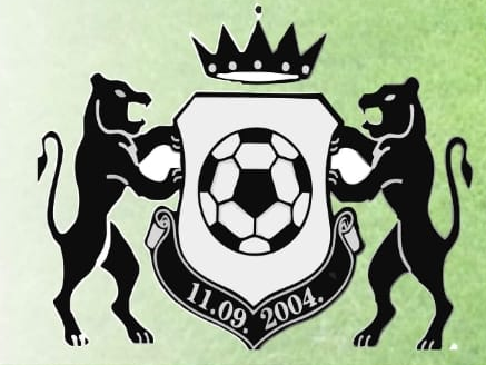
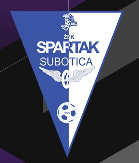
the spartan bust is the same image that serbian žfk spartak d.o.o. uses in their logo. sfk sarajevo 200 - transp. bg
-
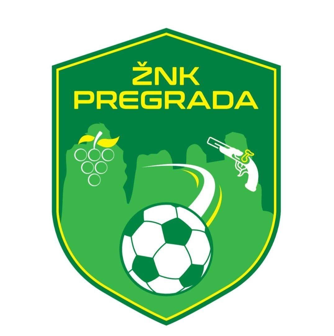
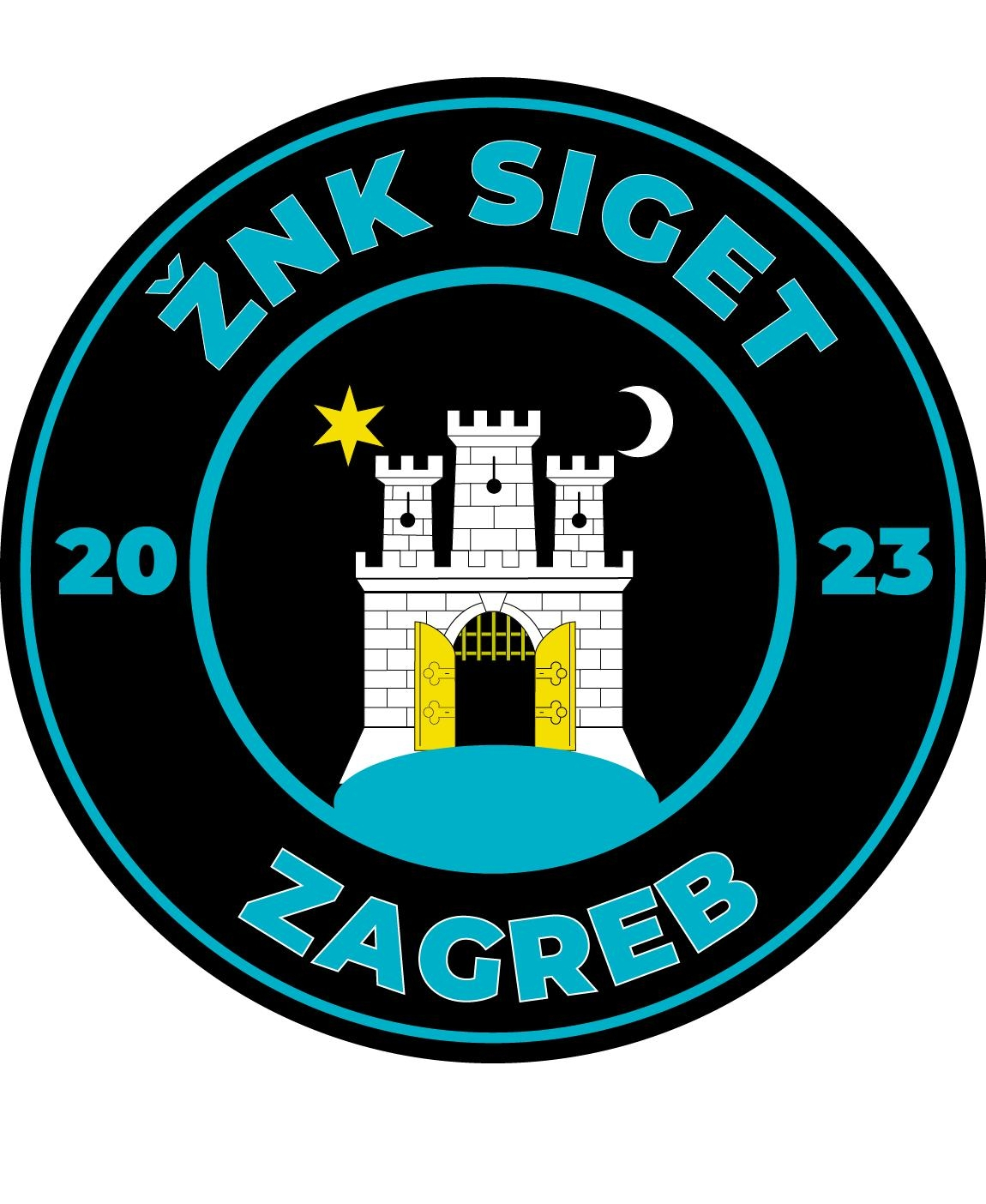
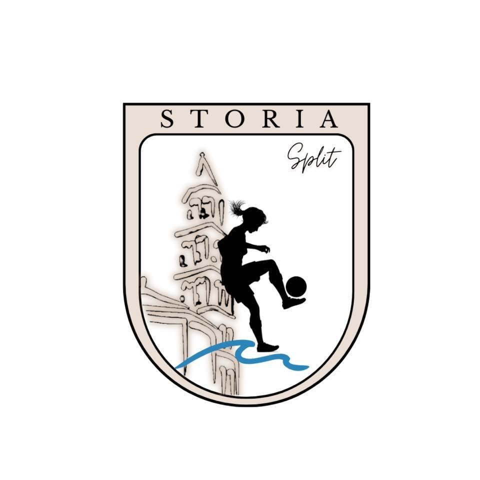
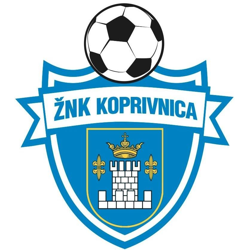
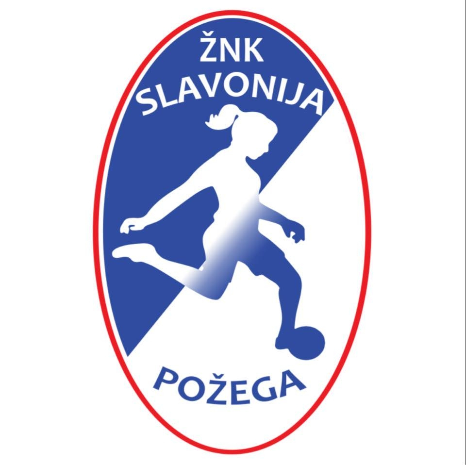
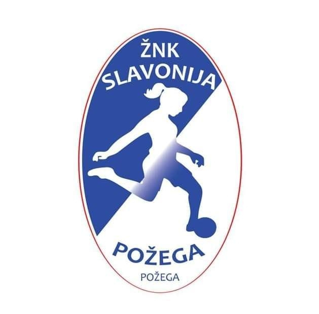
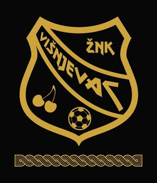
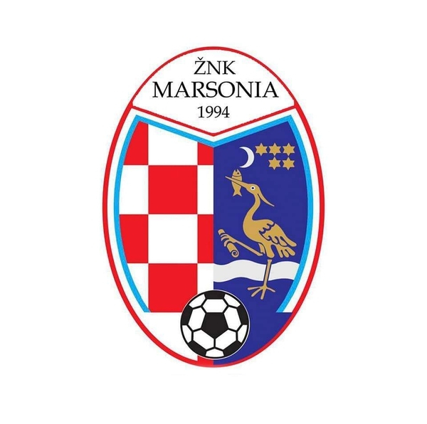
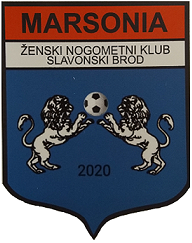
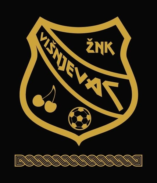
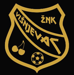
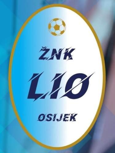
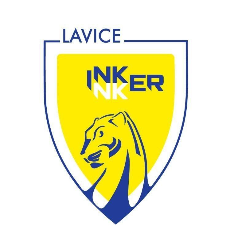
ŽNK Donat - 2000279731 ŽNK Inker - 2000488435 alt (main for men) historical ŽNK Karlovac 1919 - 2000390725 - same as men ŽNK Pregrada - 2000363340 historical ŽNK Rijeka - 2000279732 historical (same shield shape) ŽNK Siget - 2000363352 ŽNK Storia - 2000488434 ŽNK Frankopan - 2000390726 - same as men ŽNK Koprivnica - 2000363347 ŽNK Marsonia - 2000279733 historical ŽNK Sesvetski Kraljevec - 2000363351 - same as men ŽNK Slavonija Požega - 2000363346 historical ŽNK Višnjevac - 2000363348 - main, transp. bg alt ŽNK Vukovar 1991 - 2000390743 - same as men žnk lio osijek - 2000488437


-376653854_282814361219019_8087750220774086704_n.thumb.jpg.f0340c8659499aa451f9048d7b7bdfdb.jpg)


-
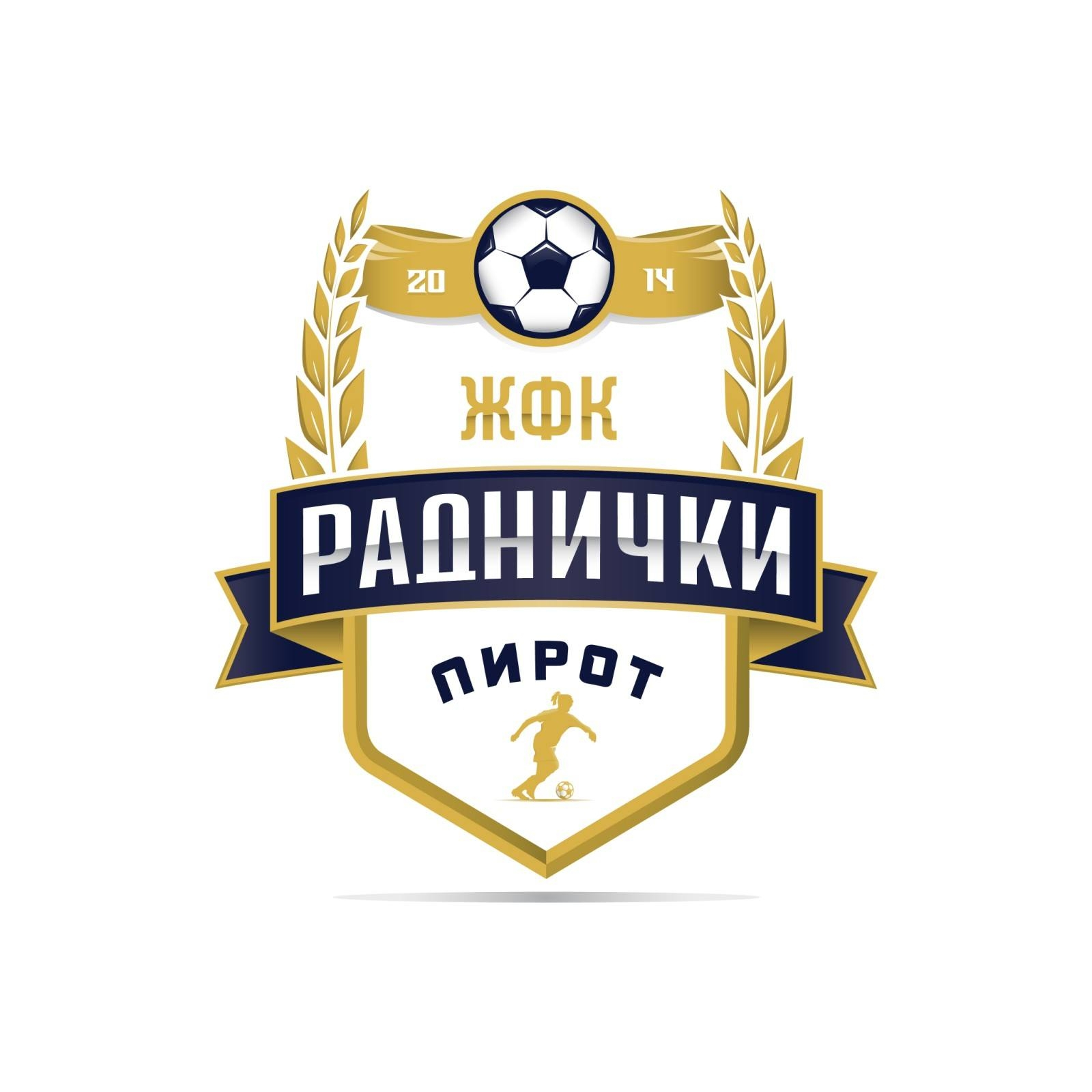
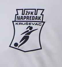
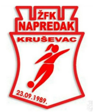
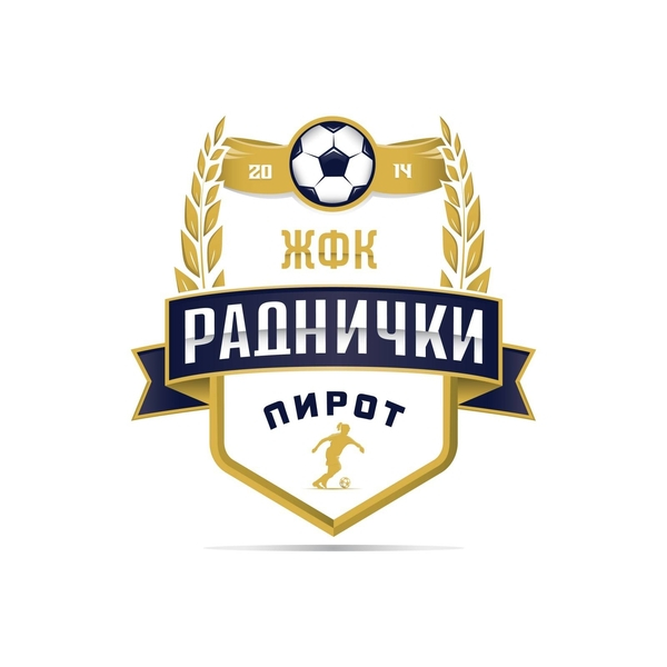
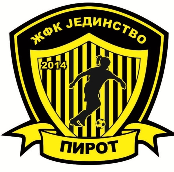
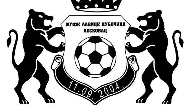
serbia -> ŽFK Napredak Junior - 2000336883 current logo alt (jerseys) ŽFK Radnički 2014 Pirot - 2000373010 historical (was called jedinstvo previously) ŽFK Spartak DOO - 2000278789 same as spartak subotica - d.o.o. means llc (limited liability company/society) - this is the reserve/youth team of 2000212163 https://www.instagram.com/zfkspartakdoo/ this is the correct logo for the reserve team. ŽGFK Lavice Dubočica - 2000369842 crown cut off - this is the main variant (with crown intact) with crown intact, but missing club name (unofficial), and distorted (squeezed) 2000343088 - prva liga srbije (second tier) transp. bg, but white is also fine


-
could you check if the other serbian and croatian logos are included? if not, i’ll quote the posts again.
-
312 - don’t know if it’s already in the pack the logo at fmref and sortitoutsi is for internacional palmira, which is the club’s name after relocation and rebranding, which is incorrect, following the db rules.
-
the background is actually supposed to be transparent -- the checkered background is a simulation of a transparent background.
-
this one should already be in the pack, i hope:
-
2000502735 - (transp. bg, white for text bg, ball and swoosh) alt

-
16023770, 16074808, 16251284, 16142536 - correct logo (transp. bg, white for text bg, ball and swoosh) alt

-
like many others, they messed this one up. the regionalliga groups are run independently from each other by the regional associations as the name implies, there is no overarching unit that groups them together -- this is effectively another inventend comp that poorly reflects real comps in-game.
-
no, the old logo needs to stay -- it reflects the former structure. regionalliga level has been reformed at least a dozen times, changing regional groups and group names. this was during a time when there were no separate logos for the groups, only for the tier itself. the 2025 dfb logo has no connection to that era and would be incorrect.
-
@Markitos can you have a look at this, too when you have the chance? do we need separate entries because of the names or just a name update in the db?
-
@Derek would a sub-division of the female and male clubs into comps, clubs and nations with their own dedicated threads make collecting and updating the logos easier? i could set them up like so: men - nations men - competitions men - clubs women - nations (where they differ, there are dedicated team logos for women’s teams) women - competitions women - clubs
-
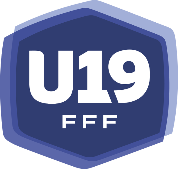
fmg exclusive u-19 women’s france - not sure if it has an id

-
one of those cases where the senior team folded and the club’s assets were used to start an academy/youth team.


-376653854_282814361219019_8087750220774086704_n.jpg.0a751d12e84a116999a02fc26e7f61a0.jpg)