


cameosis
-
Posts
923 -
Joined
-
Last visited
-
Days Won
52
Content Type
Profiles
Forums
FM News
Events
Articles
Downloads
Design Factory
Club Shop
FMG TV
Everything posted by cameosis
-
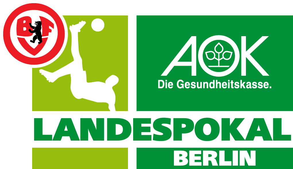
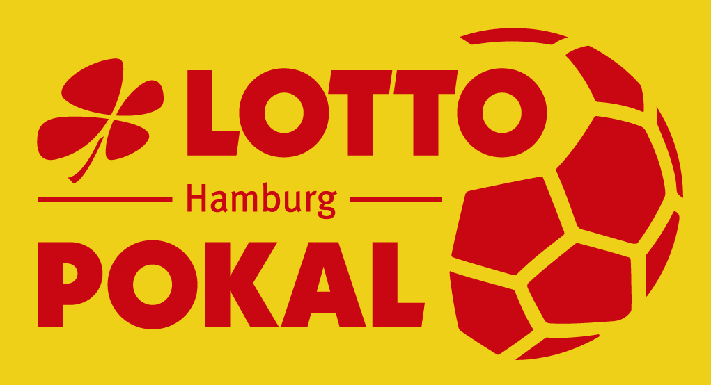
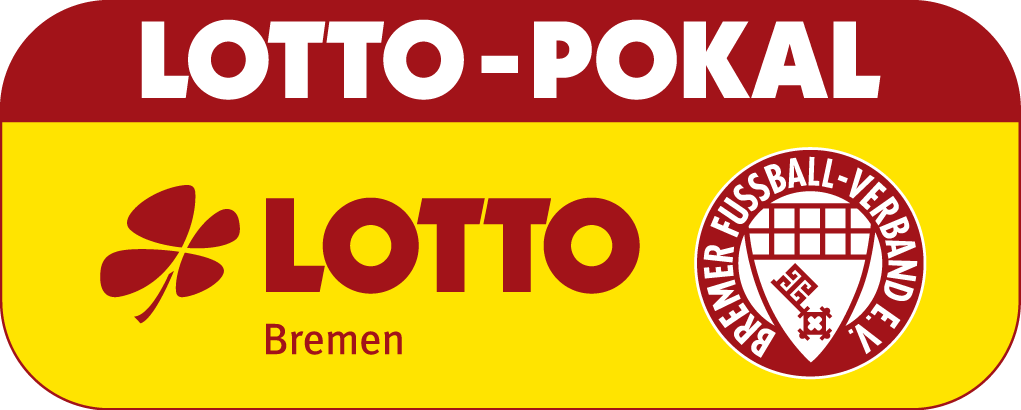
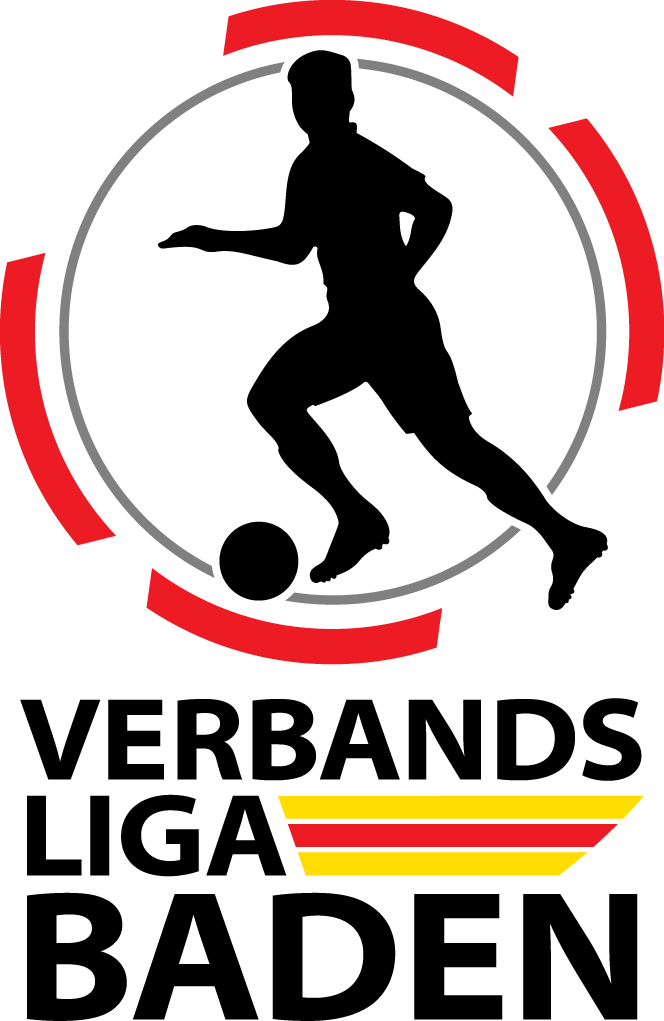
previously missing logos + corrections, improvements, updates: Verbandspokal Mittelrhein - ID 2000073337 Verbandspokal Baden - ID 2000073329 Verbandspokal Südbaden - ID 2000073345 Verbandspokal Südwest - ID 2000073346 Verbandspokal Westfalen - ID 2000073348 Verbandspokal Württemberg - ID 2000073349 Verbandspokal Brandenburg - ID 2000073332 Verbandspokal Hessen - ID 2000073335 Verbandspokal Sachsen - ID 2000073342 Verbandspokal Thüringen - ID 2000073347 Verbandspokal Berlin - ID 2000073331 Verbandspokal Bayern - ID 2000073330 Verbandspokal Schleswig-Holstein - ID 2000073344 Verbandspokal Niedersachsen - ID 2000073339 (same logo) Verbandspokal Niedersachsen (Amateure) - ID 2000104662 (same logo) Verbandspokal Sachsen-Anhalt - ID 2000073343 Verbandspokal Hamburg - ID 2000073334 Verbandspokal Bremen - ID 2000073333 Verbandsliga Baden - ID 2000075292 Verbandsliga Hessia/Staffel North - ID 2000075289 (same logo) Verbandsliga Hessia/Staffel Central - ID 2000075290 (same logo) Verbandsliga Hessia/Staffel South - ID 2000075291 (same logo) Division Middle Rhine - ID 91109042 Division Lower Rhine - ID 91109041 Division Westphalia - ID 8700005 Division Bavaria North - ID 91109039 (same logo) Division Bavaria South - ID 91109040 (same logo) Division Hessia - ID 8700003 Division Rhineland-Palatinate · Saar - ID 8700004 Regional Division Bavaria - ID 91107111 Division NRW - ID 91000065 Division Lower Saxony - ID 35102297 Division Hamburg - ID 35024475 (same logo) Landesliga Hamburg Staffel Hansa - ID 2000075257 (same logo) Landesliga Hamburg Staffel Hammonia - ID 2000075258 (same logo) Verbandsliga Southwest - ID 2000075287 Landesliga Mittelrhein Staffel 1 - ID 2000075282 (same logo) Landesliga Mittelrhein Staffel 2 - ID 2000075283 (same logo) Landesliga Bavaria Staffel North - ID 2000075469 (same logo) Landesliga Bavaria Staffel Northeast - ID 2000075296 (same logo) Landesliga Bavaria Staffel Northwest - ID 2000075295 (same logo) Landesliga Bavaria Staffel Central - ID 2000075297 (same logo) Landesliga Bavaria Staffel Southeast - ID 2000075299 (same logo) Landesliga Bavaria Staffel South - ID 2000075468 (same logo) Landesliga Bavaria Staffel Southwest - ID 2000075298 (same logo) Saxony-League - ID 2000075278 Thuringia-League - ID 2000075277 Verbandsliga Saxonia-Anhalt - ID 2000075276 Berlin-League - ID 2000075275 Brandenburg-League - ID 2000075274 Landesliga Bremen - ID 2000075259 Landesliga Mecklenburg-West Pomerania - ID 2000075414 Frauen-Bundesliga - ID 2000148115 SVG File (direct download link) Westphalia-League Staffel 1 - ID 2000075284 (same logo) Westphalia-League Staffel 2 - ID 2000075285 (same logo) Verbandsliga Württemberg - ID 2000075294 Verbandsliga Südbaden - ID 2000075293 Landesliga Schleswig - ID 2000075254 (same logo) Landesliga Holstein - ID 2000075255 (same logo) Division Schleswig-Holstein - ID 35024476 Saarland-League - ID 2000075288

-
duncannon are experimenting with their colors, just posted a slightly different version of their new logo 15 mins (!) ago:
-
@Derek, i was actually thinking more of using this as a place of presenting stuff individually and expressing thoughts on why a different logo than the one in the database would be a better choice, more leaning towards discussion (others are welcome to comment here, of course). have you downloaded the archive i uploaded? everything i posted here is included, plus lots more. you can then pick whatever you want to add to the megapacks.
-
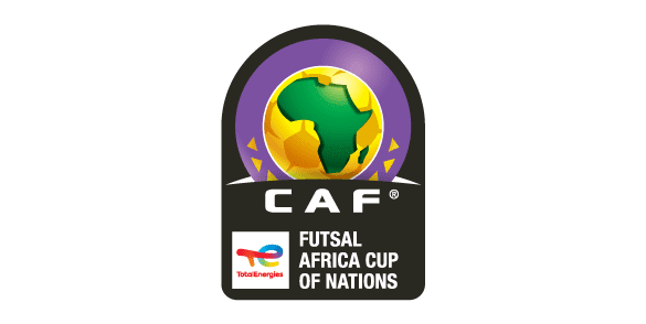
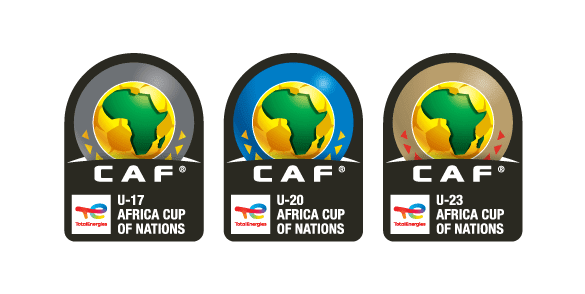
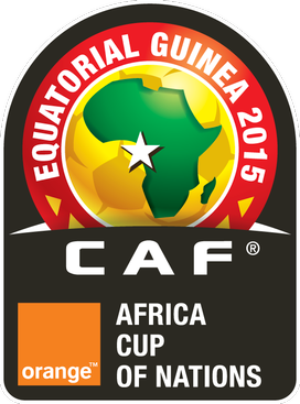
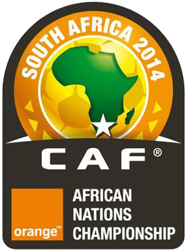
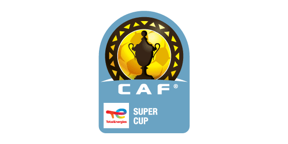
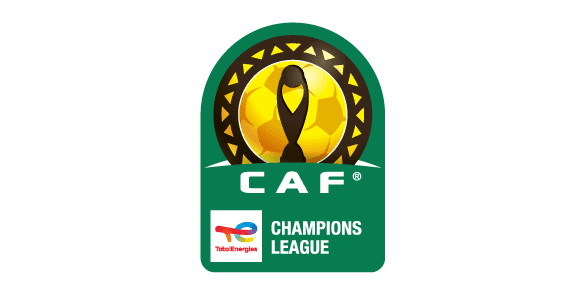
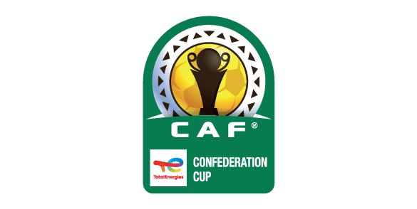
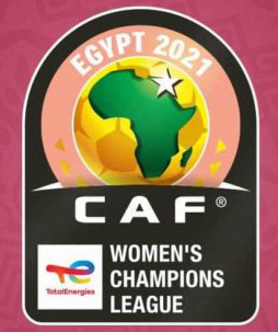
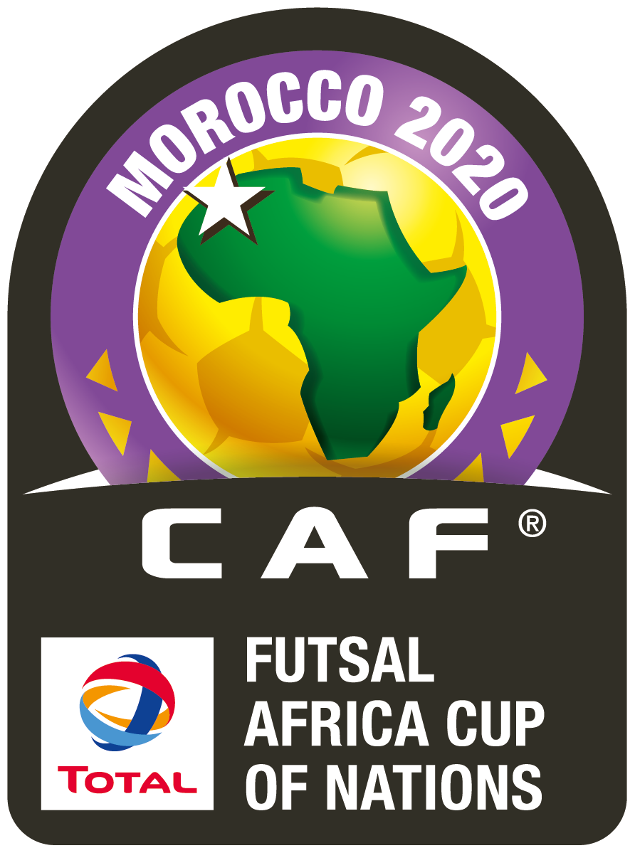
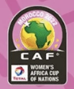
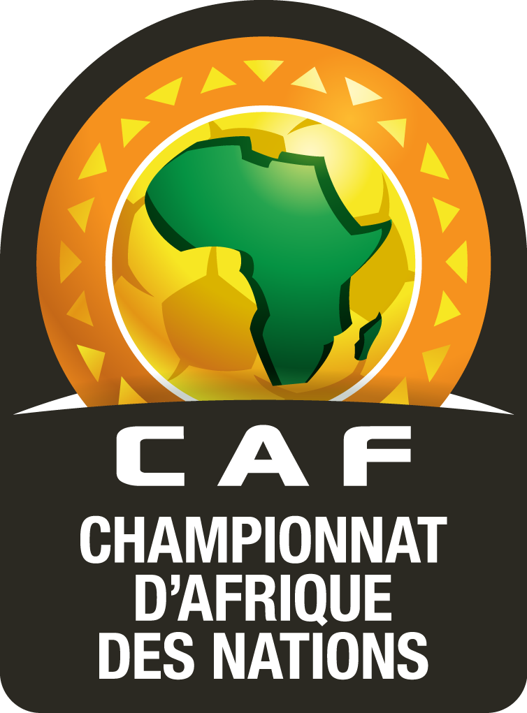
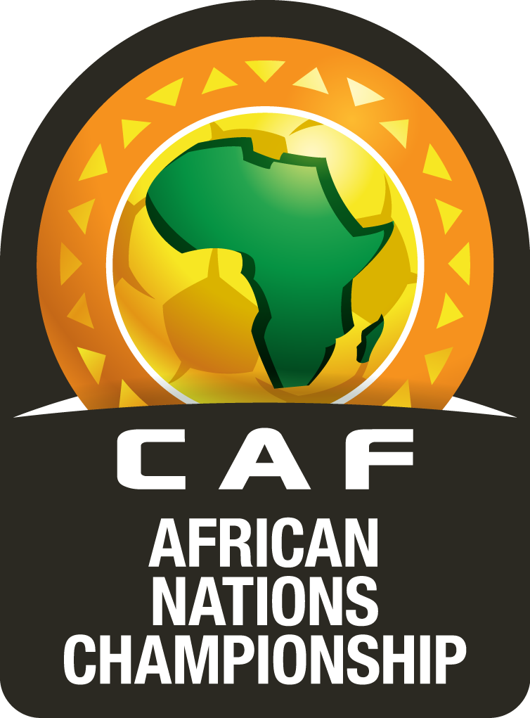
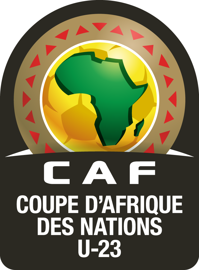
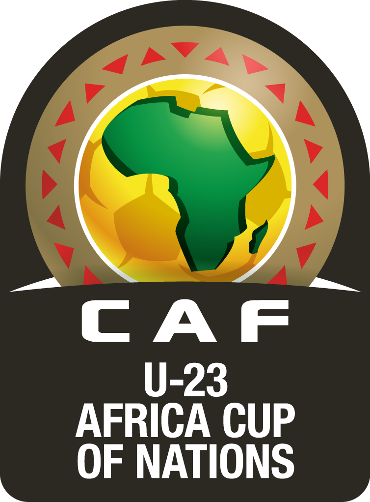
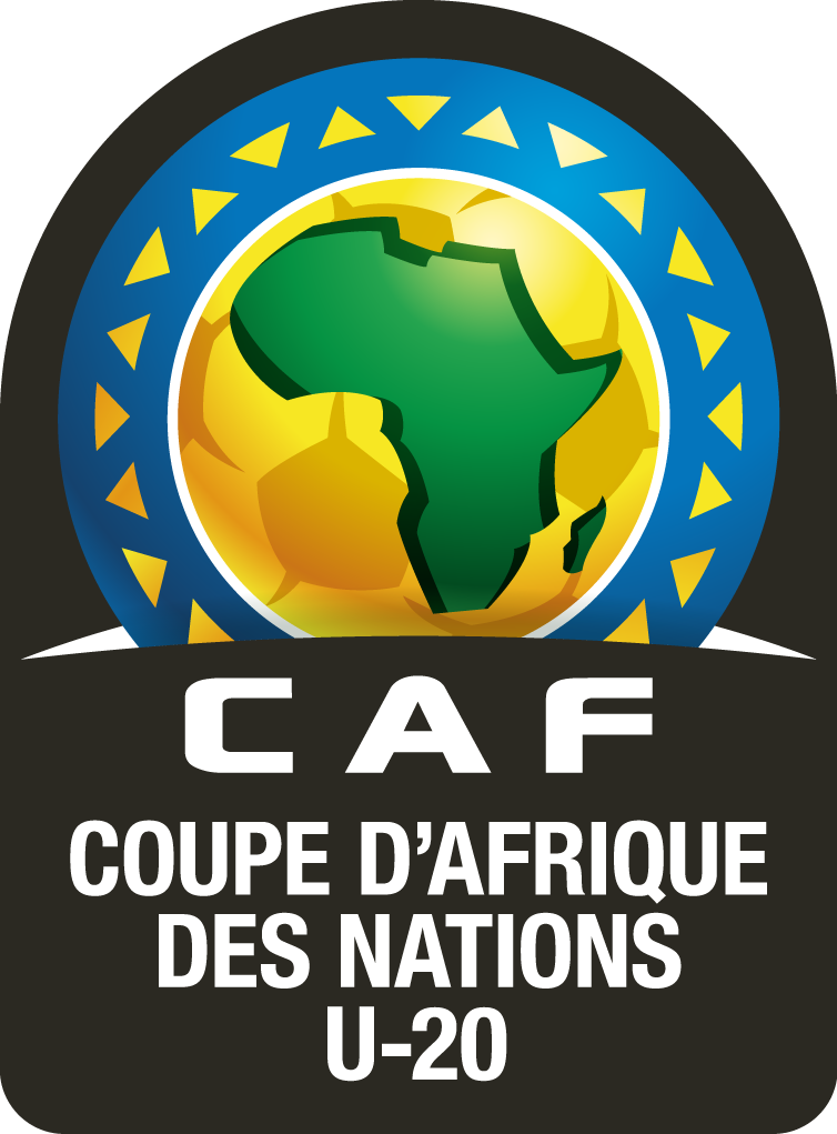
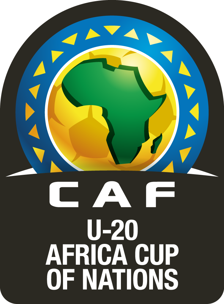
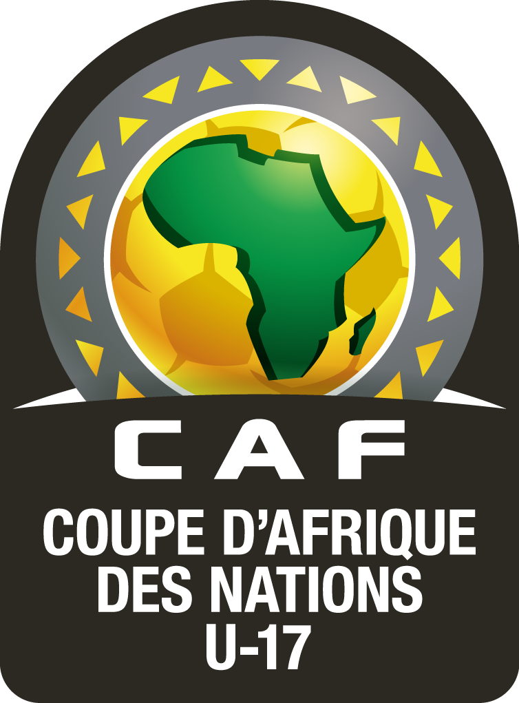
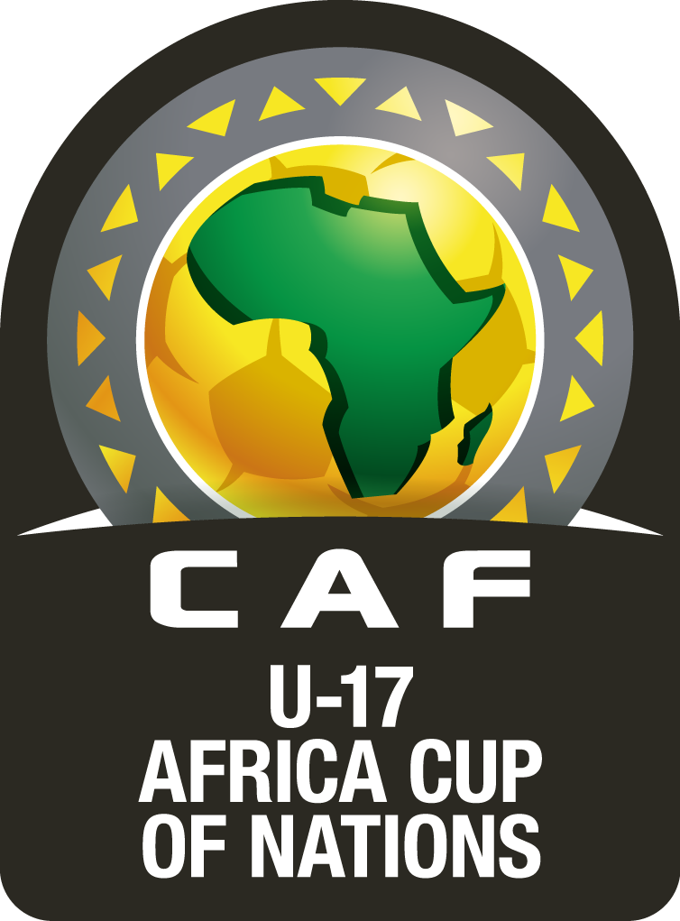
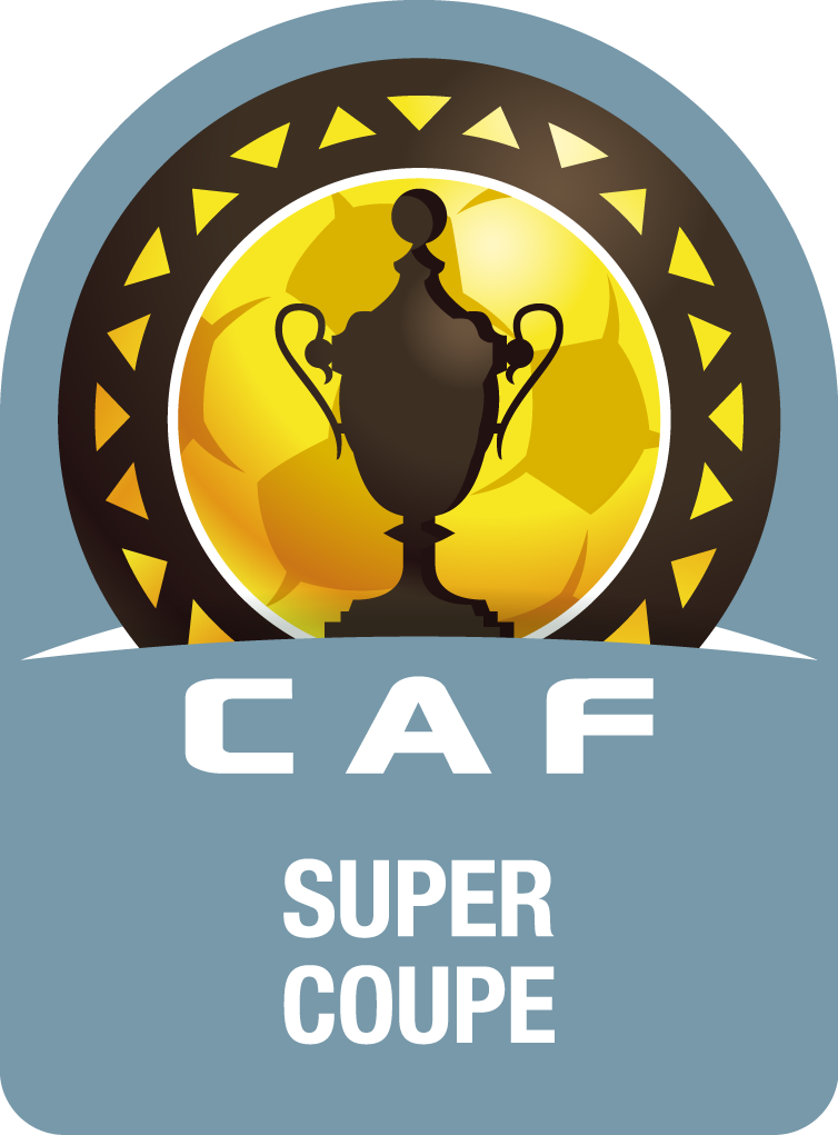
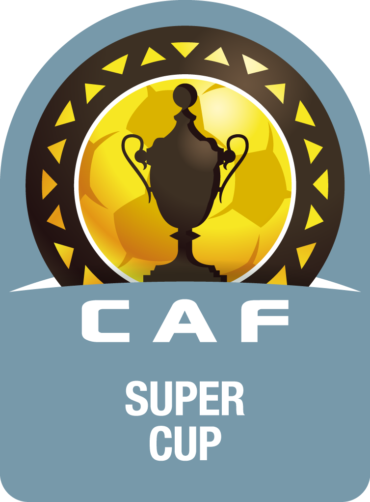
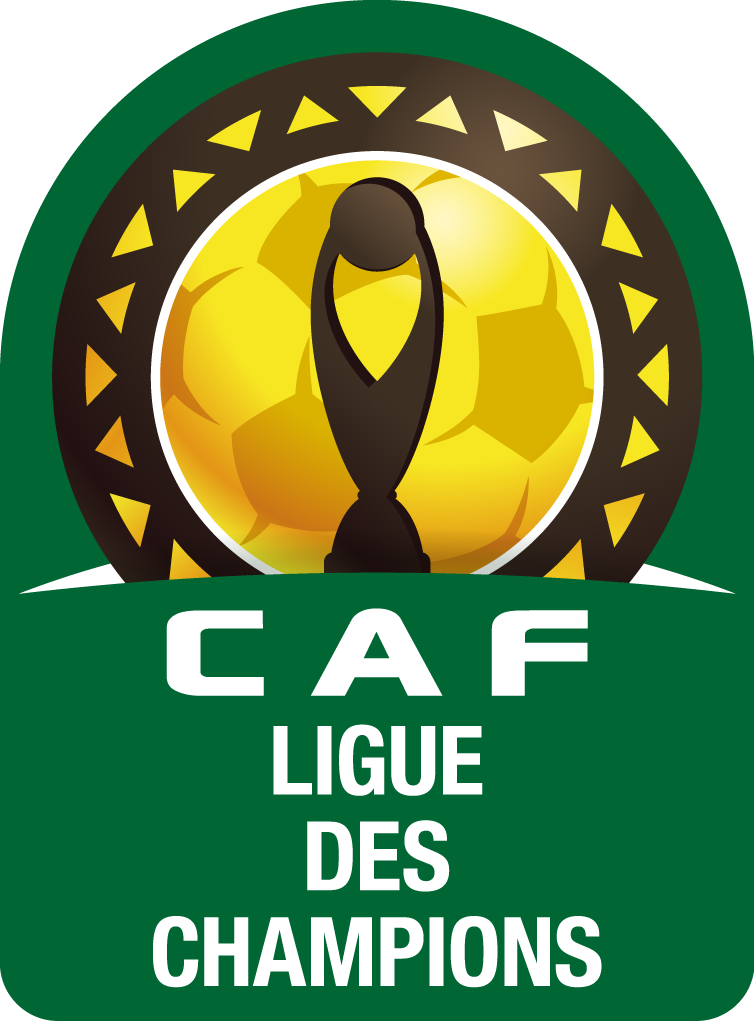
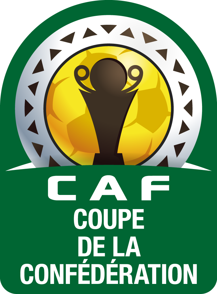
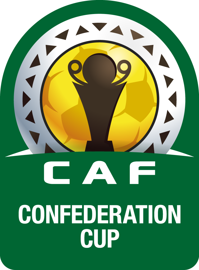
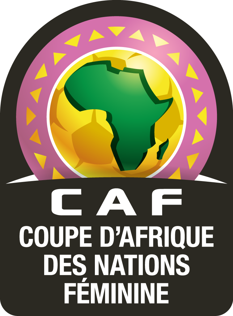
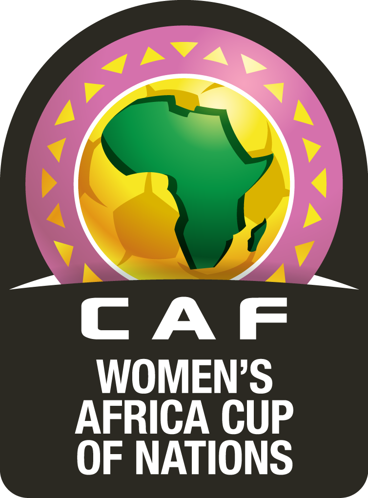
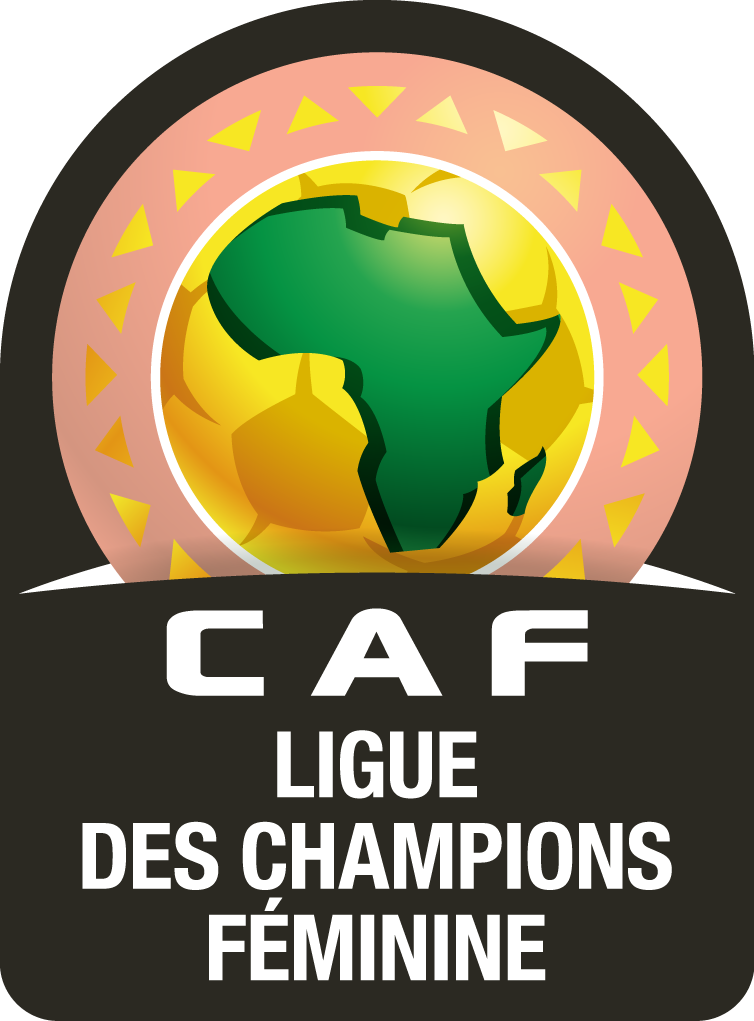
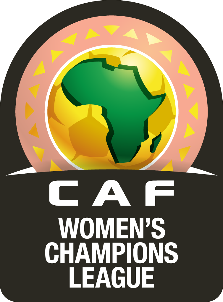
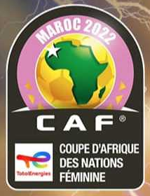
here’s an instance where official sources can be misleading - the caf organized competitions. let’s have a look at the national team competitions (image sources are caf and the main sponsor total energies): these might look like the correct logos for the competitions where the decorative triangular elements are only present around the bottom. however, i believe that they are not, but are rather the result of a mixup of templates that are used for the respective tournament where the host country is added. see below for examples. the 2015 afcon had, thanks to the length of the host country’s name, only two triangles even on each side: if you look at the confederation logo and the club competitions logos, you’ll notice that the decorative elements are continuous: you can see what happened with the newly introduced women’s club competition: another error is the logo for the upcoming women’s afcon in morocco: this is actually the color for the futsal afcon … this is how the logo of the women’s afcon in morocco looks like: the correct generic logos for the competitions would therefore be as follows (versions without sponsors):
-
i decided to start a separate thread where i’ll ramble about logos that i have either worked on or drawn myself and share some of the thoughts behind the decisions i made. this way i wont clutter up the »logo update« thread, while i figure out the best way to contribute logos without having to spend too much time on looking up game ids or other fm-related stuff. i mentioned before that i’m currently not playing, simply because most of my free time is used for collecting and drawing logos, albeit the long-term plan is to return to fm and maybe even drop a logo megapack conforming to my personal preferences on the unsuspecting public one day. my priorities in regard to logos are as follows: flat design -- i prefer logos without fluff and unnecessary effects, gradients et al. wherever possible, i remove these effects and keep the simplified logo as my main logo of reference. no sponsorship -- the same goes for competitions or club logos with sponsorship elements. there are a few reasons for this: sponsoring deals change frequently, and the more logos there are, the more tedious it is to keep everything somewhat up-to-date. official, sponsor-free logos are a more sustainable option for me as a collector and i like the look just better. when a sponsor logo is the only existing logo, it will be retained, however. clean graphics and files. official sources in many cases are not necessarily the best sources for logos. sometimes the files are mangled, they can cause applications to crash when you open them or other mishaps might occur. if it’s a poor design choice, i modify the logo until i’m satisfied with the result, but not going all the way as some other users do who »rebrand« clubs / federations or make fantasy logos (which are often brilliant). i’ll post examples to better illustrate what i mean when i share and upload logos here.
-
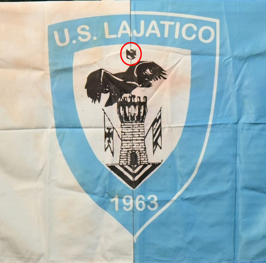
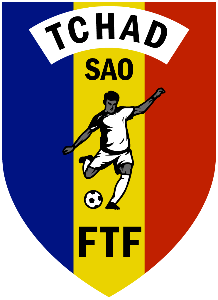
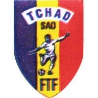
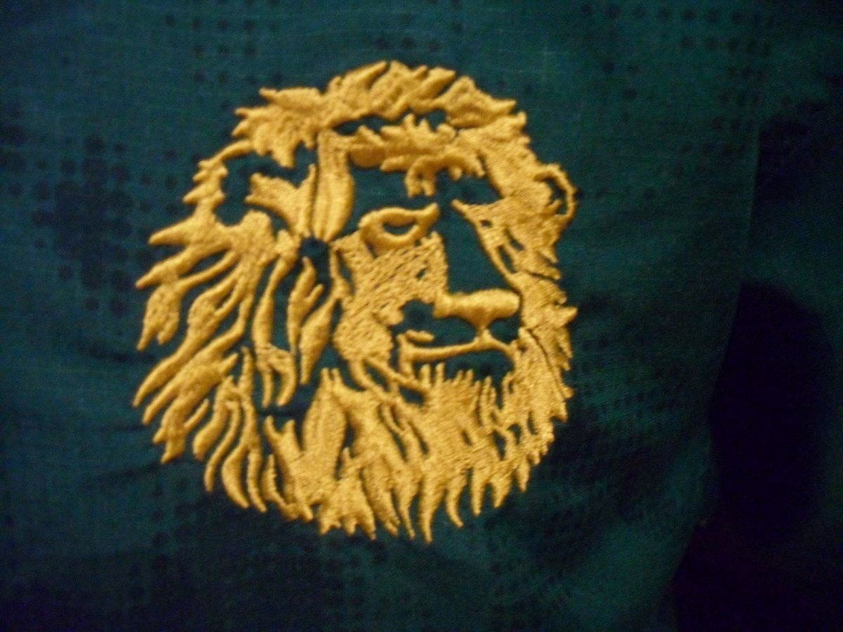
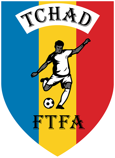
wow, i like this one a lot, actually. what i learned over the decades of collecting and drawing logos is that most people who are affiliated with a smaller club (and sometimes even a bigger club) usually look at football crests the same way they look at heraldry. in other words, as long as it meets the description, it works for them. let's take lajatico and these two logos as an example: if you never saw the logo and i had to describe it to you, i would say it's a pointed triangular shield with a blue border. on top it says u.s. lajatico, in the middle it depicts a crowned eagle sitting atop the tower of lajatico and at the bottom you have the year of foundation 1963. this is what both versions of the logo have in common. they look totally different, but they both show the same thing regardless. it's a general reference, not a unique description. for big clubs or federations, branding and consistent corporate identity are very important, so naturally they make it clear what the official or »correct« logo at any given time is and if it looks different, it's not »their« logo. with small clubs and federations, they have other prioirities, it's often volunteer work, lack of funds etc. so some dude shows up and asks for a logo ... how weird - what kind of person collects football logos, they must be as crazy as stamp collectors. i'll send him this one that i have on my computer or one that gianluca/andrew/fritz made recently for this and that purpose. i had similar conversations more than i can count, then you ask them »but which one is official?« how do you mean official, it is official, club name, eagle on tower, year of foundation, period. two german clubs where i played have simple but nice shields installed on the club house. when you look at the web sites or facebook pages, it pains me, because the online versions are not very attractive the way they are drawn, but this is how everyone sees the club logo who is not a local or has ever been to the ground and seen the club shield in person. the person who is the webmaster or responsible for the internet presentation is the one making the logo and that's it. it's one of the reasons why so many smaller clubs just pick shields from popular clubs and add their name or change a few elements. most don't have this deep interest into DESIGNING a logo. they want to play matches and hang out with their club mates and drink in their free time. this makes recreating logos both frustrating and easy, often at the same time. sometimes when i recreated a logo and contacted a club official, they would take my version. there are facebook pages, where the webmaster is experimenting and you can see four or five different club logos as the profile picture. or, to go back to the chad football federation, the player has become unrecognizable but that blob is the »official« version ... the old logo from glasgow rangers, look at the lion ... before they decided to redesign it (big improvement), i had used the lion from the scottish fa in my recreation, because it looked much better for me. anyway, enough of my blabla. it's possible that both are valid, the one on facebook and this one you posted now. i can tell you one thing, though: sooner or later, we will get the logo in big resolution. i was the first one who ever made a complete list of all active leagues and clubs in croatia in 2006/2007 and 2007/2008. i live in germany, back then only a handful of first league clubs even had a web site, so this took almost a year to find all the info, league names, club names just by searching online. forget about logos back then. but today, every club either has an fb page or website, instagram, twitter, or a blogger is posting or on some forum there is a logo section etc. so it has become a lot easier to find and it will become even easier in the future with reverse image search (i wish i had that 16 years ago!). i had good results with contacting municipalities or local administration, sometimes they are also at the club or they can give additional information about the heraldic elements.
-
@AndreaSSL1900 have you contacted them directly on facebook or by email and asked about the logo? i know that many smaller clubs don’t necessarily answer, but i get feedback or help very often, too. worth a try. you can also tell them that they’ll get a vector logo in return if they provide a high resolution template.
-
correction: Polish Third Division - ID 129560 the logo in the database is incorrect. this is the correct logo. source: https://pzpn.pl/
-
@Derek, are you interested in historic tournament / competition logos, too?
-
very true. i particularly like the bit of info about nils being a competitive bowler, really enjoy that sport every once in a while.
-
this one is smaller resolution, but i can tell that the template is much better even at this size, it’s a lot cleaner, and i think this is drawn, not scanned or copied. by the way, note the different typeface. this is the case with so many lower league clubs, they just pick what is available and use it. then you end up having several different variants of the club logo at the same time … maybe the rose from the city coat of arms? but this is speculation. look where carpaneto chero got the stone crown from. https://www.araldicacivica.it/ there is another logo for lajatico, is this one historic? tuttocampo is down at the moment …
-
correction: Canton League of HBZ/ZHZ - ID 2000005596 the logo in the database is incorrect. the map of bosnia-herzegovina and the location of the canton are not part of the logo. source: https://znszhb.com/
-
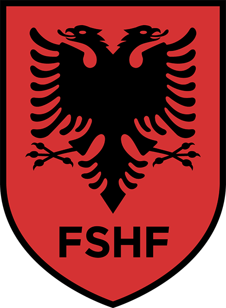
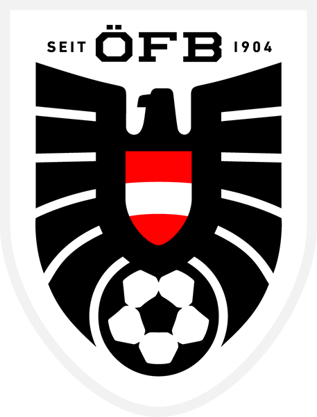
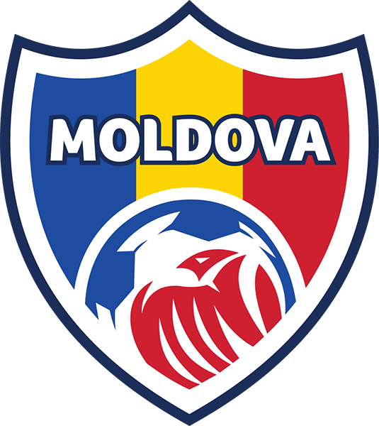
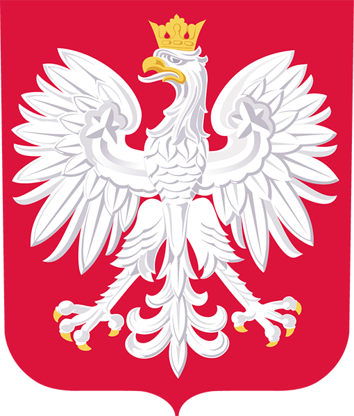
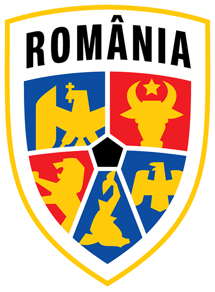
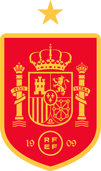
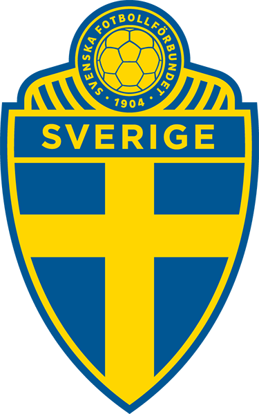
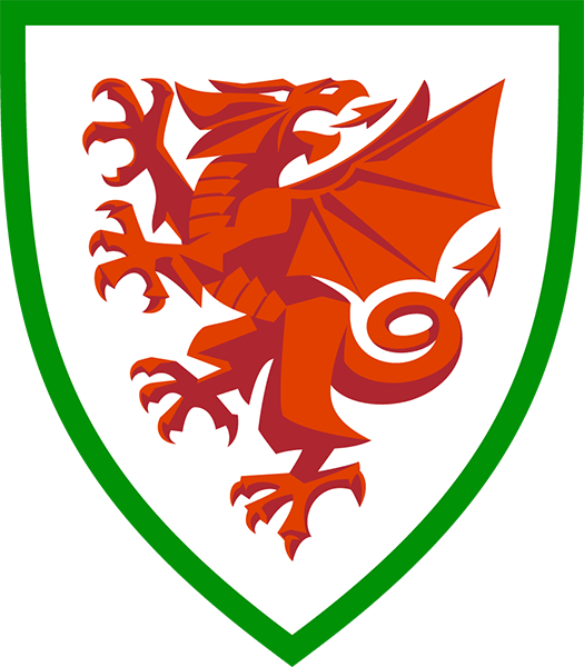
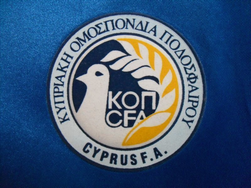
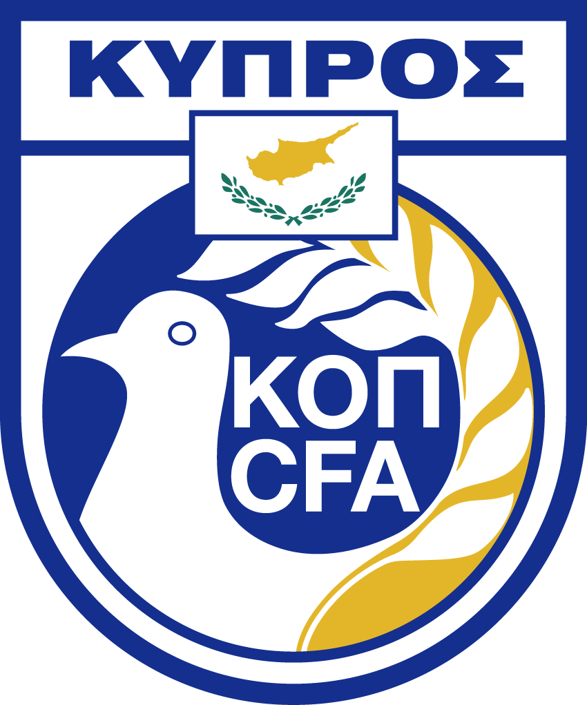
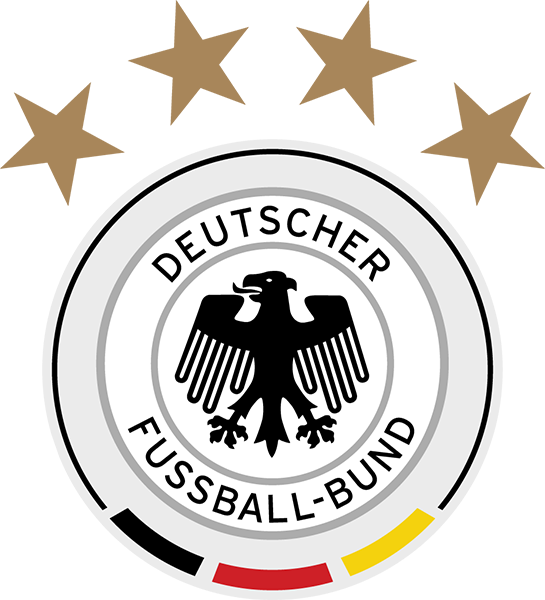
corrections: Ukraine - ID 800 the logo and the name in the database are outdated. source: federation / team Germany - ID 771 the federation and the team logo in the database are outdated. source: federation / team Kuwait - ID 120 federation logo Iraq - ID 115 federation logo Czechia - ID 763 federation and team logo, respectively Albania - ID 752 federation and team logo, respectively Austria - ID 755 team logo Cyprus, South - ID 762 federation and team logo, respectively Greece - ID 772 team logo Ireland, South - ID 789 team logo Iceland - ID 774 team logo Latvia - ID 777 team logo Liechtenstein - ID 778 team logo Moldova - ID 783 team logo Poland - ID 787 team logo Romania - ID 790 team logo Russia - ID 791 team logo San Marino - ID 792 team logo Slovakia - ID 794 team logo Spain - ID 796 team logo Sweden - ID 797 team logo Switzerland - ID 798 team logo Turkey - ID 799 team logo Wales - ID 801 team logo
-
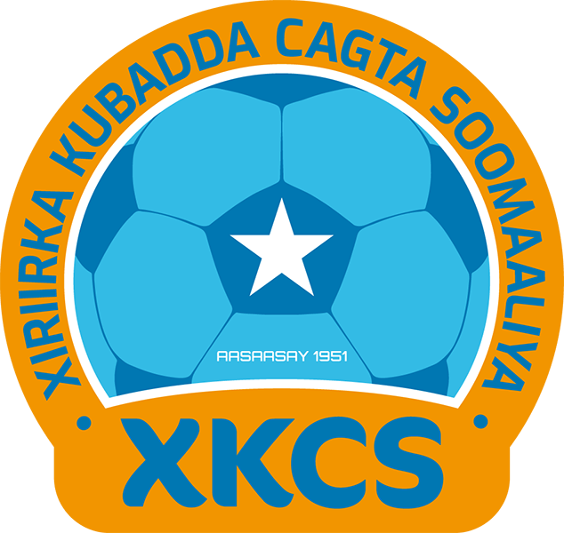
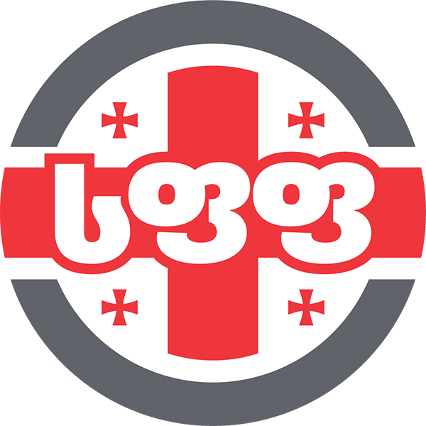
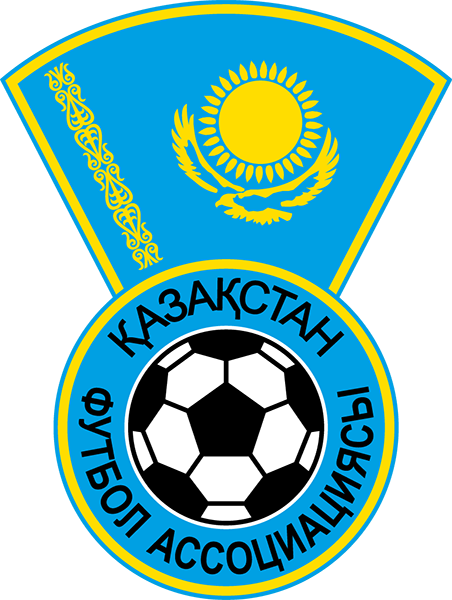
Kosovo - ID 217945 federation logo Norway - ID 786 team logo Burkina Faso - ID 9 federation logo KF Luz i Vogël 2008 - ID 2000032828 DFB-Pokal - ID 1301410 Somalia - ID 44 federation logo not fantasy as such, but unofficial. i loathe the trend that many federations and clubs resort to branding themselves in english, hoping to gain more traction and other possible benefits that way. i have made a number of logos for federations and clubs in the official language of the country they represent. Cambodia - ID 118 federation logo Vietnam - ID 145 Armenia - ID 754 federation logo Georgia - ID 770 federation and team logo, respectively Israel - ID 775 federation logo Kazakhstan - ID 119 federation logo
-
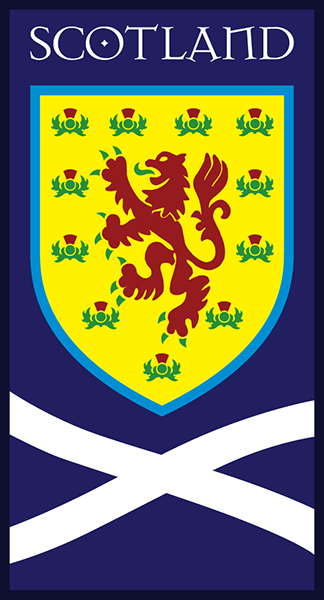
Sint-Maarten - ID 917506 federation logo, 2006-2009, i believe. the very first vector logo i made, player clipart and bauhaus typeface. Mongolia - ID 129505 federation logo, 2013-2017. Austria - ID 755 team logo. Lithuania - ID 779 team logo. Malta - ID 782 team logo. Poland - ID 787 team logo Scotland - ID 793 team logo, 2006-2010.
-
Ghana - ID 21 alternate typeface to beef it up a bit (too many federations and clubs use arial, helvetica or times and the fonts supplied with coreldraw or windows office …). Cameroon - ID 11 in french and spanish, it is perfectly acceptable to omit diacritics when words or abbreviations are typed in all capital letters, the same goes for the tonos mark in greek. i prefer to keep them, so here’s an alternate version of the cameroonian federation logo.
-
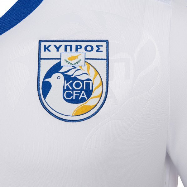
Cyprus, South - ID 762 team logos, 2000 (with alternate version all helvetica condensed) and 2018/2019. source: Germany - ID 771 team logo, 2008-2017.
-
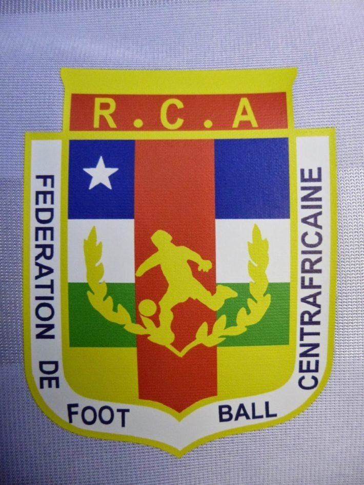
lajatico maybe -- i can do a quick and dirty version for you as a placeholder, if you want. simply put, i can basically autotrace the images and convert them into vectors, then export the result in bigger size. it will look crappy, however. i’ll show you what i mean in a short while. carpaneto chero would take too long, to be honest. the amount of detail in the crown and tree is staggering, and i would need a high resolution source for it to be acceptable. then there’s the typeface. very idiosyncratic, but would have to be sourced as well. all the images i have posted so far are png exports from vectors, i work with illustrator. lajatico - as a temporary solution it’s acceptable, but for a clean recreation a much better source is mandatory. i believe the club itself only has an old black and white copy of the crest and this is why the logo looks the way it does. the shield is unrecognizable, for example. we have the same problem here as with chad.
-
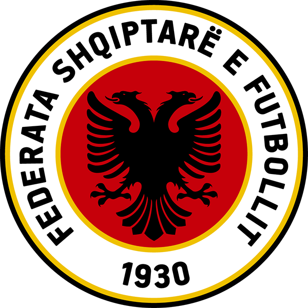
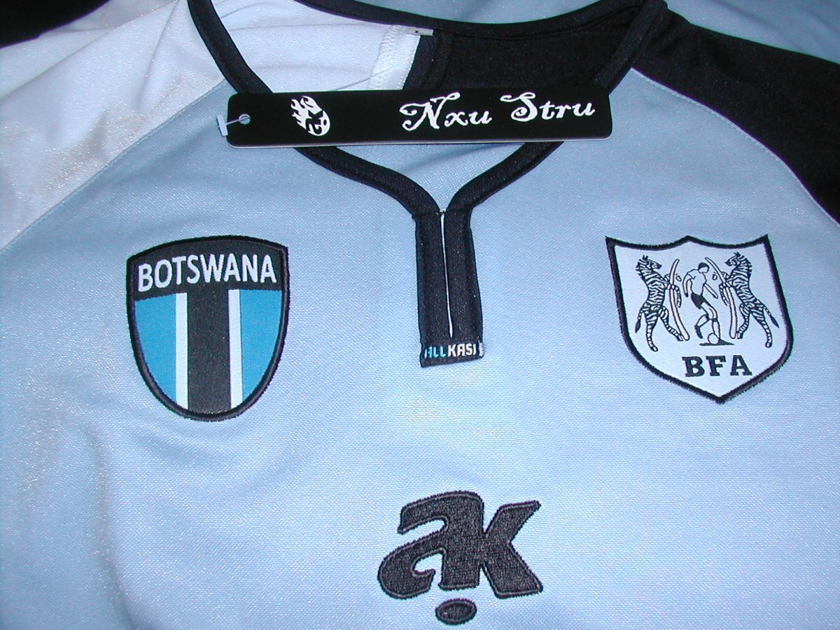
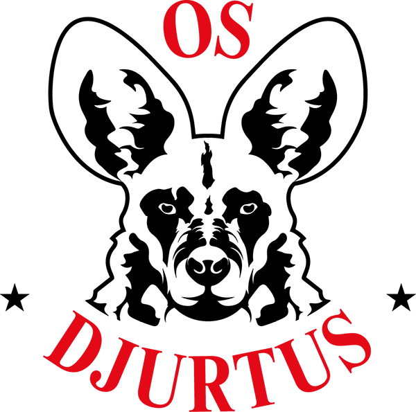
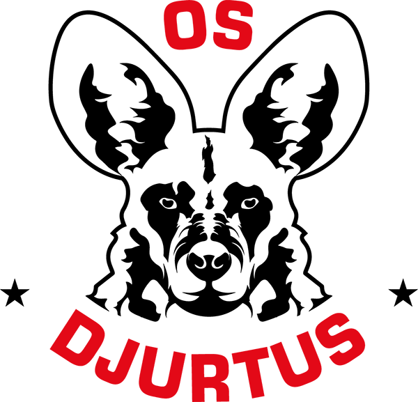
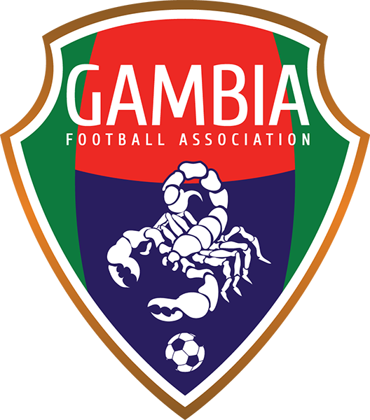
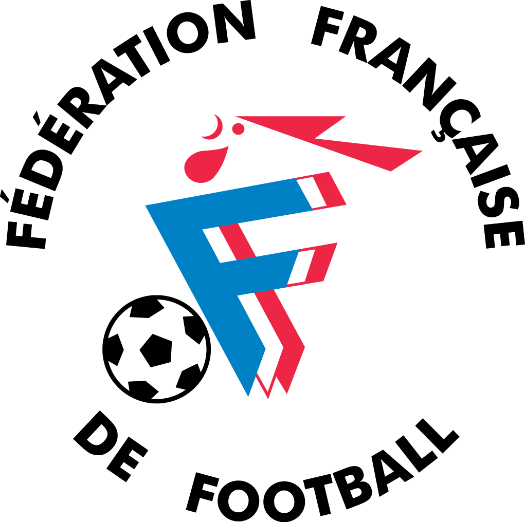
Albania - ID 752 federation and team logo, respectively (1989 - 2014). source: federation / team Kazakhstan - ID 119 federation logo, early 1990s. Germany - ID 771 federation logo, 1920s. source: https://www.dfb.de/ Chad - ID 14 federation, i believe early 2000s. source: Cameroon - ID 11 team logo, 1990s. source: Botswana - ID 8 team logo, 2012. source: Guinea-Bissau - ID 23 team logo, 2016 (with alternative typeface eurostile). source: os djurtus (official team fb page) Gambia - ID 20 federation logo, 2011/2012. source: https://twitter.com/GambiaFA/ Venezuela - 1658 team logo, 2014-2017. source: cambio de camiseta France - ID 769 federation logo, 1995-1998.
-
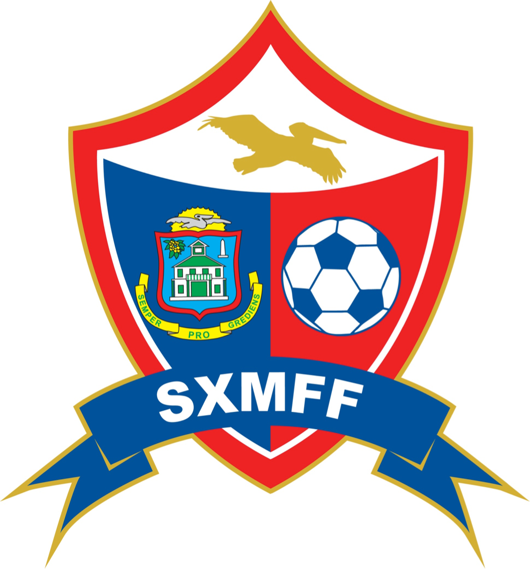
Sint-Maarten - ID 917506 curiously, this one has been flying under the radar for at least five years, both in regard to federation name and logo (both outdated) -- even concacaf lists the wrong logo and name. the entry in the database is wrong. St. Maarten Football Federation source: https://www.facebook.com/SXMFFed source: jersey 2017/2018
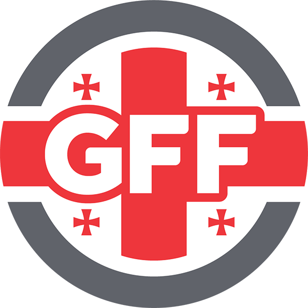
-
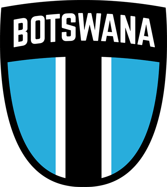
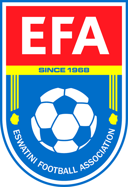
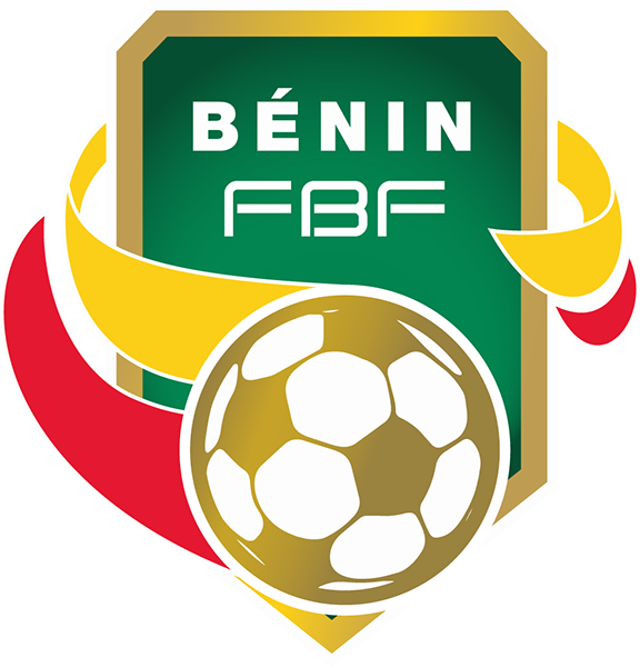
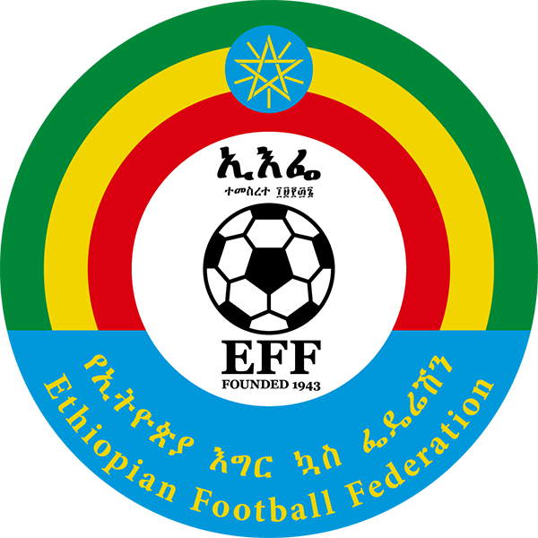
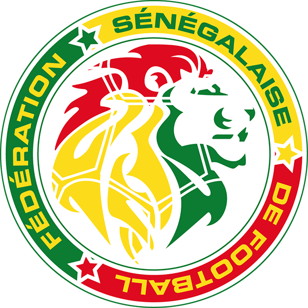
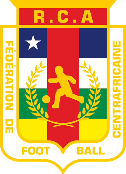
apologies in advance for posting doubles, i.e. logos that are already in the packs, i’m a bit anal about details - sometimes official sources are the worst, but i’ll get to that later and post a few examples. all the images have been processed by me, regardless of source format, so they’ve been cleaned up and prepped. Kosovo - ID 217945 federation and team logo, respectively source: https://www.ffk-kosova.com/ Georgia - ID 770 federation and team logo, respectively source: federation / team Botswana - ID 8 federation logo. they have used elements of the country’s coat of arms and a clipart image of a player. i believe this to be the cleanest version out to date. source: http://www.bfa.co.bw/ / player Eswatini - ID 47 Namibia - ID 36 drop shadow removed, usage is inconsistent anway, see source: https://neweralive.na/ South Africa - ID 45 made the football symmetrical, cleaned up the country’s silhouette and made the distance between the dividing lines even, also improved kerning (typography). Tanzania - ID 48 mostly typographic tweaks, centered the football. without and with gradient (i prefer flat design and usually remove effects). Zimbabwe - ID 55 without effect. the federation’s application of effects and graphic elements is all over the place. if you want, i can add gradients, there are all kinds of variants of the logo in use, however. someone at the federation used a psd template with glass / polish effect, i even have the file somewhere. Benin - ID 7 Ethiopia - ID 18 Senegal - ID 41 made the overlaying football pattern symmetrical and improved kerning (typography), cleaned up the paths (outlines). Somalia - ID 44 Chad - ID 14 the player on the crest has very likely been copied back and forth between kit suppliers, officials, (and i am positive that the images had to be converted from bitmap to vector) until the graphic element lost all the distinguishing features and became a blob. if you zoom into the attached source file of this historic federation logo, you will see that the player actually has a face and even fingers can be made out. here is the logo with the details of the player restored: Central African Republic - ID 13 the same blob story applies to the central african republic, have a look at the different silhouettes used for and on the logos: i’ve picked a silhouette that doesn’t deviate far from the official one, yet is clean and well proportioned. the text has been spaced and aligned to flow better with the shape of the crest and not look like an afterthought.
-
cheers, i’ll unload more of my vectors, just need to export them to png first. i’ll also explain my priorities and reasoning as i go along whenever my recreation deviates from the source image so that all of you can decide whether you want to add it or not.
-
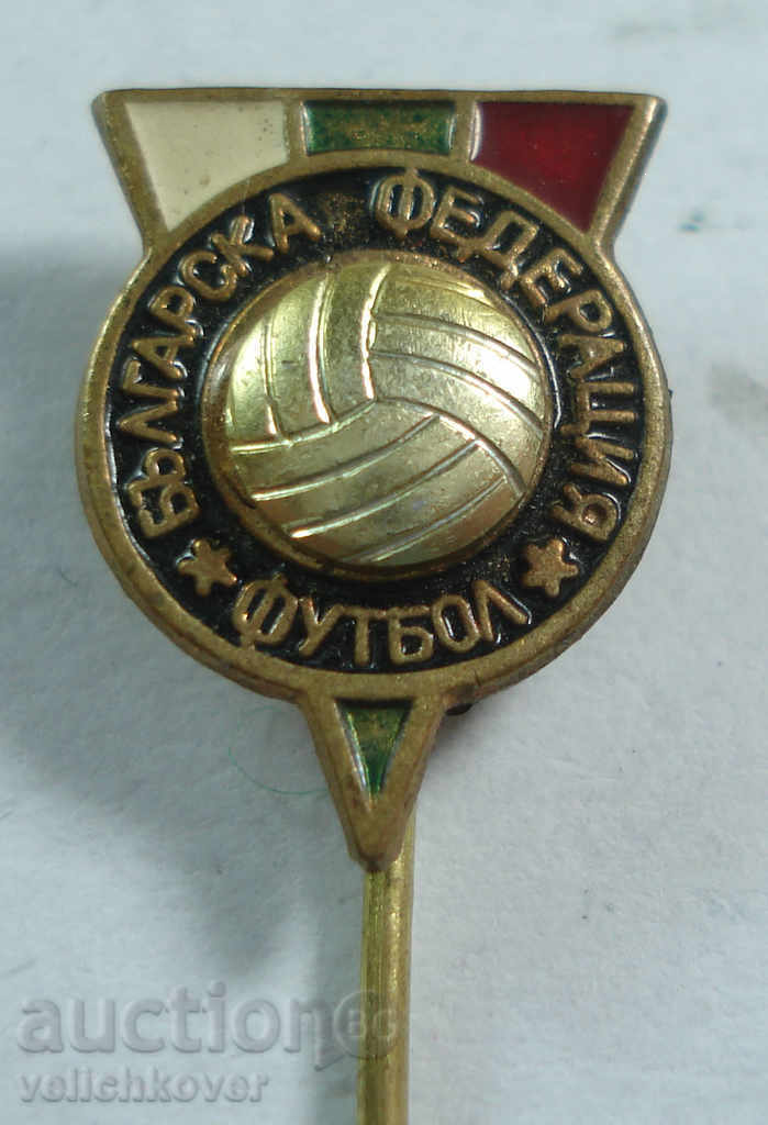
Croatia - ID 761 source: 1940s source: 1970s Bulgaria - ID 760 source attached (pin), 1960s/1970s
-
michael jackson generates more attention even in death than many other celebrities do during their lifetime. hbo apparently timed two other releases on streaming platforms of michael jackson’s live concerts to coincide with the documentary. it’s all big business. there are two documentaries who (claim to) refute the accusations of »leaving neverland«, »neverland firsthand: investigating the michael jackson documentary« and »michael jackson: chase the truth«
-
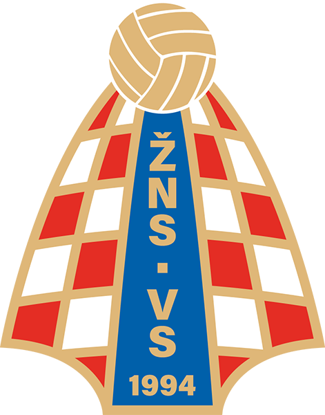
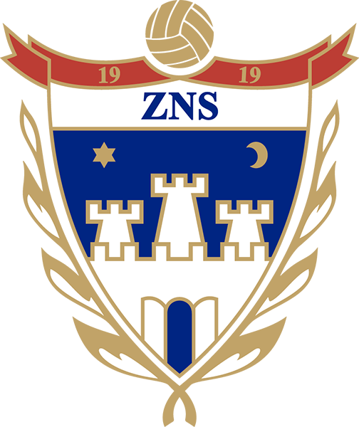
corrections: Croatian Regional League - Gospić - ID 24000266 the image used in the database is outdated (coat of arms of Lika-Senj county). correct logo redrawn and visually improved. source: https://nogometnisavezlsz.hr/ ======================================================================================== Croatian Regional League - Zadar - ID 24000270 the image used used in the database is based on a stamp. correct logo redrawn and visually improved. source: second from right, bottom row ======================================================================================== Croatian Regional League - Vukovar - ID 24000273 the image used in the database is the district football association, not the county association. correct logo redrawn and visually improved. source: http://www.znsvs.hr/ ======================================================================================== Croatian Regional League - Zagreb - ID 24000278 the image used in the database has minor incorrections. correct logo redrawn and visually improved. source: https://zns.hr/ ======================================================================================== Croatian Regional League - Osijek - ID 24000271 the image used in the database is incorrect. please note that the official version is grammatically incorrect - »osnovano«. instead, the correct form has to/should be - »osnovan«. correct logo redrawn and visually improved. source: http://znsob.hr/ ======================================================================================== Croatian Regional League - Bjelovar - ID 24000264 correct logo redrawn and visually improved. source: https://nsbbz.hr/ ======================================================================================== Croatian Regional League - Slavonski Brod - ID 24000269 correct logo redrawn and visually improved. source:https://zns-bpz.hr/ ======================================================================================== Croatian Regional League - Koprivnica - ID 24000263 correct logo redrawn and visually improved. source: http://ns-kckz.hr/ ======================================================================================== Croatian Regional League - Karlovac - ID 24000261 correct logo redrawn and visually improved. source: http://nskz.hr/ ======================================================================================== Croatian Regional League - Virovitica - ID 24000267 the image used on the county website is not the actual logo in use, the colors are off, too. correct logo redrawn and visually improved. source: https://www.icv.hr/ ========================================================================================


.png.e497accda55bfded1cbdbbb374b43c37.png)
.png.06eb3ec7bae81ef9a6abe222273252a0.png)
.png.ff19a056aea9ab081b182d2912c45969.png)

.png.fe8e51f301b26abc6687902cddc64d45.png)

.png.8eb457a61625c26cfdf2faa0d9640fae.png)
.png.f991f26bd9d09d121cd1dbcc62bcc4ee.png)
-1.png.84155abc83ed2cc12afd6607b8d3ac95.png)
-2.png.f8f5a75342db7052a2eeb5fc511398e1.png)

.png.c5427501f34df68c8ce37c8671dd60f3.png)
.png.8af36a4f3352dd8c58adc24d7171dff3.png)
.png.8c624112120eacfded64b86d32a1db71.png)
.png.69865ca29ae1905609a2dbee5c971409.png)

.png.1609c52fe7e69d1f9108e70ce831df49.png)

-2.png.d5c654010d0868b707efbf0467bc8b85.png)


.png.41936f856faf7fa557a50e577f95a2d0.png)
.png.76e4efdfa234ef3c4faf077bff3dfe8b.png)


