cameosis
Moderators
-
Joined
Everything posted by cameosis
-
cheers, i had followed up on heva's post. 👍🏿😁
-
bigger resolution:


-
not really better, but bigger and from the official club site, slightly different variant:
-
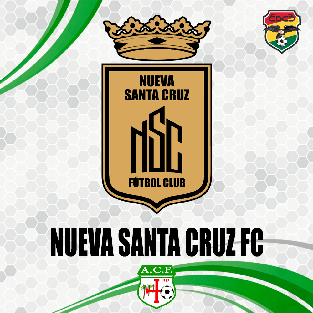
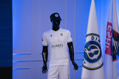
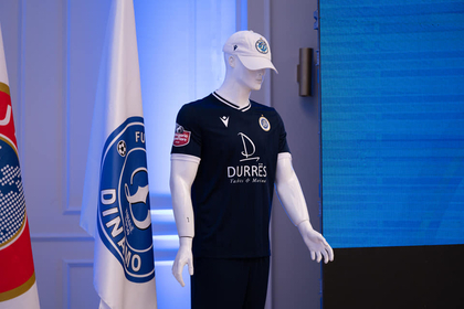
this one got mixed up, i was asking about dinamo tirana, now dinamo city durres. 😁 schweigi confirmed the new id. all good, thanks -- i had found the info about cd nsc after you posted earlier, so i read about the story on nacional b bolivia's fb page: https://www.facebook.com/1383903315202982/posts/3233154696944492/ lower league business can be very confusing when fusions and name changes are involved and they don’t publish press releases or updates themselves. 💀
-
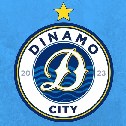
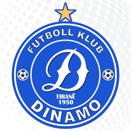
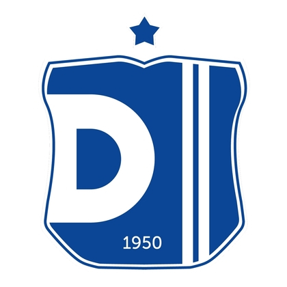
i googled it because i was »wtf« … seems i wasn’t the only one 😵💫 the year of foundation was the reason for me, i thought it’s a new club. @Markitos, this should probably become a new club entry with a different id. similar thing happened with wimbledon fc, which was relocated from london to milton keynes and renamed mk dons. the fans then founded their own club, afc wimbledon. https://www.facebook.com/fkdinamo.tirana/ the previous logo was this, btw: and before the previous logo, it was this, according to the official club website:
-
the dinamo change is highly controversial: city group wants to move the club from tirana to durrës, and they changed the year of foundation from 1950 to 2023 ... protests already under way. https://sot.com.al/english/sport/ndryshuan-emrin-e-klubit-shperthejne-dinamovitet-nuk-mund-te-deformohet-hi-i607897 there was a previous attempt to rename the club into olimpik in the 1990s, it was forbidden by uefa, the opponents want to appeal to uefa again this time.
-
blog page and fb page for bolivian football logos (haven’t checked them): https://escudosfutbolivia.blogspot.com/ https://www.facebook.com/EDCB.OK
-
looks like the logo for a beach soccer club https://www.facebook.com/people/Nueva-Santa-Cruz-Futbol-Playa/100063545796056/ official fb site of the association football club still uses this logo, including match announcements: https://www.facebook.com/CiudadNuevaSantaCruzAcademia/ flat design: city of nueva santa cruz page on ig: https://www.instagram.com/p/CwWA4AaO0YH/


-
alternative with gradient:
-
two different clubs: https://en.wikipedia.org/wiki/FC_Krasnoye_Znamya_Noginsk https://en.wikipedia.org/wiki/FC_Znamya_Truda_Orekhovo-Zuyevo
-
istres fc, svg vector: https://upload.wikimedia.org/wikipedia/fr/b/b0/Logo_Istres_FC_-_2022.svg
-
disagreement is fine. supporters are traditionally against crest changes, because they are emotionally attached to the club and to what the old logo represents to them. to be fair, the previous logo is a copy of the old inter crest ... i believe spezia was a feeder club for inter at some time, is that correct? i don't think that a copied logo/brand identity without any creative merit of its own is »better« design - apart from the emotional aspect for people supporting the club.
-
bit of an awkward design, but i don't think it's all bad. the typeface is very reminiscent of eurostile, which was designed by aldo novarese, so there's the italian connection.
-
svg vectors spanish cup https://bartv.es/img/logos/copa-rey.svg spanish super cup https://bartv.es/img/logos/supercopa.svg
-
https://upload.wikimedia.org/wikipedia/commons/9/9b/LaLiga_Hypermotion_(Black).svg https://upload.wikimedia.org/wikipedia/commons/d/d9/LaLiga_Hypermotion_2023_Vertical_Logo.svg
-
not loading.
-
so without the sponsor, the logo is identical to the first and second division?
-
not to mention the similar name 😁
-
svg vector: however, this version is unofficial and not current anymore, redrawn after the older variant of the original logo (see different typeface, should be a variant of futura / century gothic): https://www.arcadiaportal.gr/news/etisia-geniki-syneleysi-gia-ton-panarkadiko then, there is this one: https://www.arcadiaportal.gr/news/panarkadikos-anavoli-tis-syneleysis-kai-kalesma-se-nea-imerominia-tin-tetarti-216 it’s also used on the supporter cards from the club: https://www.arcadiasports.gr/index.php/football/g-ethniki/panarkadikos/70266-kar-os-a from 2021, note that tripolis is missing: https://www.contraepithesi.gr/βασικοί-οι-αργεντίνοι-επιθετικοί-τ12/ also newsfeed and match pictures here: http://www.panarkadikos.gr/ https://www.facebook.com/panarkadikosgr from 2020: https://www.arcadiaportal.gr/news/panarkadikos-file-dimo-kalo-taxidi-tha-se-thymomaste-gia-panta from 2020: https://www.arcadiaportal.gr/news/ampot-el-arampi-asimellis-irthan-ston-panarkadiko-gia-na-dosoyn-kati-parapano from 2016 (official club site, now defunct/offline): https://web.archive.org/web/20160204182407/http://www.panarcadikos.gr/ maybe our greek experts can shed some light on this, @Alieeks@Lavegaks
-
atlético madrid will return to their old logo in the 2024/2025 season: https://www.kicker.de/offiziell-atletico-madrid-kehrt-2024-zum-alten-wappen-zurueck-956950/artikel
-
some historical: source official fb (the last two are quite crazy)


-
ohrid is not representative to be honest, this is one of the places that everyone tries to milk to make some coin. regarding traffic, very correct … but you probably haven’t been to egypt or turkey yet, let alone india – then you’d find albanian driving habits therapeutic. 🤣
-
these images have been resized (upscaled) and thus are of inferior quality due to the pixelation/blur. northern and central have been posted here previously in better resolution: pngs in original size:
-
bigger resolution:

-
svg vectors: