


cameosis
Moderators
-
Joined
Everything posted by cameosis
-
another anniversary logo:
-
albania definitely, not overrun by tourists, astonishing landscapes. croatia doesn't need an introduction, montenegro is a bit under the radar, slovenia, bulgaria, serbia (central region called šumadija), hungary etc. you could plan an itinerary for years to come. 🤣
-
the region is well worth checking out! just read your story now @Tempelman, wonderful!
-
@Alieeks@Lavegaks if i'm not mistaken, there are 54 regional football federations in greece, and 51 have been posted so far. could you locate the remaining three logos?
-
on another note, this flame is green, alieeks' version has a red flame.
-
i don’t play/have the game, either - i checked with the database on sortitoutsi, which is accessible with a web browser - https://sortitoutsi.net/football-manager-2023/database all good.
-
svg vectors: historical:
-
both wrong, logos and ids. 432266 + 88006344 you mean https://en.wikipedia.org/wiki/NRFL_Championship - 88006348 + 88006353 418021 please check official sources first, i have mentioned this a few times in this thread and provided links.
-
the caf competitions have already been supplied by me, those are the logos i drew.
-
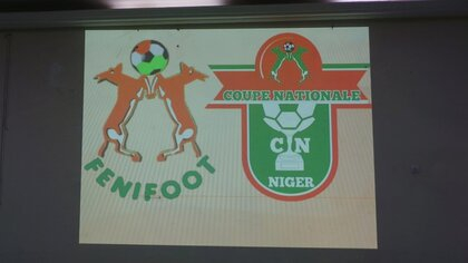
niger - alternative federation logo (id 37) and national cup competition (haven’t found an id): typeface for the competition is chunk five: https://meredithmandel.design/chunk-five extended charset: http://www.peter-wiegel.de/Chunk.html
-
this is a web logo apparently -- bigger resolution: inner part of the logo is national customs authority of niger: alternative: see the shape of the logo on the team jersey:


-
images not showing, site is offline.
-
for those who are researching images, this is a helpful website -- an image extractor, user-friendly: https://extract.pics/ you just paste the url of the website into the mask and the pictures are extracted automatically, you can then select them and download them. the only caveat is that sometimes the source websites resize the images, this app only shows you the resized images, but it’s excellent as a first step.
-
svg vector: u19 svg vector: u17 svg vector:
-
this should go into the alternatives folder, if at all. it’s a fan page: https://www.facebook.com/people/Nasarawa-United/100063858840643/ official page on fb: https://www.facebook.com/people/Nasarawa-United/100057262765922/?sk=photos the logo has a red football and a solid color background, not a picture of rocks/minerals: https://www.facebook.com/people/Nasarawa-United/100057262765922/?sk=photos https://www.facebook.com/photo/?fbid=363377698914319&set=a.137865001465591 https://www.facebook.com/photo/?fbid=363377698914319&set=a.137865001465591 https://www.facebook.com/photo?fbid=660942222711067&set=pb.100063858840643.-2207520000. this looks like the one: https://twitter.com/NasarawaUnited/status/1638639514032783360/photo/1


-
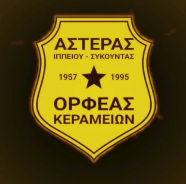
https://www.facebook.com/Asteras.Orfeas/photos/pb.100063448586350.-2207520000./440752911067288/?type=3 historical logo (1980s, most likely) https://m.facebook.com/ippeioslesvou/photos/a.562620797093638/3861274150561603/?type=3&_rdr&_se_imp=2E3WYhZxa07FI2ThE

-
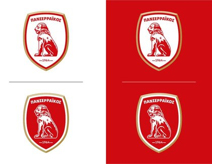
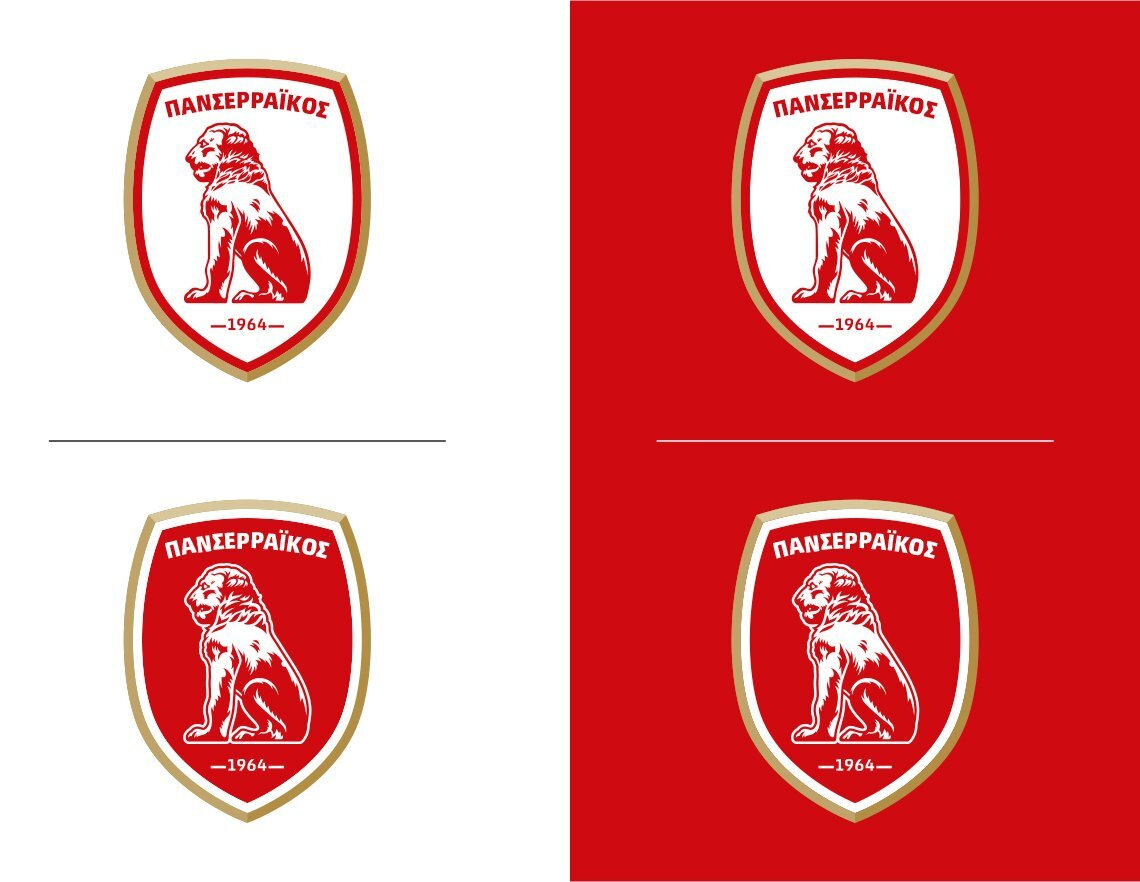
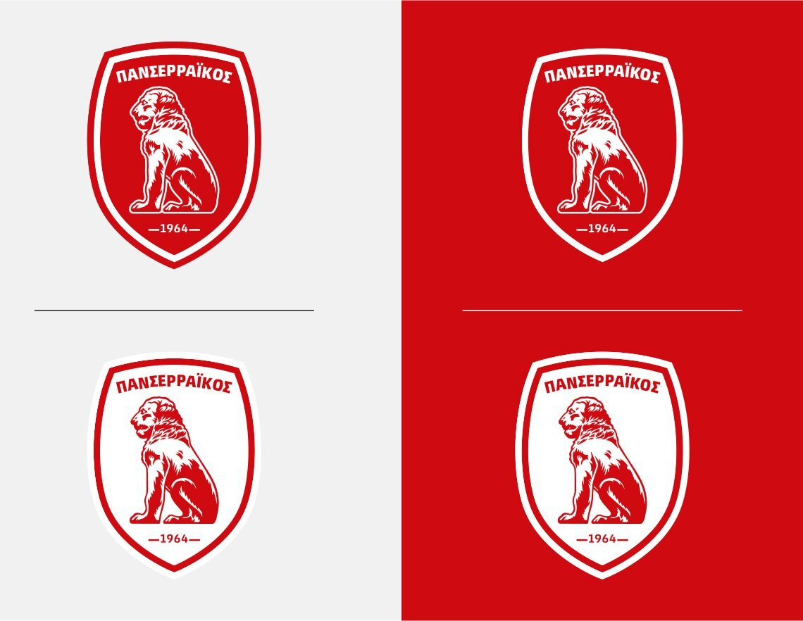
that was a misunderstanding, yes: i asked about the current logo. i couldn’t find any info on the greek sites why they would change the year to 1946 instead of 1964, and i wonder what the reason for this is. the image with the logo history »50 years of panserraikos« that i posted is from an article from 2014.
-
are you sure? they use it on their website and merchandise / jerseys (macron): https://panserraikosfc.gr/
-
do you know why they changed they year of foundation from 1964 to 1946? this one is from the club website: here, the year is omitted, same as the macedonian sun: historical logos: https://www.serressport.gr/50-χρόνια-πανσερραϊκός-50-ημερομηνίες-στ/ concept logos: https://www.lithografiki.gr/portfolio/mgs-panserraikos/ official profile with club history (1964 - present) https://www.multisportclubs.eu/index.php/9-teams/35-gsm-panserraikos


-
excellent, so the first two are concept logos, the last one is the historical one. what is a »fifa system«, a registry for clubs?
-
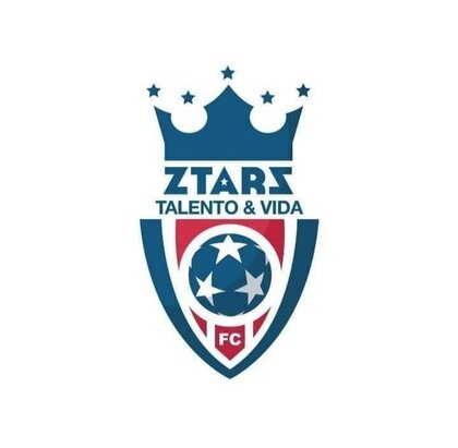
they have a lot of variants/alternatives flying around: https://www.facebook.com/photo?fbid=10160043572501634&set=g.708533505859731 https://www.futbolasyaf.com/talento-y-vida-fc

.thumb.jpg.ddf0f078c460282c5d2eb35a8abc3c89.jpg)
-
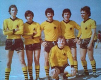
so it’s historical?
-
did you read about the background with messi? they apparently plan to persuade his former team mates to move to saudi arabia as well, so he would have a familiar environment and feel more at ease. this is like catering to a child with special needs, he's a fucking football player for god's sake, not a physician or someone else making fundamental improvements to society ... that's what i mean with perversion. at the same time, ngos for example struggle with fundraising for different causes.
-
it shows the perversion of professional football. hundreds of millions for kicking a ball. yes, the sport is popular but what is it actually other than entertainment? anyway, am digressing, i'll leave it at that.
-
well, that pretty much is true for all players, to be fair. look at the argentinian and the portuguese, for instance - the former needed gifted penalties to score and lift the world cup trophy, no impact in paris either, living off the past glory in barcelona; the latter was shrunk down to real size once the rest of the team's purpose was no longer assisting him to reach personal records, causing him to disappear to western asia and milk the sheikhs for as much money as possible. haaland was a prolific goal scorer for dortmund too, and they arguably had a weaker squad.


.jpg.a8022b7d2844287936e08e2c3c922f63.jpg)