
cameosis
-
Posts
1,073 -
Joined
-
Last visited
-
Days Won
62
Everything posted by cameosis
-
marked areas of the flags have to be white, not red

-
first one is the current one, second one is the historical logo - bigger resolutions but with tops/bottoms cut off:
-
happens, the combination of small resolution on the club site and »2024« in the file name was misleading. as they still haven’t updated it on their website, it will coincide perfectly with the fm25 megapack release.
-
these are actually the correct main flags in regard to sports and the french flag should go into the alt folder for them. it’s actually in practice for sports events to use the regional flags in many instances, as this is who they represent, not the entirety of france. the french flag is official, as they’re part of france, but they are not france (which is the sum of all french territories). bit counterintuitive, but that’s how it should be handled. same with england, scotland et al - part of britain/uk, but each one of them alone is not the uk.
-
this was the first logo style i saw for fm, around 2008/2009 if i'm not wrong. was thinking about it a while back, just awesome.
-
i cannot believe our admin and site owner is risking a permanent ban! anyway, smokin'! therefore, i shall be merciful. you could try making displacement maps from the jersey textures and apply them onto on the logos, that would knock it up another notch, i believe.
-

Champions League 2024 skin (full version released!!!)
cameosis replied to a31632's topic in Football Manager 2024 Skins
thankfully, there is more than one way to skin a cat/game. -
i cannot approve of this as long as the preview for the most important bundesliga club is missing.
-
id should be 5621797 according to the name, but i think it’s a concept logo (nicely done, though).
-
vector: https://images.mlssoccer.com/image/upload/v1709221457/assets/nyc/logos/mnp/NYCFC_badge_rgb_full-color_2024-web_w4fla0.svg
-
are you a club? how does my criticism of the logo affect you? again, still no justified reason for your post above, instead you keep talking about the logo, but it has nothing to do with you or your reaction. the logo is a collage, you should look up the definition of collage and the technique. i won’t derail the topic further.
-
i’m not responsible for what triggers you or what you assume. »clearly denigrating« towards you, are you serious? you’re pretty much the only one with that unfounded opinion, which doesn’t make sense in the first place. i have never criticized any of the uploaders because of some shitty logos, least of all you. again, if you jump to conclusions without asking first and then lash out, i won’t tolerate it. that’s all from me on the matter.
-
i advise you to watch your mouth, andrea, thanks. i commented on the quality of the logo, which is terrible. not sure what got you so riled up, but your response is way out of line. ask first before you assume things and go out on a personal attack.
-
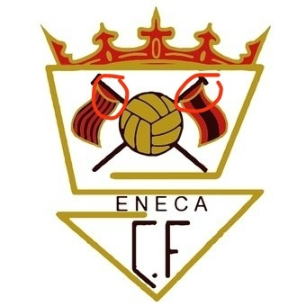
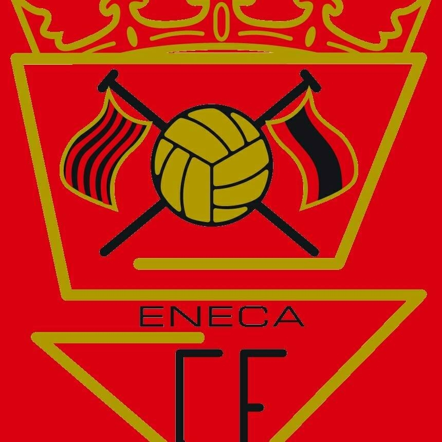
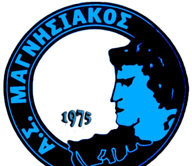
i’ve done some digging, here’s what i came up with: the line is part of the character’s clothing and actually the border / contour shape in the neck and upper arm area to set it apart from the logo’sbackground (visible below). the black version has deleted the upper part of the shape and now it looks like scribbling (when you compare the two) … they had one job. i would suggest using the logo with the white background as the main variant and the all-black one as an alternative - of course, the bottom has to be corrected -- how they managed to cut it off TWICE when taking a screenshot is beyond me. i will definitely need to redraw this one eventually. the club uses the version with the white background for match announcements and it has been on their kits both with main and inverted colors. check out the football player on the right, it’s amazing how he continues playing with a dislocated rubber leg! as a bonus, i also found the historical logo, unfortunately blurry:
-
this one is ... remarkable ... a black hole in the center do you know if the bottom is a signature or just graphic decoration? i have the impression something is missing in the center.
-
for now ☝
- 80 replies
-
- 1
-

-
- fmg standard logos megapack
- fmg standard logos
- (and 8 more)
-
ma non è vero … clubs are doing collage logos now … this looks a bit like a mix of a fever dream and a kindergarten art project.
-
an african samurai in feudal japan ... epic fail. next thing will be that shaka zulu was in fact a danish guy ...
-
that's inevitable with the transition to a new engine, the graphic parameters will be very different, as the possibilities will be very distinct from the current and retired engine framework. i'm curious to see how it will affect the dimensions of graphics, could be an increase in display size again.
-
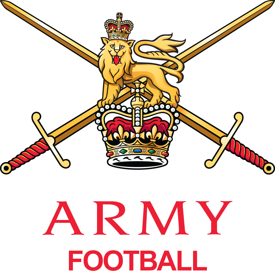
»great britain« - id 145174 all the teams listed are army regiments, so it seems very likely that this is actually the army fa: https://sortitoutsi.net/football-manager-2024/nation/145174/great-britain#staff nation logo and team logo:
-
i was actually trying it out (cabo verde) a few months ago, but it wasn’t very user friendly. managing a national side in the game is what i’d almost find more interesting than a club, i’m one of those 5 percenters.
- 5 replies
-
- 2
-

-
- football manager
- football manager 2025
- (and 2 more)
-
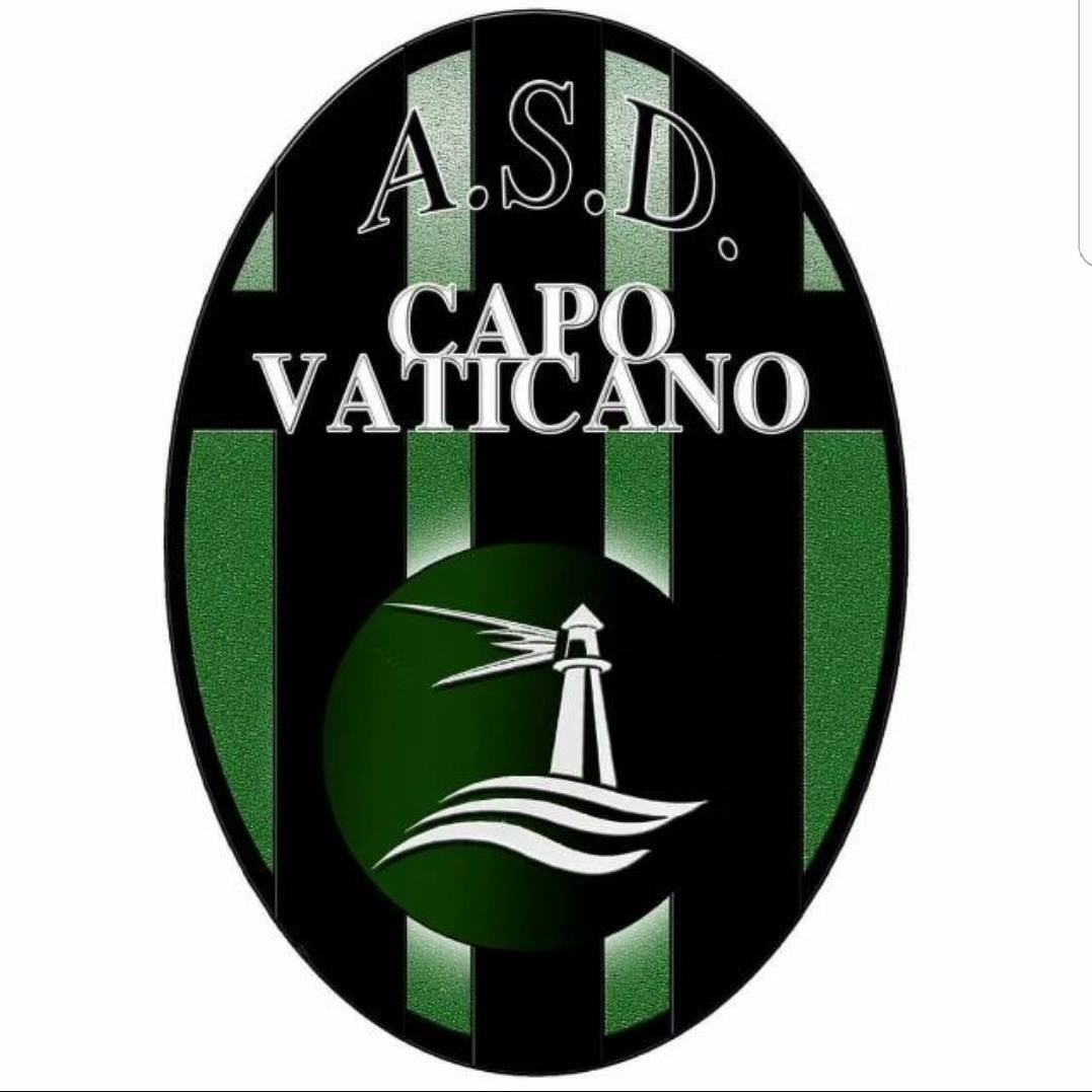
asd sport in vaticano - id 2000004828 historical: capo vaticano - id 43127061 historical 2017: historical 2016:
-
you have to wonder who would use a dropped ice cream cone as their logo ...