


cameosis
Moderators
-
Joined
Everything posted by cameosis
-
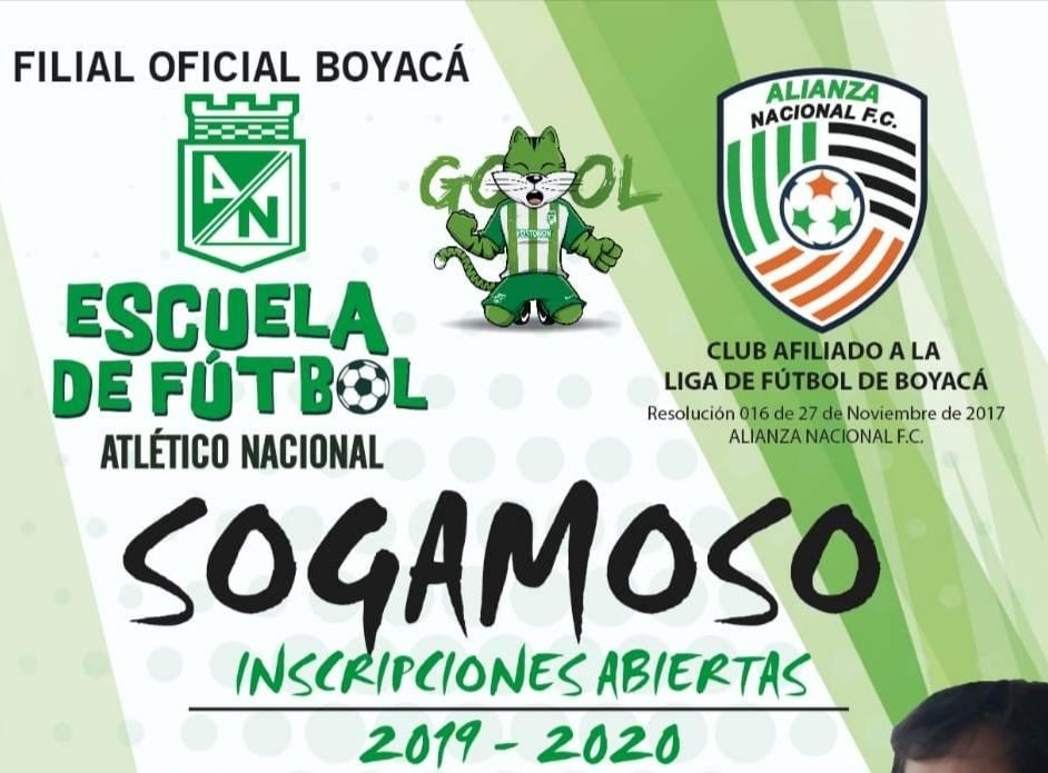
can you give me the city for this one?
-
i think this is the correct logo: bigger resolution: bigger resolution: concept:


-
bigger resolution and alt: slightly bigger resolution and alt, possibly historical:


-
so many good looking logos all of a sudden 👍🏿❤️ the typeface for veikkausliiga 🔥🔥
-
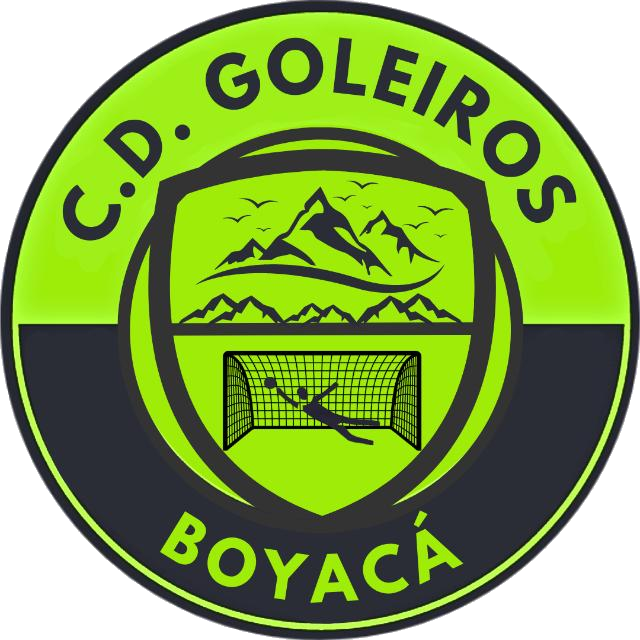
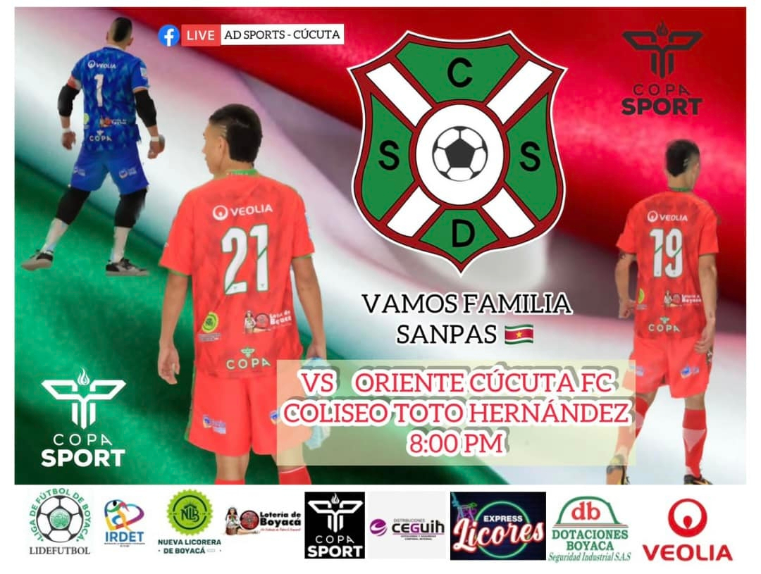
bigger resolution: https://goleirosboyaca.com.co/ bigger resolution and historical (logo for liga boyaca included): https://www.facebook.com/alianzanacionalf historical (different ball, colors and typefaces amongst other things): bigger resolution and alt: https://www.facebook.com/SANPASBOYACA


-
💀💀💀 i can attest that many designers are full of shit, tbh, taking themselves too seriously and suffering from delusion in regard to their relevance. i was in a relationship with a designer for a while, and she was writing the same trivial nonsense to describe some of her work (which actually wasn't half bad), it gave me a headache, and i laughed about it in the end, because it was so ridiculous. »this is a chair. it has four legs to emphasize that it is grounded and represents a perfectly balanced entity in harmony with its surroundings. the material wood underlines how much it is in tune with nature and aware of its origins, conveying the message of an intricate and deeply intimate connection between the chair, the environment, and your tired ass cheeks looking for a place to rest for a while. the end.« 🙄😆
-
clearly, they haven’t heard of »restraint« before …
-
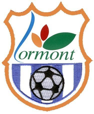
us lormont - 34014701 historical logo:
-
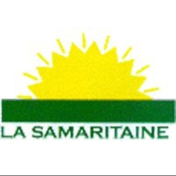
correct logo for as samaritaine - 919121 unfortunately bad, but should work for a while until i redraw it - typeface is copperplate gothic https://www.facebook.com/lasamaritaine97230/ alt:

-
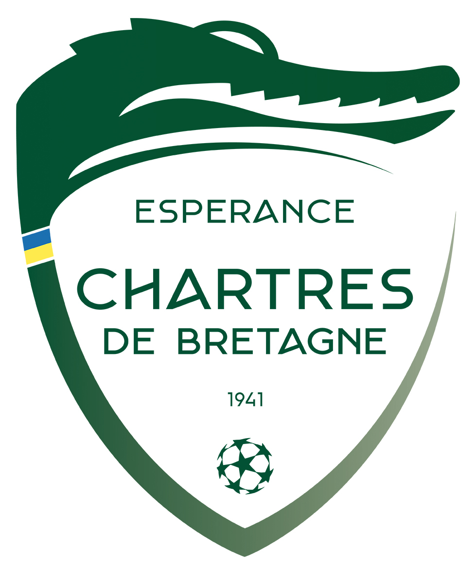
new logo for ésp. chartres de bretagne - 49034307

-
bigger resolution:
-
historical logos (new to old):


-
possible, i looked it up later.
-
it means that the logo isn’t visible. in this thread. for me. whether the club is included in the game db doesn’t matter in regard to the visibility of the image here.
-
they have all the logos for download on the official website
-
the logo is not showing in the thread here.
-
not showing
-
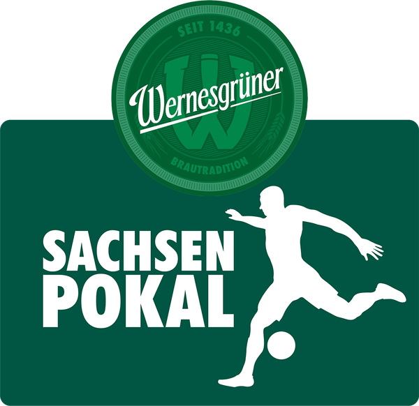
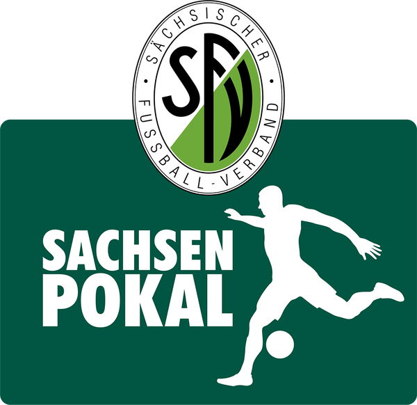
if you have better source logos, you can post them hereuzbek superliga - id 59135038 vector logo https://pfl.uz/sachsenpokal - 2000073342 alt sachsenliga - 2000075278 alt
.thumb.png.84d8eb5d7daff6a9fdb3f8f153361962.png)
_.thumb.png.7620276bc9ce4c5065efad483fa32185.png) sc borea dresden - 6002627, 2000072723 not new, but i only came across it yesterday - feast your eyes
sc borea dresden - 6002627, 2000072723 not new, but i only came across it yesterday - feast your eyes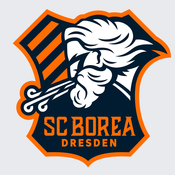 vectors or bigger resolution pngs for the previously uploaded german logos (haven’t checked if all of them are corect / current): https://seeklogo.com/vector-logo/443548/tsg-backnang https://seeklogo.com/vector-logo/474659/fussball-club-dornbreite-lubeck-1958 https://www.fv-dudenhofen.de/dokumente/Vereinskollektion-FV-Dudenhofen_2023.pdf @kristo feel free to share the vectors right away, as it saves time, cheers.alt
 alt
alt


.png.cc312e5a273699354d4abd6d30396b5e.png)
_.png.fff842075477b4242330586b5f2d284e.png)


Important Information
Terms & Conditions