


cameosis
Moderators
-
Joined
Everything posted by cameosis
-
vector of new logo for fk orenburg - 58127493, 58135242 vector of current logo for fk neftekhimik - 130550 http://fcnh.ru/wp-content/uploads/2024/03/logo.zip
-
new sponsor vectors for the russian fnl divisions: fnl 1 - 130487 main alt fnl 2 a - 2000272297, 2000272298, 2000272300 main alt fnl 2 b - 2000272301, 2000272302, 2000272303, 2000272305, 2000272306 main alt
-
national league new logos - 150990, 109201, 5123055, 5123054, 5123054 the league cup has been revived - 109203 (formerly setanta shield due to sponsorship)
-
-
thanks, that clears it up. so one alt folder it will be. as to the montserrat logo, the answer is no, sadly. given that most parts of the island have become uninhabitable, i don't think that the league or cup competitions are the same anymore and i can imagine that most clubs have folded, including salem. i don't even know if they have any football activity at all anymore, population dropped down from 15000 to 4000 people after the volcano erupted. no pics of the logo available online, to my knowledge. 💀 https://www.theguardian.com/artanddesign/2025/jul/11/montserrat-30-years-on-volcanic-eruption-photo-essay
-
i have an idea:
-
coupe de la ligue (guinea-conakry) -> no id (yet) (without the year) new competition since 2022/2023 -> contested by 28 clubs from ligue 1 and ligue 2: https://guineefoot.info/coupe-de-la-ligue-2024-la-lgfp-annonce-le-report-du-demarrage/ sponsor logo below (national lottery of guinea-conakry)
-
logo simplified in 2025 -> 2000142307
-
new league since 2025 -> »level 4« in the u.s. system https://www.theleaguefc.com/our-clubs https://en.wikipedia.org/wiki/The_League_for_Clubs unknown id - @Markitos the league for clubs main alt secondary (both in main - black and alt - white) finals logo (both in main - black and alt - white)


-
new logo as of july 17, 2025 -> 2000008083
-
do we have some means of contact when the site is gone for a while, derek? i remember a few people i had refered to here previously began asking me why it was offline. i told them to sit tight and it would resurface. 😄fire is underestimated until someone or something is affected. we lost our hotel 18 years ago to fire - built in 1910, nordic log cabin style: before the fire: fire (18 hours): this wing below is the only one that didn’t burn to the ground, but it’s been abandoned ever since and looted by all kinds of fuckfaces. 1-2 million euros went up in smoke …a technical question to the colleagues -> i’m still in the process of recovering and reorganizing my files, and i recalled that many clubs use different logo variants for their kits/jerseys, not unlike football federations do for their teams. clubs even have different logos for female and male teams -> the question: does fm offer separate logo displays for clubs and their teams as they do for federations and their teams? if yes, that would impact the packaging of logos.the reasoning behind this is that trophies and achievements are mostly attributed to a club during a period when it had a certain name, otherwise it would mess up the club history in-game. si can be inconsequential and inconsistent about this, absolutely. however, markitos only comments when the id has indeed changed and makes sure that the logo is connected to the right time period/game id. 👍🏿correct logos for rc eduardo castex -> 14089905 main alt

 botafogo-pb -> 301208 new alternate logo, with possibility to become the main logo in the future (simple red star): reason: the current main logo is a trademark of the original botafogo-rj, and simply coloring the star red doesn’t meet the conditions to register it as a trademark proper. https://ge.globo.com/pb/futebol/times/botafogo-pb/noticia/2025/07/21/conselho-do-botafogo-pb-vota-nesta-segunda-feira-a-autorizacao-de-escudo-alternativo.ghtmlsalem fc -> 2000071293 the logo which is active on the sortitousi site - and possibly in our packs, too - is of a british club from halifax in west yorkshire, which folded in 2020 (founded in 1960). it is incorrectly attributed to the montserrat club of the same name, and needs to be removed/deleted. https://www.facebook.com/salem.fc.1/ https://x.com/salemfc https://web.archive.org/web/20190521190118/http://www.salemfootball.club/correct logo for thüringenliga -> 2000075277@Derek serbia’s separate team logo has been retired - 802 they have reverted to using the federation logo: https://www.mozzartsport.com/fudbal/vesti/fss-vraca-grb-sa-cetiri-ocila-beli-orao-odlece-sa-dresova-srbija-u-bojama-zastave/474064 https://www.b92.net/sport/fudbal/srpski-fudbal/110825/srbija-protiv-engleske-u-beogradu-igra-u-plavim-dresovima/vest it can be moved to the »retro« folderdfl-supercup new logo from 2025 (transparent background) -> 92030194 also rebranded to franz-beckenbauer-supercup
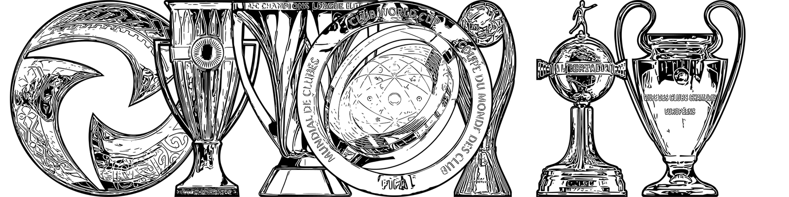
 we usually keep the old logos connected to the old clubs, and in the case of mergers or name changes the new logos are assigned to the new ids, which prevents confusion and historical inaccuracies (hopefully, because si is not consistent in that regard). markitos is our main db dude and can tell you more.i had people like you in mind when i mentioned liverpool in the writeup, have a look. 😁the trophy starter packs are finally live ->


Important Information
Terms & Conditions