cameosis
Moderators
-
Joined
Everything posted by cameosis
-
monochrome alt, from ipswich town’s site:
-
nope! why settle for second best? 😆
-
for completists: last logo before it was dissolved: historical (planned name was women’s major league soccer) barclays vector: VectorSeekWomen’s Super League Logo PNG, SVG, AI Vector – Free Down...Download the Women’s Super League logo in PNG, SVG, and AI formats. Free HD files in one ZIP — ready for web, print, and personal use.wsl 2 bigger resolution (right edge of 2 is cut):

-
ahh, excellent. you had a typo in your post (wls), and there was a league in the usa from 2011-2013 called women’s league soccer, so that threw me off -- they had a division 2. 😂 https://en.wikipedia.org/wiki/Women's_League_Soccer
-
wls as in women’s league soccer? haven’t delved into women’s research yet, had no ids. i’ll have a look. as to the »delay«: some of those should try and see how much time they need to invest in collecting and prepping the logos. ☠️
-
this is usually the case with lower league clubs where there are fewer sources from which logos in hd can be obtained.
-
@Derek by the way, give me a day or two before you release the women’s update -- i have to convert a load of vectors for women’s competitions, mostly historical and alts -- both senior and youth levels.
-
not 100% percent certain, but very likely this: 2000181661 <- u.s. invitational tournament the wicc is an annual invitational tournament in the usa -- or was, rather -- last edition was held in 2022: https://en.wikipedia.org/wiki/Women's_International_Champions_Cup
-
fifa wcc (vectors) women’s icc fifa u-17 wwc (vector) FU17WWC-Logo-for-header-v2.svg fifa u-20 wwc (vector) FU20WWC-2026-Logo-for-header-OK.svg fifa wwc (remove year - variant for dark backgrounds)

-
club wc, variant from fifa tournament site: fifa u-17 wc (vector) Header-Logo-TEST-SVG.svg
-
arab cup vector
-
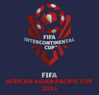
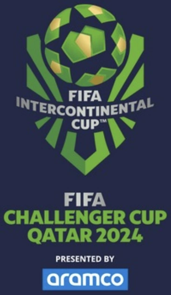
current and correct logos, main and alt variants color wise: ILoveQatar.netFIFA Intercontinental Cup 2025™The FIFA Intercontinental Cup 2025™ final three matches will be taking place in Qatar from 10 - 17 December 2025.https://www.fifa.com/en/tournaments/mens/intercontinentalcup/2025/articles/intercontinental-cup-2025-everything-you-need-to-know the logo is the same, with the respective name of the qualifier added. haven’t found the derby of the americas and challenger cup variants, but that’s how they will look like, too.

-
these are all historical/outdated logos from last year -- the main logo would be incorrect -- the qualifiers have their own logos. link to vector for main (color and black): https://fclogo.top/fifa/comp/FIFA-Intercontinental-Cup-v2024 the historical ones were color-coded:
-
i’ll have to have a look -- the typeface had been changed in the meanwhile, i need to update it, too.
-
vector of the new austrian federation logo:
-
i went back until page 225 in the men’s thread and stayed on the conservative side, i.e. i only moved posts where there were women’s logos exclusively. this should be good enough for starters. @Derek are the 14 leagues you posted above the ones which are playable in fm 26?
-
ok, i'll step forward and announce (wonderfully official) that we will have a separate researchers’ club for women's logos. this will facilitate both tracking changes/updates for the game's two categories and - for purely selfish reasons - make the logo collecting for me easier. 😁 if i haven’t messed up anything, the new dedicated research club and thread should be accessible here: i’ll see if i can find all the relevant posts and move them to the thread, see you there – the more, the merrier! 😄
-
just a question out of curiosity - would it make sense to separate research for women’s and men’s clubs into two threads?
-
thanks for the info, derek. complete trash. i see they have removed background graphics support, too. saves me time regarding stadium and city packs. oh, there's going to be backlash over a lot of stuff, i can already tell. an open source variant of fm 24 would probably kill them.
-
wtf ... i was planning to continue next year with the packs after the data recovery is complete. 💀 what an epic fail, that would be terrible news regarding the immersion level of the game. @ozo pr le moment, c ps possible de les ajouter. on devra attendre la version finale pr savoir plus.
-
franchement, chui ps sûr, car j n'ai ps encore obtenu la version beta pr faire des tests. @Derek has the way how to add the flags to the game changed with fm 26? this user asks how to add them.
-
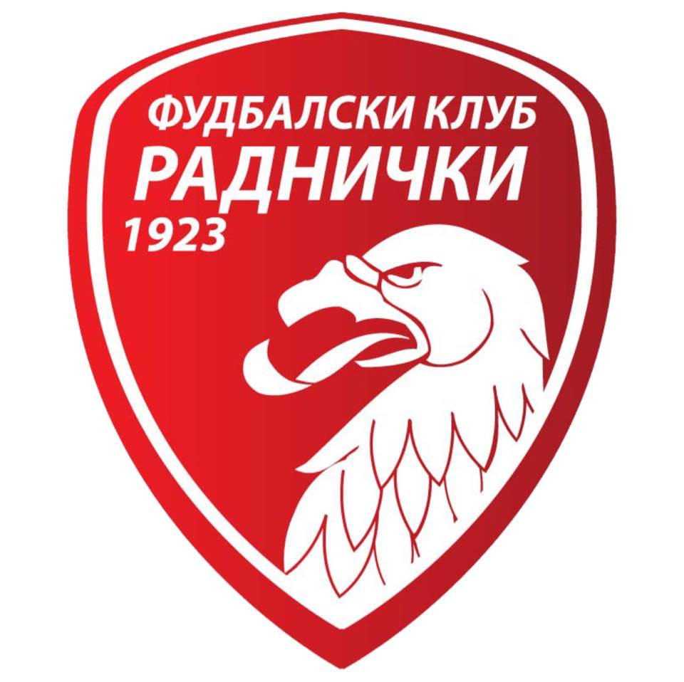
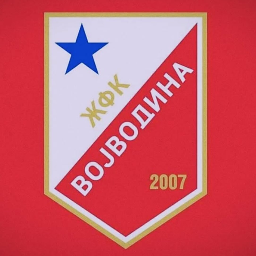
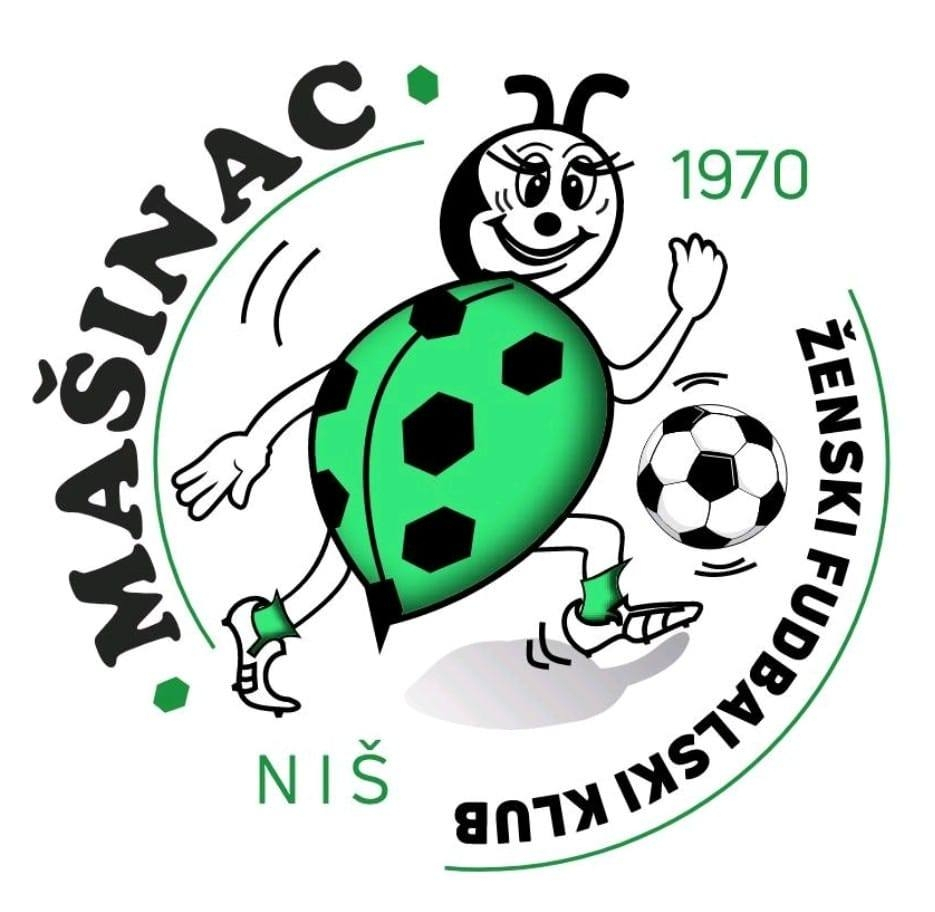
superliga srbije za žene - 2000232686 (vector) alternative (transparent background) historical (transparent background) ======================== žfk crvena zvezda - 2000278776 youth team (extinct) ======================== žfk mašinac - 2000278781 historical historical ======================== žfk milutinac 2023 - 2000369558 historical ======================== žfk partizan sloga - 2000278783 (transparent background) historical ======================== žfk radnički 1923 - 2000278782 historical ======================== žfk spartak - 2000212163 (transparent background) historical historical (transparent background) anniversary ======================== žfk tsc - 200027877 ======================== žfk vojvodina - 2000278784 (transparent background) historical ========================


0.png.cd8d25759ab3ba411bab28753f18ad84.png)


301185192_513163557475515_8292491868308119096_n.thumb.png.262f0fafa68ce55e8507891c8fee35a8.png)


-
magenta liga - 2000232723 ======================== žnk agram - 2000279729 ======================== žnk dinamo - 2000279727 (vector) alternative ======================== žnk gorica - 2000313511 (vector) ======================== žnk hajduk - 2000279730 (vector) alternative historical ======================== žnk istra 1961 - 200036335 (vector) ======================== žnk međimurje - 200031350 ======================== žnk osijek - 2000232707 historical anniversary ======================== žnk split - 2000233752 historical ========================


-
remember who you bought him from! i can't comprehend where the insane amount of individual brainfarts comes from this season, defense was the team's strong suit. 3 goals in ten minutes, two after corners. thankfully, i didn't waste my time on the second half.
-
sadly, i will have to ban derek for five months as penance for this outrageous display of scouser audacity, one month per goal.


301185192_513163557475515_8292491868308119096_n.png.548a12661252c0bacab2416af1050343.png)