cameosis
Moderators
-
Joined
Everything posted by cameosis
-
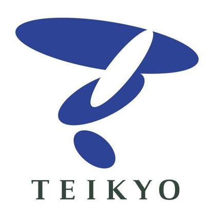
excellent work. i was in a rush to finish the croatian league logos, so apologies for not posting the team names. i found alternatives for teikyo nagaoka and what seems to be a proper logo on their jersey, which is why i posted.
-
the reworked top three league levels and other competitions/clubs for croatia should trickle in sometime before the may update if all goes well.
-
absolutely agree. all these 3d effects and similar nonsense don’t really add much and can be sometimes detrimental to the look of the logo, which is why i strongly prefer the flat design options and variants -- and as you said, makes it easier to create derivative logo packs.


-
teikyo nagaoka jersey with logo (no higher resolution):
-
given that i don’t play fm, i have no idea if these are in the game or have ids, but here goes anyway: alternative logo for the institution (school + university) (sign for the extra-curricular football club): and this one on the right is also used on a site covering the all japan soccer school tournament for teikyo: https://www.sportsanalyticslab.com/match-analysis/shoushi-nagaoka-review.html nihon bunri fc niigata -- current and historical logo (official fb) https://www.facebook.com/nihonbunri.fc.niigata/

-
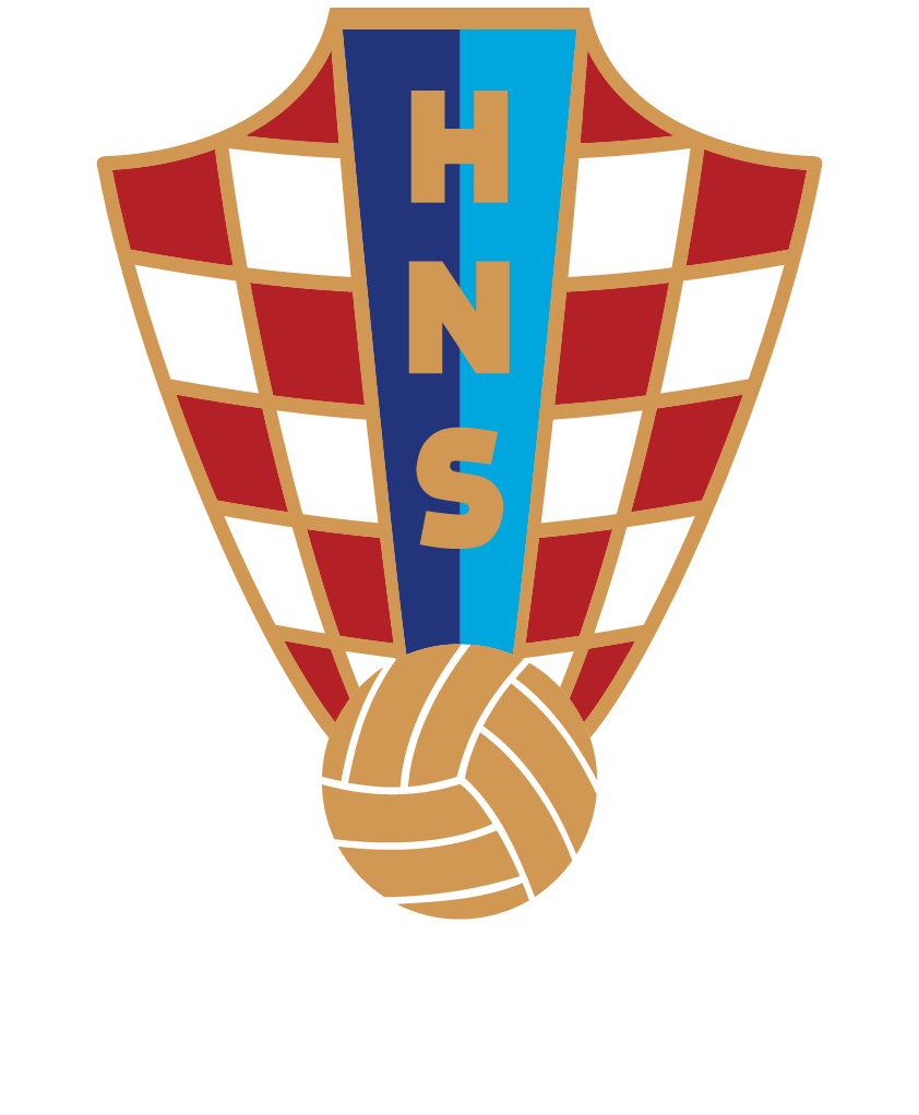
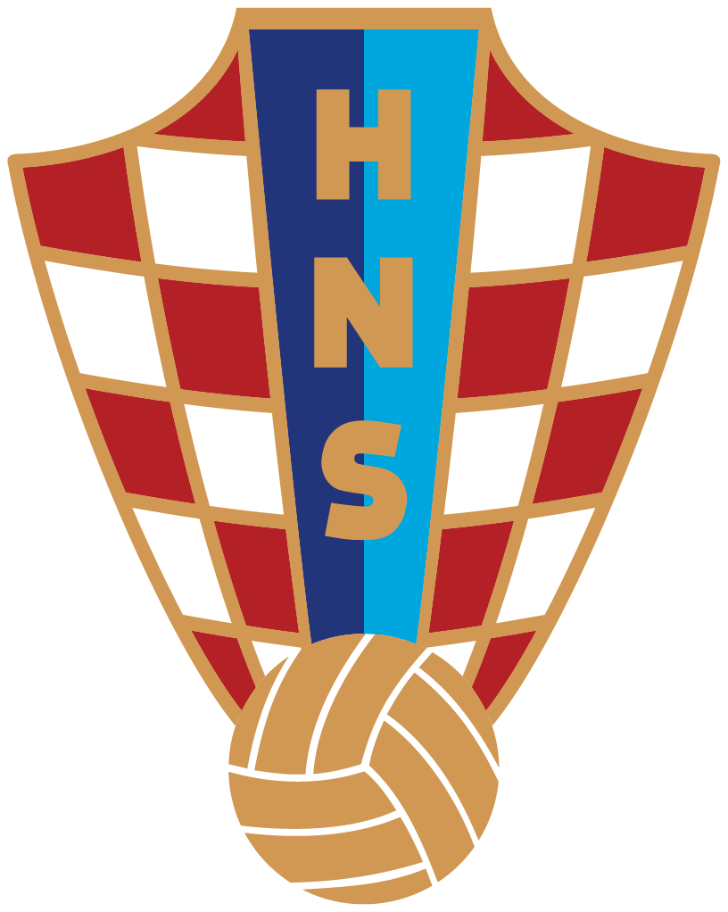
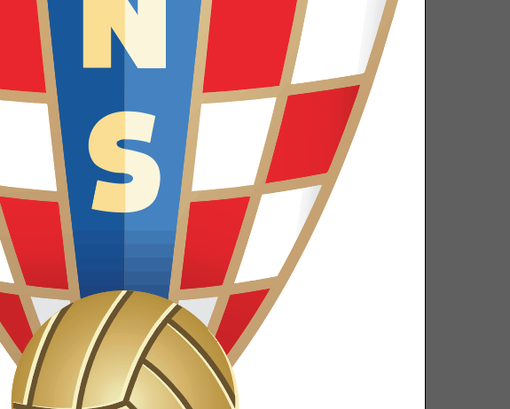
level 4 league competition logos for croatia (3. nl regional groups) - typeface on the federation site is museo slab: https://hns-cff.hr/natjecanja/3-nl-jug/ flat design and alternative gradient version, same with the federation logo (colors taken from the jersey) @Derek, if you need a version with white text, let me know. croatia - id 761 cleaned up the paths and typeface and added a real gradient -- the version on wikipedia and in the official documents has a blocky transition and messed up letters which looks plain bad, see here:


-
alternative logo close to the version on the jerseys:


-
brilliant work, i like the style a lot -- some great concept design there! would have to disagree in part with your bundesliga statement about poor quality logos. it’s correct in regard to munich, but the official eintracht logo is the best football logo in existence (aside from hajduk). ☝️
-
you are correct. it has become a youth club for ages 6 to 14, so this was a bit confusing, together with the cherkassy name, which is a village and doesn’t belong to fanipol city proper, but rather the fanipol district (and there is also a city of the same name in ukraine). https://www.transinfo.by/distance/Черкассы,Минская область,Беларусь/Фаниполь,Минская область,Беларусь the alternative logo for vetraz needs to be edited: v is not part of the company name (it’s a latin letter, too) and the name is written in all capital letters. you can see it in the image from late 2022 that i posted. the cyrillic »d« in the word »zavod« is the bulgarian variant, not the variant used in russia, belarus et al. all super nitpicky, so no stress. 🤣 i listed the main logo for vatraz in a previous post. 👍🏿
-
oh, that absolutely. it shows the form of the legal entity. what i meant was that corporate social responsibility usually is a statute that defines the self-regulating business model that helps a company be socially accountable to itself, its stakeholders etc. it's usually a document/text, the same way terms of service or the end user license agreement are, which just lets you know how the company operates in that given context. that's why i found it so weird. imagine the club was called: terms of service internacional club de fútbol 🥴 but then again, this wouldn't be the first time there is a club with a strange name ...
-
could you post the link to the source file, please? then i’d try and do a parallel search as well, thanks.
-
hehe, i actually did find that but thought that it couldn’t be - naming a club »corporate social responsibility« sounds very weird to me (legal background) … as for example, »terms of service« or »end user license agreement«
-
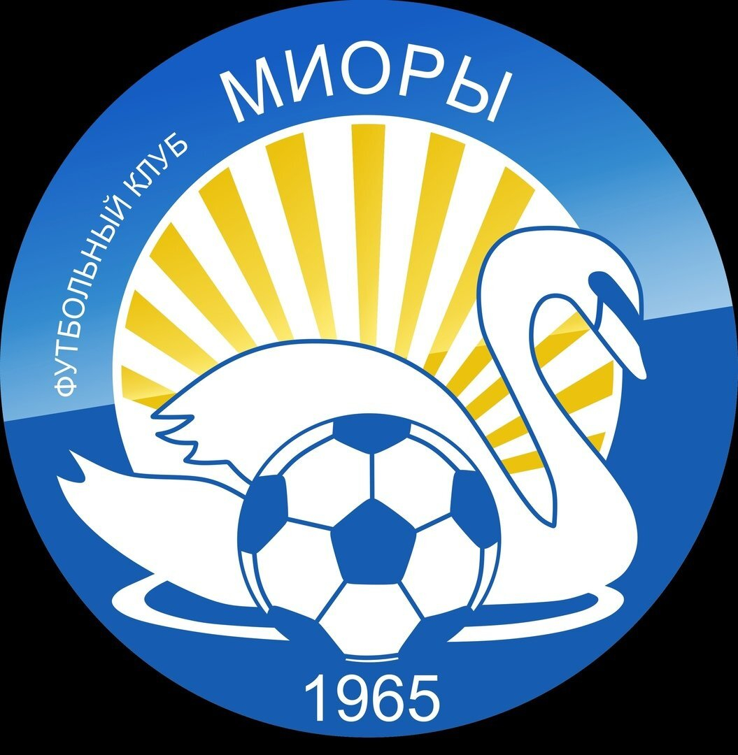
club logo: source: https://vk.com/fc_priozerie factory team for the company ОАО Завод «Ветразь» http://zavod-vetraz.by/ there are jerseys with the factory name, the typographical arrangement is like this: ОАО Завод «Ветразь» the typeface could be cooper black cyrillic, though not 100% certain source: https://vk.com/club51198268 current logo fk miory - id 17025019 source: official vk profile https://vk.com/fcmiory


-
alternative
-
do you know what the abbreviation RSC stands for? i couldn’t find any info about it.
-
svg vectors for the above:
-
it was rejected and remains a concept (really good design though) - the current logo stays: https://www.bradfordcityafc.com/news/2022/november/your-city.-your-say.-the-results/
-
hehe, the audacity to nick finland’s logo and then just cut out the cross (and badly):
-
even bigger they added the olive twig around september 2022 https://www.facebook.com/photo?fbid=535411285056706&set=pb.100057635160836.-2207520000. https://www.facebook.com/photo/?fbid=534675181796983&set=pb.100057635160836.-2207520000. the version without the twig is thus also correct, but historical

-
ευχαριστούμε για την ανάρτηση των λογότυπων εξαρχής! 👍🏿 (and no, i don't speak greek 😂)
-
svg vector (source official club press release) https://www.fc-carlzeiss-jena.de/fileadmin/downloads/fcc_presseinfos_stand_0821.pdf
-
bigger resolution bigger resolution

-
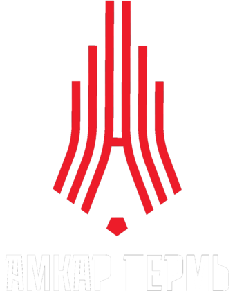
alt with club name (source youth academy progress, cooperation partner of amkar) https://fa-progress.ru/ vector svg (source official club site) brand guidelines and logo pack: https://brand.amkar-perm.ru/ https://brand.amkar-perm.ru/upload/amkar-perm-logotype.zip
-
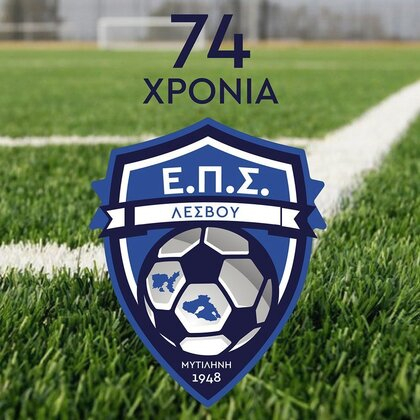
correct logo in bigger resolution (source official club site), note the olive twig https://epsl.gr/
-
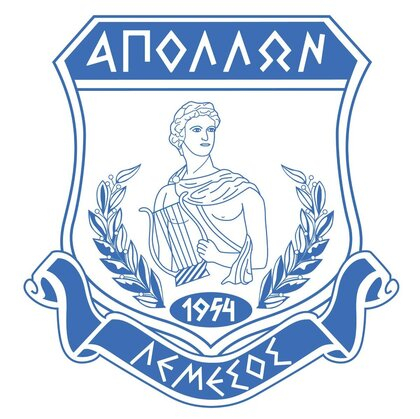
correct logo in bigger resolution (source official fb) https://www.facebook.com/apollonclubofficial bigger resolution bigger resolution but worse quality (official fb) https://www.facebook.com/kerkyrafc