cameosis
Moderators
-
Joined
Everything posted by cameosis
-
svg vector https://horoyaac.com/wp-content/uploads/2022/02/LOGO_HOROYA_AC_Simple-03.svg
-
they are, or should be. i always make sponsor-free versions of logos and have uploaded the caf competition logos previously.
-
u-23 can and can are incorrect, albeit they’re official -- note how the white backdrop for can has inadvertently been placed atop the caf logo and is visible in front, compare it with the u-23 can. detailed explanation here:
-
Verbandspokal Berlin - ID 2000073331 new logo for season 2022/2023
-
atsugi hayabusa fc (missing) - id 45122774 current logo historical logo name change announcement for 2023
-
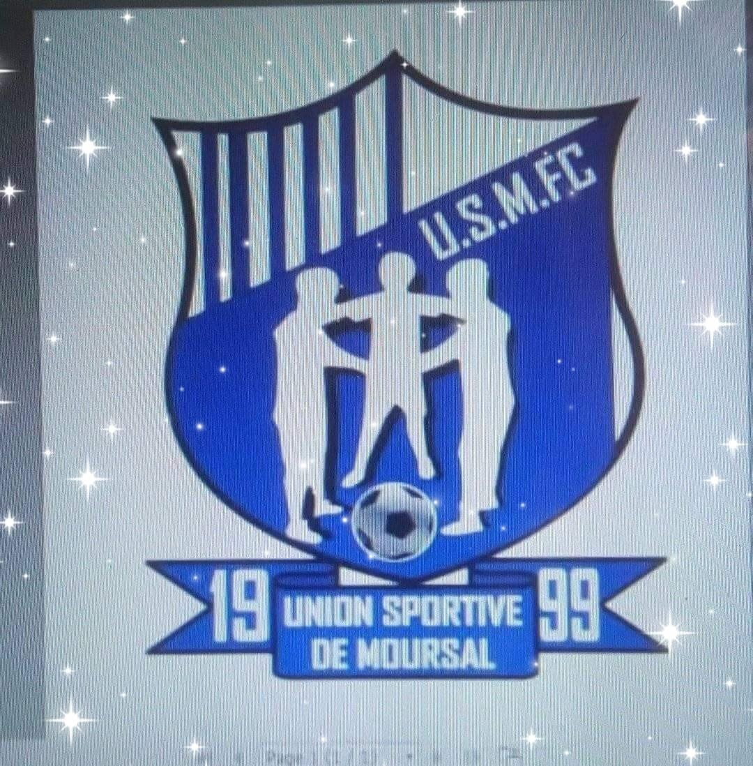
us moursal from chad, no id how the logo does look how the logo should look


-
cheers. there are often hints when you look at lower league club logos what their intention is, but they don’t have the skills or time to do it properly. in germany, a group of guys used to offer free vectorization and logo drawing service to smaller clubs to alleviate this problem. i’ll post another example that i downloaded recently.
-
historical: https://yaita-chuo.com/ https://twitter.com/yaitachuo_ouen/ https://fremn.holyzone.top/index.php?main_page=product_info&products_id=14273 logo for junior high school sections: alt colors: https://yaita-sc.com/ https://twitter.com/yaita_sc/ https://www.instagram.com/yaitasc/ https://www.juniorsoccer-news.com/team/750/
-
bigger resolution:

-
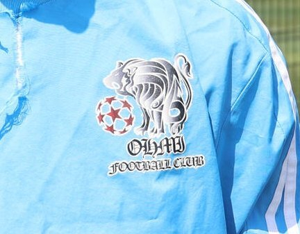
this is closer to how the logo is supposed to look -- another example of a lower level club that doesn’t have resources or staff who know how to update a logo or no access to an image editing application (weird, because open source exists) -- this will have to be worked on eventually to remove the white background around the lynx and draw the diagonal lines correctly all the way to the corners.

-
incorrect logo -- this is the logo of portuguese club Clube Desportivo e Cultural Juventude Ilha Verde (see initials on the logo) https://www.facebook.com/juventudeilhaverde/
-
historical:
-
i believe the correct current logo is the one shown below, following the company logo -- january 14, 2023: https://www.facebook.com/photo.php?fbid=623337543132042&set=pb.100063674046114.-2207520000.&type=3 https://www.facebook.com/photo.php?fbid=422813833184415&set=pb.100063674046114.-2207520000.&type=3 https://www.facebook.com/ascoton.tchadsn

-
the correct name for the top division is Ligue Nationale de Football the correct current logo for the Ligue Provinciale de Football de N’Djaména (LPFN) is below historical logo https://lpfoot-ndjam.com/championnat/


-
historical logo: great stuff, @NassFas!

-
-
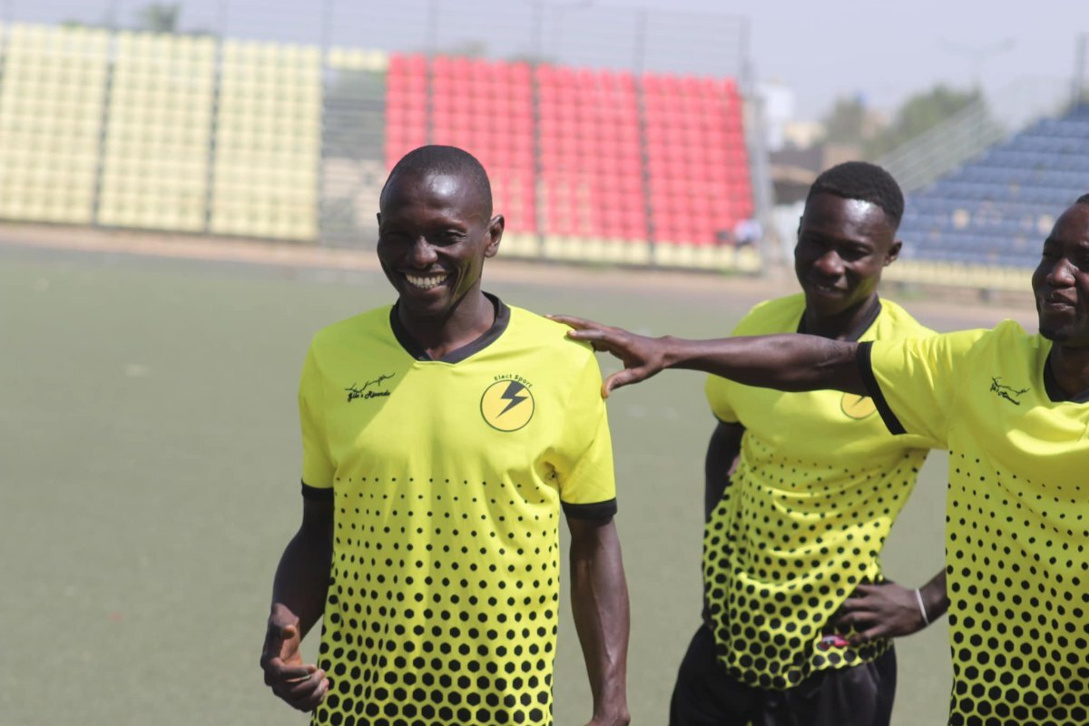
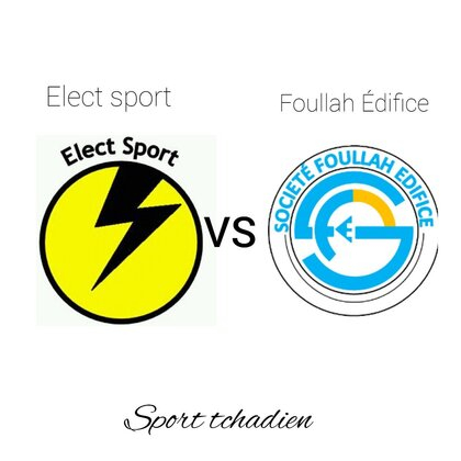
main sponsor/owner is the state-owned société nationale d’électricité, this is their logo: https://sne.td/ the fb page is the official page. one of the many variants they use. there is no »main« logo, consistent corporate identity isn’t a priority, see below, pictures are from late feb 2023 and early mar 2023, home kit/s is/are yellow, away kit is black. elect sport football club on top, 1964 at the bottom elect sport on top elect-sport on top (with hyphen) elect sport football club on top, 1964 at the bottom elect sport on top elect sport on top elect sport football club on top, 1964 at the bottom


-
@AndreaSSL1900
-
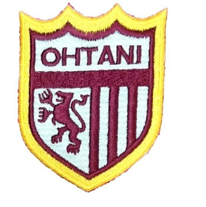
the above is for the senior high school team. logo for junior high school team: alternative logo (used for both teams): https://www.facebook.com/OTANI.HS.CF https://www.facebook.com/OTANI.JHS.CF historical logo:


-
historical logo for the football team and current logo for the volleyball team (reference) current logo for the football team
-
version in ukrainian:
-
this would be the logo for the school, the logo for the football team is below: https://twitter.com/chisuikan_fc/ https://icfc2023.wixsite.com/mysite alternative logo: https://www.facebook.com/iwamichisuikanfc/

-
both aliasing (the jagged look) and matte (background color) issues: that's why png and/or svg/cdr/ai are the preferred image formats for adding and working on logos, because they natively support transparent backgrounds, whereas jpg doesn't - then you need to remove the background and that can cause these issues in the process. the bottom of the caf champions league seems to be cut off.
-
if it is, then the database name transcription/entry is incorrect -- the syllable »zu« is pronounced as in »zoo« -> hiragana: ず, katakana: ズ. tsu is a different sound/syllable and character -> hiragana: つ, katakana: ツ name in kanji with correct transcription: 大津町 (Ōdzu-machi) edit: okay, i looked it up and this is one of cases when japanese and their transcription into latin works wonders 🤣 it’s actually neither zu nor tsu, but in this case dzu -> づ, an irregular reading of the kanji. dzu and zu is often difficult to tell apart for japanese (and in turn, for non-japanese who listen to japanese pronunciation). anyway, not going to bore you with linguistic details 😆. so, it is the correct logo for the correct team, but both transcriptions (zu or tsu) are incorrect. https://kumamoto-oozu.com/
-
if you have questions, you can post here and i’ll try to answer 👍: