cameosis
Moderators
-
Joined
Everything posted by cameosis
-
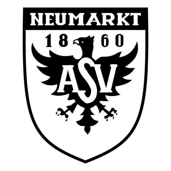
historical logos alt

-
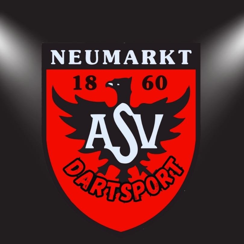
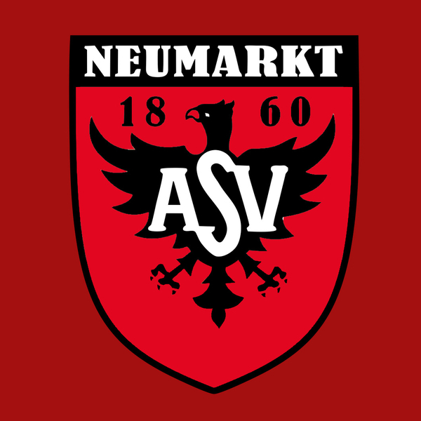
this is incorrect, it’s historical. correct logo is this:

-
better quality - from the club website:
-
same on the football section official website: https://asv-nm-fussball.de/ ironically, from the football fb page (2016): https://www.facebook.com/photo/?fbid=675265135959024&set=a.130065515787375 the font is called itc belwe condensed. dart section uses the parent club logo (in a way): https://www.facebook.com/photo/?fbid=972194241005403&set=pb.100046445078526.-2207520000 the font is called itc souvenir bold. the font in the current football section logo that i posted previously, is mti bernard condensed, and as its name suggests is actually a condensed font. they stretched it, which is why it looks terrible and distorted.
-
they don't have a consistent design, anyway. this is from the official fb page of the football section - different font, red beak (mistake) and different shape of the shield:
-
i had posted the vector already
-
which makes this even easier - the player silhouette and futura bold condensed font, to have a consistent appearance with the cup competition logo, and the league logo is done.
-
you definitely have the high pass filter available in photoshop: https://leannecole.com.au/high-pass-filter-mini-tutorial/
-
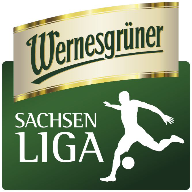
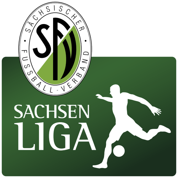
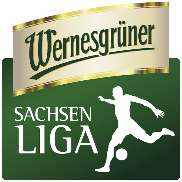
do you mean this one? this is - or was - the correct logo; wernesgrüner sponsored both the cup and the league. the colors are off, because i just took a quick copy of the image fom the vector i drew to post it here, but other than that, that was the league logo. i made an alternative sponsor-free logo:
-
to avoid misunderstandings - the background is supposed to be white, not purple: alt:

-
brilliant brilliant logo, i'm pretty sure this was done by jakub malicki of polskielogo.net
-
vector: asv-neumarkt-logo-svg-vector.svg raster color: raster monochrome: this one needs to be overhauled as well, but that’s for another time.
-
current logo - franklin gothic only version current logo - futura for year of foundation historical - franklin gothic only version historical - futura for year of foundation


-
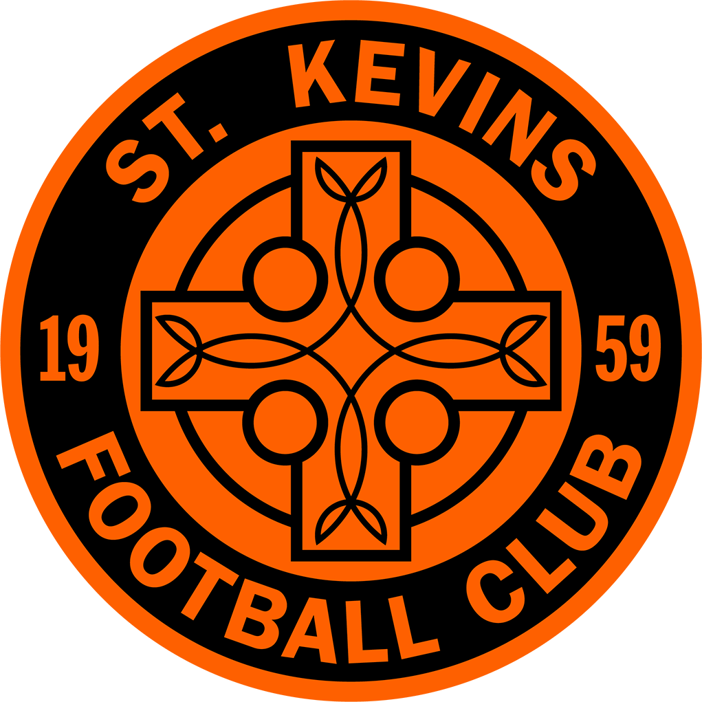
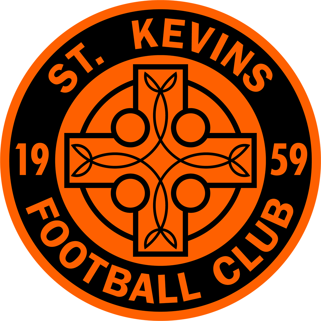
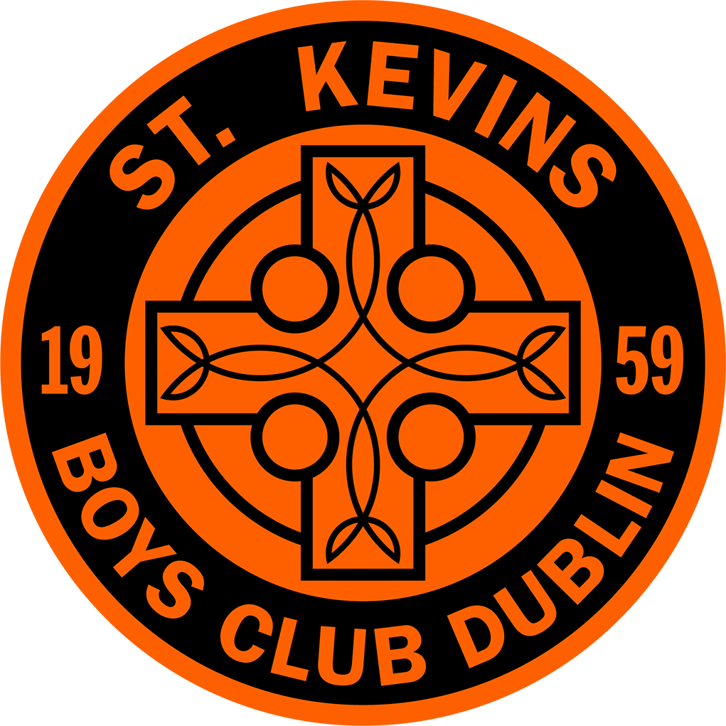
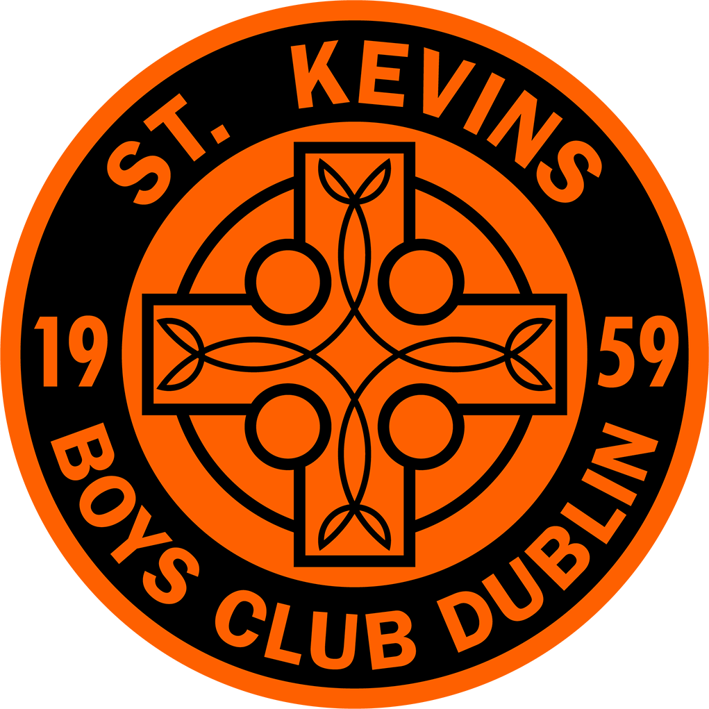
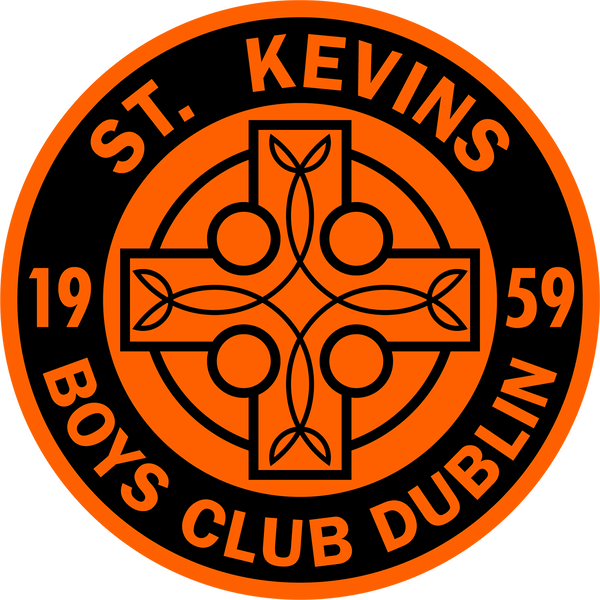
i checked, and am pretty sure that it's one of those cases where an update was botched. reason: the club was called st. kevins boys club dublin - they changed it to football club and that's why the lower part looks like it does. in the process, the circle was squeezed together inadvertently, it's supposed to be perfectly round. kit pictures here: the font is franklin gothic - the good news is, there is also a condensed and a compressed cut, so the entire text can be set in the same font family. anyway, i cannot let this layout/design crime go unpunished, will see if i can manage to put together another variant.

-
it's not a correct circle either but rather an ellipse/oval ... they also use three different fonts, typography is terrible. is this by design or accidental? the ornaments inside the cross aren't centered either.
-
guyana current federation logo - id 374
-
this is why i prefer for my personal collection logos without any sponsors - they have a longer life cycle and last longer than sponsor logos. in such extreme cases, they waste everybody’s time by trying to be up to date with their decisions.
-
i love your priorities, the most important club first! 🔥
-
just seeing these now, i barely check anything outside the logo thread, because buidling the portrait database takes up all of the time at the moment. gold! the dual lighting effect is applied brilliantly, looks natural (as if shot that way initially). @Milho28 you have several sharpening options/filters in photoshop and other graphics applications, which have become better over time, and with the addition of ai, there are a lot more possibilities. 1. camera raw filter -> there is an option for sharpening in the »details« section of the menu; 2. high pass filter (this is where it’s at) as well and then you pick the blend mode that has the best effect - usally something between soft light and linear light; 3. adding contrast also gives the viewer the impression that the image is sharper. there are also options for both opacity and fill, which are not the same. worth checking out tutorials online. an example (for portraits skip to around minute 13): this picture is basically already sharp and hd. if you have a low quality picture to start with, it won’t turn out this way.
-
-
(even) bigger resolution here 😅 couldn’t help it
-
historical (2003-2013): https://baltyckifutbol.pl/lv/bebri-no-staiceles-intervija/
-
sure - »alts« is short for »alternatives«. the championship page was updated and the vector logos are not as easy to find or have been removed altogether. the ones i posted above are the most recent alternatives still on the anfp site. we use different abbreviations sometimes to describe the respective categories that logos fall into: 1. main - current or correct logo 2. alt - alternative 3. hist - historical 4. fantasy or concept
-
campobasso correct logo - ids 43204869, 43066009 i haven’t checked the pack, but there is a wikipedia version floating around which has mixed fonts for the foundation year (serif and sans), see here (19 on the left and 19 on the right, colors are also slightly off) ->it’s a vector, but this one is incorrect. correct logo from official club site:
-
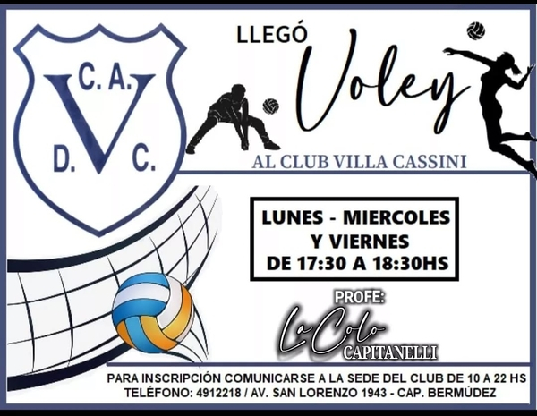
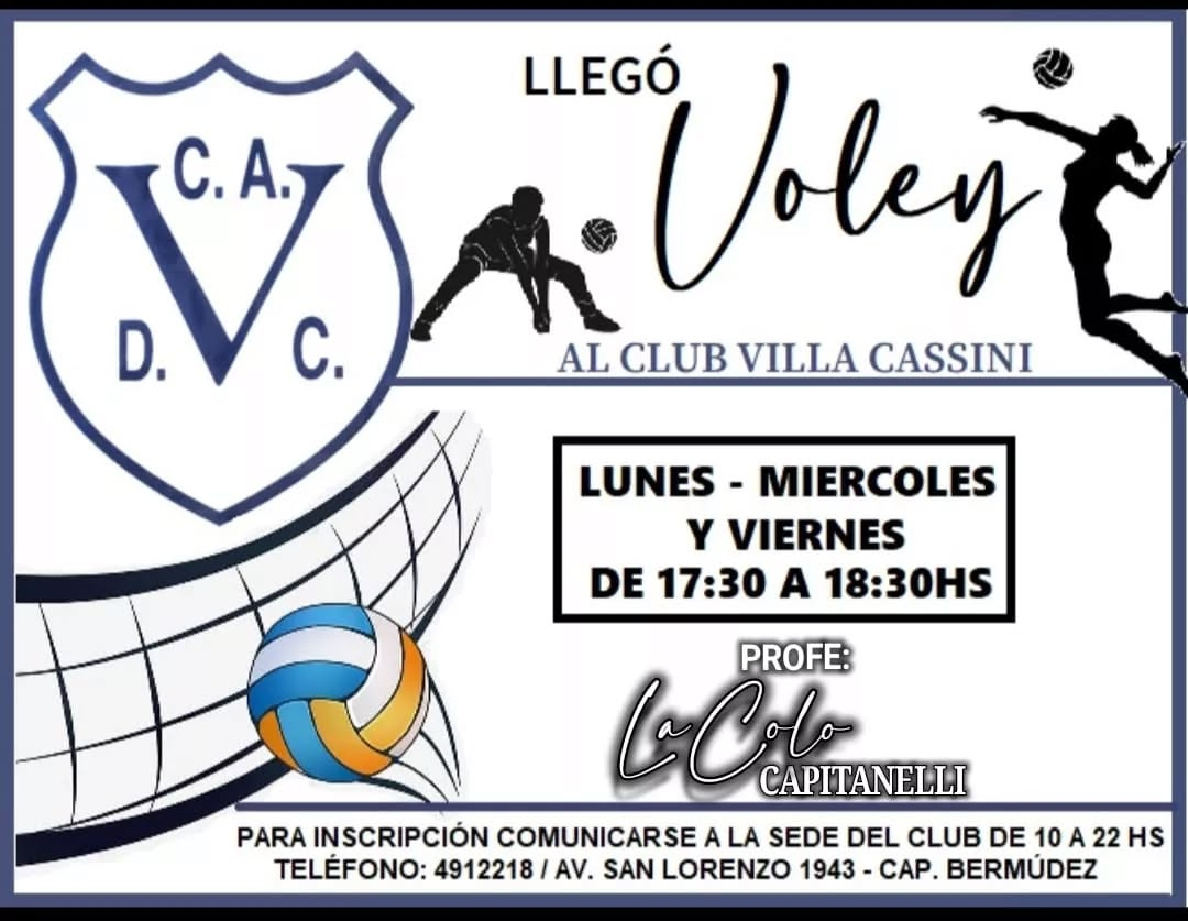
villa cassini, actually -> https://www.instagram.com/club.villa.cassini/ the logo above (white background, blue text) is for the parent club/association (omnisport). the football section’s logo is blue background, white text: https://www.instagram.com/cadvillacassini/ alt bigger resolution: alt 2 (different typeface): logo evolution: