cameosis
Moderators
-
Joined
Everything posted by cameosis
-
regional cup mecklenburg-vorpommern - id 2000073336 new logo for 2023: alternative
-
bigger resolution:
-
they have a lot of wrong names in their database, very sad.
-
commonwealth of independent states, not »soviet« states.
-
that works for me. 👍
-
what wording do you suggest instead?
-
i didn’t say that anywhere, i posted a heads-up about the name change and the new logo.
-
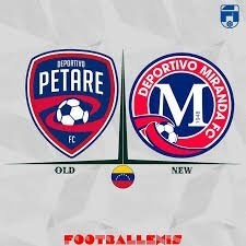
petare changed its name to miranda - id 86000033 https://www.instagram.com/reel/Cpd2hDppuLw/?igshid=MTIyMzRjYmRlZg%3D%3D https://www.balonazos.com/deportivo-petare-cambia-su-nombre-a-deportivo-miranda-fc-para-la-liga-futve-2/ the colors are solid, not semitransparent as in the image above:
-
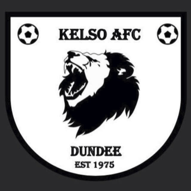
kelso is incorrect, this is the logo for the RUGBY club -- see initials: https://www.facebook.com/KelsoRFC/ the correct logo is this: https://www.facebook.com/MonTheKelso/ gala fairydean correct colors: plus a clone from edinburgh: concept / fantasy:

-
credit to @NassFas

-
it is a football team, but a portuguese one -- i had already posted the correction a few pages ago:
-
that is the case here, yes. what image tracing means: i don’t want to repeat myself here, because i mentioned/explained a lot of these things in my thread that i already shared and sent you the link, but this is one of the examples why official is not the same as good quality. look at the outlines of the initials »rvm«, the city coat of arms and you will see the difference. the vector file was auto traced from a raster/bitmap image, which resulted in loss of quality and detail. the paths are not clean or smooth, the width is uneven etc. another example of an official logo that was auto-traced and thus bad -- örgryte is: https://oisfotboll.se/ for game use, most of the people won’t even care and that’s fine. i personally look at all the details and therefore mention them whenever i notice flaws. redrawn version by me:


-
vector svg
-
vector svg https://upload.wikimedia.org/wikipedia/en/6/69/GIF_Nike_logo.svg
-
this has been traced, the difference shows in the outlines, which are of lower quality. ateesz's share should be used instead. 👍🏿
-
no problem. generally speaking, i don’t know what’s included or missing, because i don’t play the game and don’t have it installed on my computer. a helpful order for research is as follows: 1. official club website / social media profile / page 2. official league or federation website / social media profile / page 3. established sports newspaper website / social media profile / page 4. official competing club website / social media profile / page (they usually post the opposing club’s logo as well when they announce matchdays) wikipedia should come last, they are more often than not either outdated and / or incorrect. i post wikipedia links when i know the logo is correct and there is an svg available, other than that, wikipedia is in general not very reliable, despite their own hype.
-
the logo is incorrect, it’s for the women’s team. this is the correct logo: https://www.scmuenster08.de/ bigger resolution:
-
it’s current, but not »new« -- it has been in use for more than six years, starting with the tournament in croatia in 2017. it was part of the redesign/rebranding of the uefa female and male youth competitions. https://en.wikipedia.org/wiki/2017_UEFA_European_Under-17_Championship
-
typeface for »jinsei gakuen« is aachen bold jerseys from season 2021/2022 onwards (typeface is serpentine): https://yansaka.com/funny/post_004515.html historical (typeface is kabel black):

-
current and historical logo in bigger resolution:


-
looks like a league for company / corporate teams, plus looks like futsal -- is this included in the game? http://brandsleague.com.ua/dokumenty/
-
correct logo, club website (sadly with 3d effect): cdr vector https://www.brandsoftheworld.com/logo/paok-fc-1
-
the name will have to be improved -- the top bar of the letter p is way too thick, compare it with a and o.
-
sv unter-flockenbach - id 91203339 new logo for season 2022/2023 fc eddersheim - id 8700445 correct logo
-
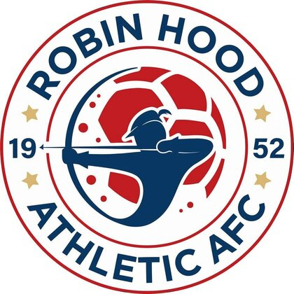
bigger resolution logo is based on clipart also used by english club robin hood athletic, for example: